The best fonts for restaurant menus, by type of venue
Typefaces that hold at 11 pt under restaurant light, organised by room: bistro, trattoria, cocktail bar, café, fine dining, sushi and the pairings to avoid.
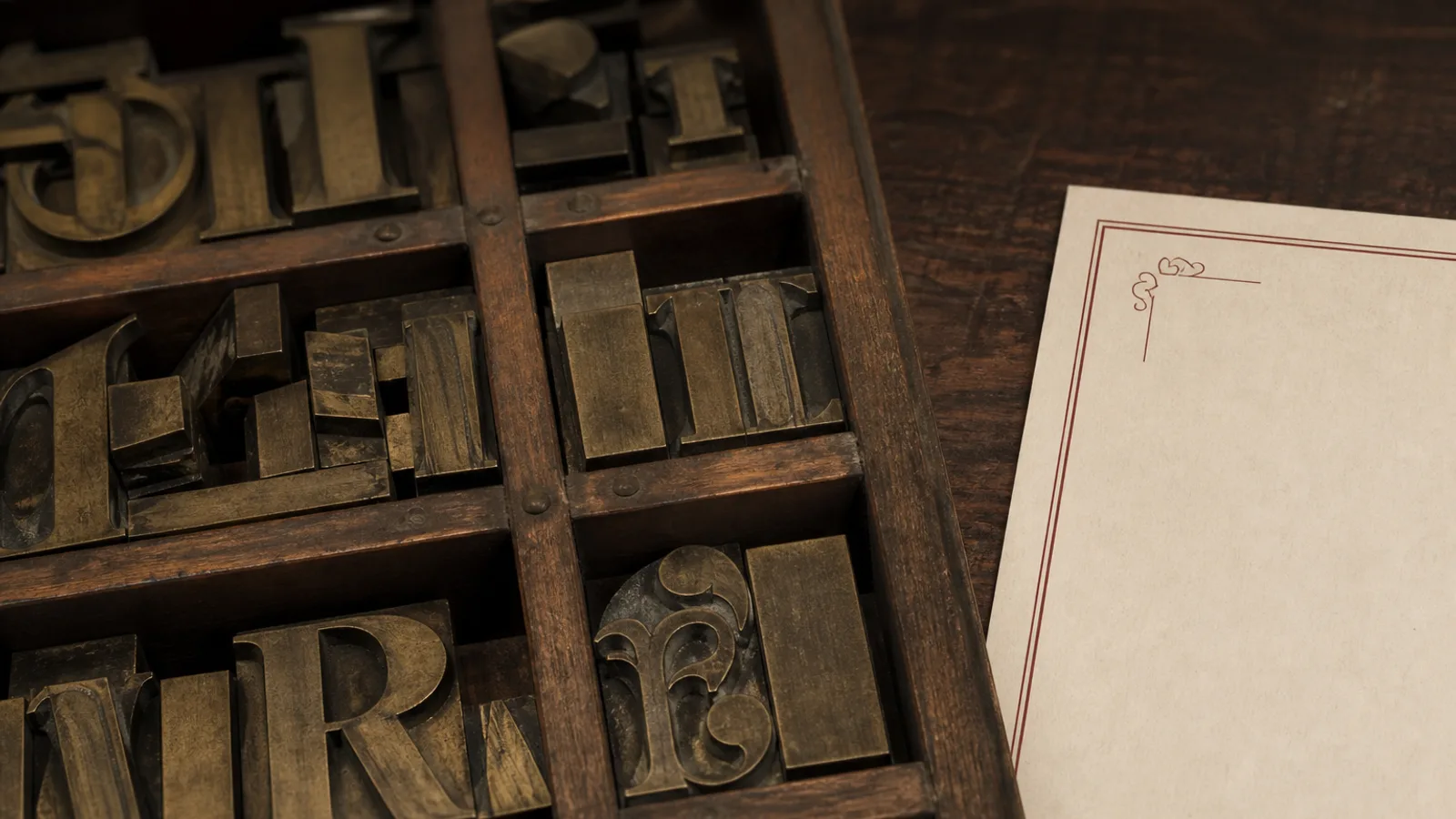
There is no best menu font. There is a font that holds at 11 pt when the pendant is at 2700 K, that has tabular figures so 12 and 24 line up, and that does not argue with the room. A trattoria in a serif that could sit on a wine label is a decision. The same serif on a ramen counter is a costume. Below is a working list by type of venue, with sizes and the mistakes that keep showing up on reprints.
What every menu typeface must do
Before the mood, the mechanics. You need a roman and a real italic (not a slanted fake), a semibold that does not explode in width, and figures that are either old-style for running text or lining tabular for a price column. The x-height should be generous enough that 11 pt does not look like 9 pt. If the family has no italic small caps, do not invent a system that needs them.
Licence the face for print, not only for a website. A free font is fine if the italic is drawn and the figures are tabular. Many free scripts and display faces fail both tests. Write the name of the family on the brief and do not add a second display face because the dessert heading felt lonely.
Bistro, brass and paper napkins
A neighbourhood bistro wants a text serif with a little ink: Freight Text, Lyon Text, Source Serif, or a well-cut old-style such as Sabon. Headings 14 to 16 pt semibold, dishes 11 pt roman, descriptions 10 or 11 pt italic. Prices in the same size as the dish, lining tabular. This is the Bistro Classic problem: warmth without nostalgia paste. Avoid Copperplate, avoid a French-looking script on every starter, avoid a condensed gothic that belongs on a metro map.
If the room is more café than bistro (daylight, breakfast, a chalk specials board), a humanist sans holds better: FF Meta, Atlas Grotesk, or Source Sans. Pair it with a small serif only if you have a wine list that needs the dignity. Otherwise one family, two weights, and let the chalk be the second voice.
Trattoria, grill and the long Italian name
Italian menus fail when the type cannot carry Tagliatelle al ragù di cinghiale without wrapping twice. You need a face with a decent set-width and old-style figures that do not shout. A Renaissance serif (Garamond in a good cut, not the system one; Freight; Kepler) or a sturdy slab if the room is more osteria than white cloth. Never set the whole card in a fake-hand letter. One line of a good script on the cover is enough theatre.
Section words in Italian (Antipasti, Primi, Secondi) can sit in small caps or in a slightly tracked grotesque, 9 to 10 pt. If you mix English and Italian, keep one language in italic and be consistent. Guests should not have to guess which word is the dish.
Cocktail bar, sushi counter, fine dining
Cocktail lists like contrast: a high-contrast serif or a sharp grotesque, never both at full volume. Art Deco rooms can take a geometric sans with a real thin (not Avenir Next Ultra Light at 9 pt) for names, and a text serif for the build. Keep the build at 10 pt minimum. Dark boards need 12 pt reversed. If the drink names are long and jokey, the type should be calmer than the copy.
- Sushi and raw bars: a quiet grotesque or a Japanese-informed sans with Latin that actually matches. Avoid brush scripts and red circles unless the room already has them.
- Fine dining: a text serif with old-style figures, generous margins, few weights. The luxury is the space, not a fashionable display.
Fine dining cards die when someone adds a fashion serif with hairlines that vanish on uncoated 350 g. Test the thins at 11 pt on the stock you will print, not on the office laser. If the hairline disappears, choose a workhorse (Lyon, Freight, Miller) over a trophy face.
Modern rooms and the sans-only card
A modern minimal room can live on one grotesque: Neue Haas Grotesk, Aktiv Grotesk, or a well-spaced Helvetica if you already own it and will not set it tight. The danger is evenness. Differentiate with size and weight, not with a second sans that is almost the same. Headings 13 to 15 pt medium, dishes 11 pt, descriptions 10 pt in a slightly lighter weight or in italic if the family has one that is not a slant.
Mediterranean and sunlit rooms tolerate a little more colour in the type: a warm serif, a slightly flared sans. They do not tolerate a party of three display faces. One accent is a heading colour or a single mark, not a new font.
Faces to leave on the computer
- Papyrus, Comic Sans, and anything that looks handwritten unless a human actually wrote the card.
- Trajan and other all-caps inscriptional faces for body copy. They are for a title, once.
- Free scripts with collapsing joins. They fail at 14 pt on a cover and fail harder inside.
- System Times and Arial used together because they were there. That pairing is a default, not a system.
If a guest can name the font from across the table, it is probably too famous or too ugly. The job is not to be recognised as a type choice. The job is to make the sea bass easy to find and the price easy to trust.
Choose the room, then the family
Write three words for the room, pick one family that can do headings and body, print an 11 pt paragraph on the real stock, and stop shopping. A reprint is not the moment to collect type. It is the moment to lock a system the kitchen and the next season can live with.
In Menu Atelier the eight starting styles already carry type systems matched to the room: Bistro Classic and Trattoria Rustica sit in serifs, Modern Minimal and Sushi Zen in quieter sans, Art Deco Cocktail and Fine Dining Editorial in higher contrast. You can switch format without rebuilding the pairing, and the print bundle keeps the faces embedded so your 350 g run does not substitute a system font at the RIP.