Old-style vs lining numerals: the detail that makes menu prices look right
What old-style and lining numerals are, when each belongs on a menu, how tabular figures align prices, and how to switch them on in your typeface.
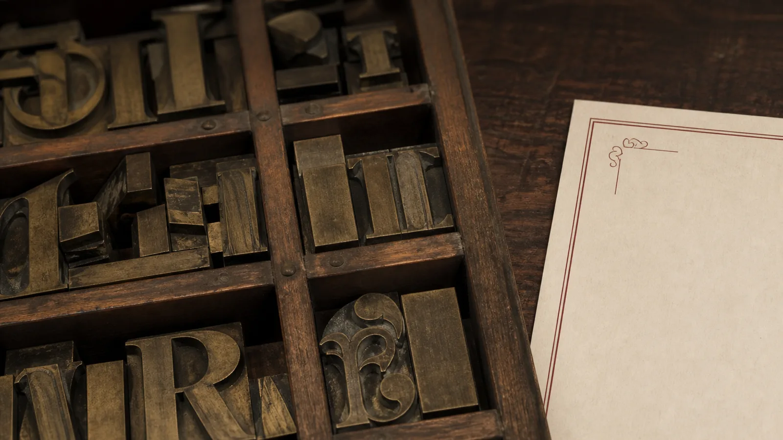
Look at the prices on two menus side by side. On one, the figures sit like capital letters, all the same height, marching in a line: 14, 18, 26. On the other, the 4 and the 6 dip below the baseline and the 8 rises above the 1, so the numbers read like lowercase words: 14, 18, 26 in a different rhythm. Neither is wrong, but each does something specific to how a price feels, and most menus use whichever the typeface defaulted to. This is a short guide to the two families of figures, the third variant that matters for columns, and how to choose deliberately.
Two ways to draw a number
Lining figures, sometimes called titling or modern figures, are all cap height and sit on the baseline. They arrived with the Enlightenment typefaces of the late eighteenth century and became the default in the twentieth because they are easy to cut for typewriters and screens. Old-style figures, also called text or lowercase figures, are older, and they behave like lowercase letters: 0, 1 and 2 sit at x-height, 6 and 8 have ascenders, 3, 4, 5, 7 and 9 have descenders.
The visual result is simple. Lining figures shout slightly; they have the weight of capitals in a line of text. Old-style figures blend in; a price set in old-style figures reads at the same volume as the dish name next to it. In a paragraph of running text, old-style figures are almost always the right choice. On a menu, where prices are both text and data, the answer depends on what you want the price to do.
What each does to a price
Cornell's menu research, popularised through Kimes and Wansink, found that the way a price is presented changes how much guests spend: prices with a currency symbol and decimals read as more expensive than a bare figure, and prices that stand out visually get more attention than the dish. Numeral style is part of that presentation.
- Old-style figures soften the price. On a fine dining or bistro menu where you want the dish to be the hero and the price to be an aside, 24 in old-style figures next to a dish name in the same face sits quietly. This is the choice for most menus that use a serif text face.
- Lining figures clarify the price. On a café blackboard style, a delivery card, a wine list with 60 lines or any menu where guests scan for value, lining figures are faster to read and compare. They also survive small sizes better because the 3, 5 and 9 do not drop below the line where ink spreads.
- Mixed usage is a mistake. Dish descriptions containing quantities, a 300 g rib-eye or a 12-hour braise, should use the same figure style as the prices, or the page looks like two typefaces.
One practical rule: if the prices are in a column, aligned to the right or with dotted leaders, lining figures usually look cleaner because the column edge is consistent. If prices follow the dish name inline, old-style figures usually look more elegant.
The third variant: tabular versus proportional
Independent of old-style or lining, figures come in two widths. Proportional figures have the natural width of each digit, so a 1 is narrow and an 8 is wide; they look right in text. Tabular figures all share one width, so that 11.50 and 88.50 occupy exactly the same space and the decimal points line up in a column. Good OpenType fonts offer all four combinations: proportional lining, tabular lining, proportional old-style and tabular old-style.
For a right-aligned price column, tabular figures are essential; without them, the column edge is straight but the digits inside wobble, and the decimals drift. For prices set inline after the dish name, proportional figures are better because the tabular 1 leaves a hole. Most menu problems with prices that look slightly off are simply the wrong width variant.
Decimals, currency and the shape of a price
The numeral style also interacts with how much you show. Menus in Europe increasingly drop the currency symbol and the trailing .00, writing 24 instead of 24,00 €, because it reads calmer and the Cornell findings suggest it costs nothing in perceived value. If you keep decimals, use a comma in French, Italian and Spanish menus and a point in English ones, and consider whether the .50 or .90 needs to be smaller: a superscript half-size decimal is a classic bistro treatment, and it works only with lining figures.
Whatever you choose, the euro symbol, if it appears at all, belongs after the figure with a thin space in French, Italian and Spanish convention, and before it in most English-language menus. Keep it in the same weight as the figures and never in bold.
How to switch them on
Both styles live in the same font file if the typeface is well made; the difference is an OpenType feature. In InDesign or Affinity Publisher the option is in the OpenType submenu of the character panel, under Figure Style: Proportional Old-style, Tabular Lining and so on. In CSS the property is font-variant-numeric with values like oldstyle-nums and tabular-nums. In Word, the setting is under Advanced in the Font dialogue, if the font supports it.
- Check the font. Many free fonts ship only lining figures; type a 3, a 6 and an 8 at 60 pt and see whether they change when you toggle the feature. If not, choose another face or accept lining figures.
- Decide by menu type. Serif, inline prices, restaurant with a story to tell: old-style proportional. Column of prices, café, wine list, delivery card: lining tabular.
- Apply the same style to every figure on the page, including quantities in descriptions, the date on a tasting menu and the phone number in the footer.
- Print a proof at final size and read the prices from 40 cm. If the 3 and the 5 look like they are falling off the line, go up half a point or switch to lining.
A detail that guests feel without seeing
No guest has ever remarked on a menu's figure style, and every guest has felt the difference between a page whose numbers sit comfortably and one where they jostle. It is the kind of decision that separates a menu set by a typographer from one set by default. In Menu Atelier the eight styles each carry a figure setting chosen for the typeface: Fine Dining Editorial and Bistro Classic use old-style figures inline, Café Chalk and the wine list layouts use tabular lining figures in aligned columns, and every dotted leader, decimal and euro sign follows the convention of the menu's language, so the prices look right before you have touched a setting.