A menu design glossary: 60 terms from bleed to x-height
Sixty menu design and prepress terms restaurant owners actually meet: paper, type, colour, folds and the words a file must get right before it goes to print.
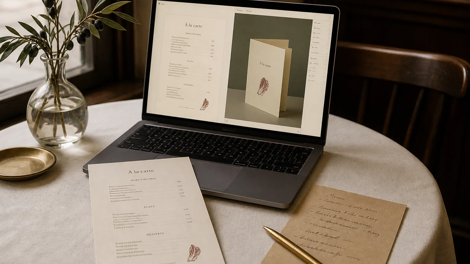
A menu file is a small document with a large vocabulary. Owners meet the words in quotes, in export screens and in conversations about reprints. This glossary is the working set: sixty terms from bleed to x-height, written the way they show up on a restaurant card, not the way a textbook orders them. Use it to read a proof, to brief a designer, or to know why a 99 € print bundle includes a 3 mm bleed whether you asked for one or not.
Paper, trim and the object
- Bleed: ink that runs 3 mm past the trim so a full-bleed colour does not leave a white sliver if the knife moves.
- Crop marks: fine lines outside the trim that show where the sheet will be cut.
- Trim size: the finished size after cutting — A4 210 × 297 mm, A5 148 × 210 mm, not the file with bleed.
- Safety margin: the quiet zone inside the trim, usually 5 mm or more, where type must not sit.
- ISO 216: the standard behind A-sizes; A4 folded in half is A5.
- US Letter: 8.5 × 11 in, common in North America, a different proportion from A4.
- Grammage: paper weight in g/m²; menus that feel like objects usually sit at 300–350 g.
- Uncoated: paper without a gloss or silk layer; takes type well, shows fibre, fingerprints more.
- Coated: paper with a mineral layer; sharper photos, more glare in candlelight.
- Soft-touch: a velvet matte coating that dulls fingerprints and reads as expensive in the hand.
- Laminate: a plastic film, gloss or matte, that survives wiping and can crack on a fold.
- Score: a pressed line that lets a heavy stock fold without cracking the fibres or the ink.
- Bifold: one fold, four pages if printed both sides; the usual restaurant card.
- Trifold: two folds, six panels; easy to overload and hard to keep in reading order.
- Single-sided / double-sided: one face or two; a terrace card is often one face, an evening card two.
- Table tent: a small standing card, usually one fold, for specials or desserts.
- Board: a wall or counter list read at a distance; not a photographed handheld card.
- Holder: the cover or stand the card sits in; measure it before you choose a custom trim.
Type, numbers and the line
- X-height: the height of a lowercase x; a large x-height reads better in dim rooms at small sizes.
- Baseline: the invisible line type sits on; prices and names should share one.
- Leading: space between baselines; menus need more than body text in a book, often 2–4 pt extra.
- Tracking: even letter-spacing across a word or line; tight tracking kills 9 pt descriptions.
- Kerning: space between two letters; display headings need it, dish lists rarely do.
- Point (pt): the type-size unit; 11 pt names and 9–10 pt descriptions are a working restaurant pair.
- Measure: the length of a line of type; more than 70 characters on a menu and the eye gets lost.
- Hierarchy: the ordered sizes that say heading, dish, description, price, legend.
- Serif / sans: type with or without feet; either works if the x-height and contrast hold.
- Weight: how dark the letters are; a bold name and a regular description beat two similar weights.
- Contrast (type): the difference between thick and thin strokes; high contrast fails when reversed small.
- Lining numerals: figures that sit on the baseline at capital height; clean in a price column.
- Old-style numerals: figures with ascenders and descenders; elegant in running text, messy in prices.
- Small caps: capital forms at x-height; useful for AOC and DOP marks if the font has real small caps.
- Ligature: joined letters (fi, fl); fine in a heading, irrelevant in a price.
- Dotted leader: a line of dots from the dish to the price; keep them the colour of the text.
- Widow: a last word left alone on a line; worse on a menu than in a novel because every line is a dish.
- Orphan: a first line left alone at the top of a column; avoid splitting a dish across a fold.
- Price column: a vertical alignment of amounts; read it on its own when you proof.
Colour, files and the press
- CMYK: the four process inks of offset and most digital presses; screens are RGB, files for print are not.
- Fogra39 / ISO Coated v2: a common European coated colour profile; agree one and stay on it.
- Spot colour: an extra mixed ink (a brand red, a gold); costs more and must be named in the file.
- Rich black: a black built from C, M, Y and K; use it for large fields, not for 8 pt type.
- Registration: the alignment of the four inks; crop marks double as registration marks on many files.
- Overprint: ink printed on top of ink; black type often overprints so gaps do not appear if registration slips.
- Knockout: the opposite — a hole left in the background for the type; needed for light type on dark.
- 300 dpi: the usual image resolution at final size; a web photo at 72 dpi will look soft.
- Vector: type and logos as outlines that stay sharp at any size.
- Raster: photos as pixels; they have a resolution and a point where they break.
- PDF/X: a press-oriented PDF family that embeds fonts and flattens surprises.
- Embed fonts: include the typefaces in the PDF so the press does not substitute Arial.
- Imposition: how pages sit on the press sheet; a bifold that reads wrong is often an imposition error.
- Recto / verso: front and back of a leaf; check both before you approve.
- Folio: a page number; menus rarely need one, version dates in 6 pt are more useful.
The card as a restaurant document
- Section heading: the word that groups dishes; five to seven headings on a card is a working range.
- Set menu / formule: a fixed sequence at a fixed price; print the hours and the rules on the same object.
- Cover charge / coperto: a stated amount, not a surprise; write it as a number.
- Allergen legend: the key to the 14 substances of Regulation 1169/2011; bilingual if the card is.
- House pour: the default glass; mark it with a word, not a trophy.
- Signature dish: the plate the kitchen is known for; it does not have to sit first, but it must be findable.
- Contribution margin: selling price minus the cost of the plate; the number behind menu engineering.
- Menu engineering: arranging dishes by popularity and margin, then using position and design to help the ones you want.
- Source file: the editable original; keep one, export print and web from it, do not maintain three lists.
Words you can take to the proof
You do not need all sixty on every job. You need bleed, trim, safety, CMYK, 300 dpi, embedded fonts and a score on a 350 g bifold almost every time you print. You need x-height, leading, lining numerals and a price column every time you set type. The restaurant words — formule, coperto, allergen legend, contribution — are how the file becomes a service document instead of a poster. When a proof comes back, read it with this list in your pocket. If a word on the quote is not on the card, ask what it is doing to the object in the guest’s hand.
In Menu Atelier the export already applies 3 mm bleed, crop marks and a 300 dpi CMYK PDF, fonts travel with the file, and a bifold is scored when you order print on 350 g matte; the 3D view is there so imposition and page order are visible before you approve.