Restaurant menu design: 9 principles that sell more of the dishes you want to sell
Menu engineering for real restaurants: layout, eye flow, price presentation, section order and white space, with examples you can apply tonight.
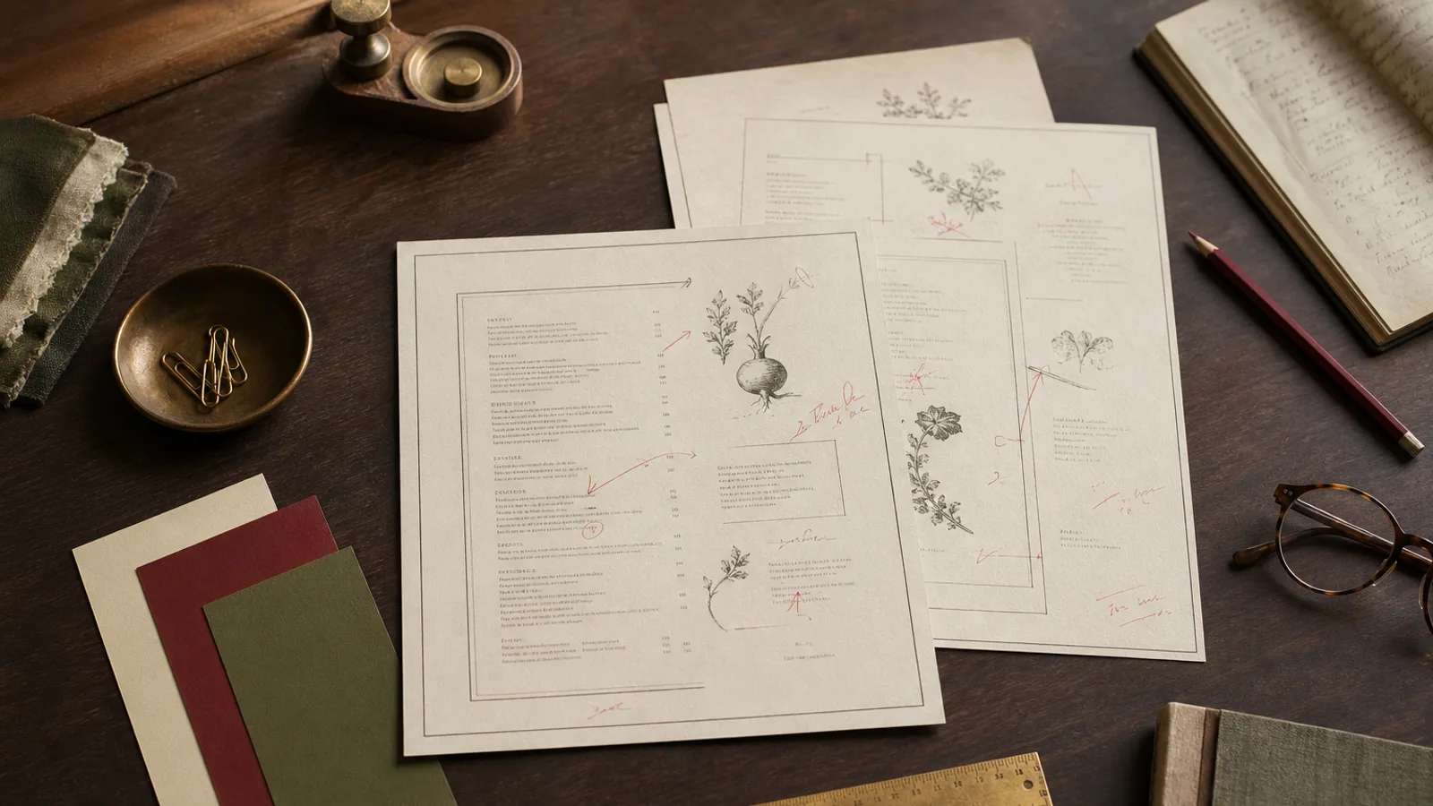
A menu is the only piece of marketing every single guest reads. Yet most are laid out by whoever had Word open the day the prices changed. The principles below come from menu engineering research and from working with printers; none of them require a designer, all of them are things you can ask Menu Atelier for in a sentence.
1. Decide what you want to sell before you lay anything out
Sort your dishes into four groups: high margin and popular (stars), high margin and unpopular (puzzles), low margin and popular (workhorses), low margin and unpopular (dogs). The layout exists to promote stars and puzzles. Everything else is supporting cast.
2. Use the eye’s natural path
On a single page, eyes land top-centre first, then top-right, then top-left. On a bifold, the inside-right upper corner is prime real estate. Place one star there, alone or in a box.
3. Limit choices per section
Seven items per section is the comfortable ceiling. Beyond that, guests default to the familiar (and often the cheapest). If you need thirty pizzas, split them into meaningful groups: classics, white pizzas, seasonal.
4. Present prices quietly
- Drop the currency symbol and the decimals when prices are round: “18” reads calmer than “18,00 €”.
- Never align prices in a column with dot leaders; it invites price shopping. Put the price at the end of the description, in the same weight.
- Avoid ending prices in 9 unless you are a fast-food brand; 14 or 15 fits a bistro better than 14,90.
5. Describe with specifics, not adjectives
“Delicious slow-cooked lamb” says nothing. “Seven-hour lamb shoulder, anchovy, rosemary” sells. Name the farm, the breed, the technique. One line, twelve words maximum.
6. Give the stars room
White space is not wasted paper. A dish surrounded by a little air, a hairline or a small ornament is perceived as more valuable. Use this for one or two items per face, never more, or the effect disappears.
7. Use section order to tell a story
Order sections the way a meal unfolds: snacks, starters, mains, sides, desserts. Put the highest-margin section (often cocktails or desserts) where the eye lands when the menu is closed or turned: the back face or the inside-right.
8. Typography carries the brand
One heading face, one text face, at most one accent. Section titles in small caps or a display serif, dishes in a readable 10.5 to 11.5 pt body face. If your room is candle-lit, go one point larger and increase contrast.
9. Design for the format you will actually print
A design that looks great on screen can fail at A5 or wrap badly once the bleed is added. Preview at real size, check margins of at least 10 mm, and export with 3 mm bleed and crop marks so your printer does not have to touch the file.
Menu Atelier applies all nine automatically and lets you override any of them in plain words: “box the lamb top right”, “prices without decimals”, “desserts on the back”. Try it on the home page with your own menu.