Font pairing for menus: headings and body that work
How to pair a heading face and a body face on a restaurant menu: contrast, shared colour, sizes in points, and combinations that survive a 350 g reprint.
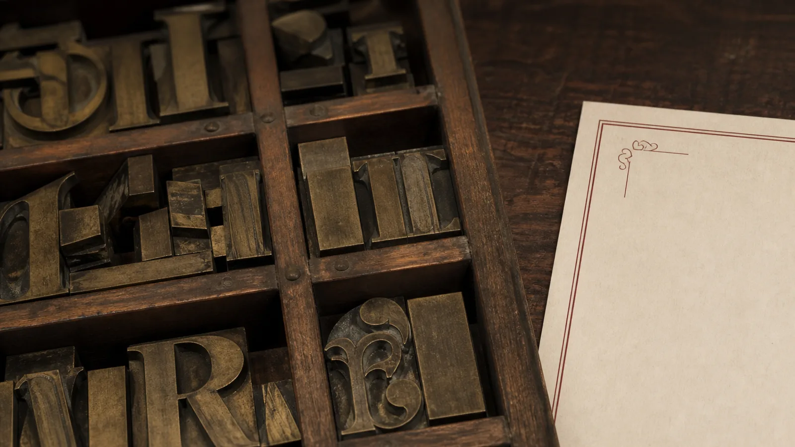
A menu needs at most two voices: one for the name of the section, one for the food. A third voice is almost always a dessert heading that got lonely. Pairing is not a hunt for two pretty specimens. It is a contract about contrast, about shared colour in the stroke, and about which face is allowed to shout. If the heading and the body could be swapped and nobody would notice, you do not have a pair. You have two strangers sharing an 11 pt line.
Start with the body, not the heading
The body does the work: dish names, descriptions, prices, wine. Choose it as if it were the only face on the card. It must have a roman, a real italic, tabular lining figures, and an 11 pt that holds on your stock. Once that family is locked, the heading has a job: to be clearly not the body, in a smaller number of words. That is why pairing from the display face downwards fails. You fall in love with a 36 pt cover word and then force the ravioli into a body that cannot carry it.
If the body is a text serif, the heading can be a sans in small caps or a heavier cut of the same serif. If the body is a grotesque, the heading can be a serif used only for three-word section titles, or a bolder cut of the same sans. Same-family pairings (one family, two weights) are not a failure of imagination. They are how most good cards are built.
Contrast you can measure
Useful contrast is size, weight and structure. A 16 pt semibold sans above an 11 pt serif is enough. A 16 pt serif above an 11 pt serif of similar colour is not, unless the heading is small caps and tracked. Do not look for contrast in decoration: outlines, shadows, a script that appears once per section. Those are noise. Guests find Antipasti because it is larger and darker, not because it is in a different century.
- Shared colour: both faces should look as if they were printed with the same ink, even if one is sans.
- Shared x-height or a deliberate jump: do not sit a tiny-x display next to a large-x grotesque at the same nominal point size.
- One italic: descriptions in the body italic, never in a second italic from the heading family.
- Figures from the body only. A heading face with old-style prices in the column looks amateur.
Pairs that hold on a short European run
Lyon or Freight for dishes, a condensed grotesque (or the sans that came with the serif's optical sizes) for section words in 9 to 10 pt small caps. Source Serif for dishes, Source Sans for labels: honest, licensed together, no drama. Neue Haas Grotesk throughout, with headings two weights up and 3 pt larger: the modern room default. A sharp display serif (a Didot or a modern) for a cocktail list title only, never for the build of the drink; the build stays in a text sans at 10 pt.
Trattoria rooms can pair a Renaissance serif with a small grotesque label. Café rooms can pair a humanist sans with a single script word on the cover and nowhere inside. Sushi rooms should not pair a brush Latin with a mincho-inspired display unless someone who reads both scripts has checked the fit. Most of those pairings are costumes.
Pairs that look like a template
Playfair or another high-contrast fashion serif with Montserrat or another geometric free sans is the wedding-menu default. It photographs well and reads poorly at 11 pt on uncoated board. Trajan with anything is a title, not a pair. A script plus a script is two desserts. Times and Arial is what the office printer already chose. If you recognise the pairing from a free Canva template, guests will too, even if they cannot name it.
Also refuse a third face for the chef's name, a fourth for the address on the back, and a fifth for the allergen key. The key can be the body at 8 or 9 pt. The address can be the heading sans at 8 pt. Restraint is the pairing.
A one-hour pairing test
- Set one section in the body only, 11 pt, with prices. If it fails, change the body, not the heading.
- Add section titles in candidate B at 14 to 16 pt. Print both on the real stock.
- Cover the headings with your thumb. If the card still works, the pair is serving the food.
- If the card collapses without the headings, you were decorating. Recast the body sizes first.
Licence both faces for print. Embed them in the PDF. A RIP that substitutes Arial for your heading sans will destroy a pairing you spent a week on. On a 50-copy run that substitution is more common than designers admit, which is why the export, not the screen, is the proof.
Two voices, then print
Write the pair on the brief in one line: body X at 11, headings Y at 15 semibold, no other faces. That sentence is more useful than a Pinterest board. When the list changes in May, you will still know what to set.
In Menu Atelier each style arrives with a heading and body already paired, so you are judging dishes and mood rather than shopping type. Switching from A5 single sheet to A4 bifold keeps the same pair at the same sizes relative to the page, and the downloaded bundle embeds the faces in the 300 dpi PDF with 3 mm bleed.