Choosing fonts for a restaurant menu: pairings that print well
How to pick heading and body typefaces for a menu, size and contrast rules for dim rooms, and eight pairings from bistro to fine dining.
Type is 90% of a menu’s design. Colours and ornaments matter, but if the dish names are hard to read at a table, nothing else does. Here is how we choose typefaces in Menu Atelier and how you can do it by hand.
Start from the body face
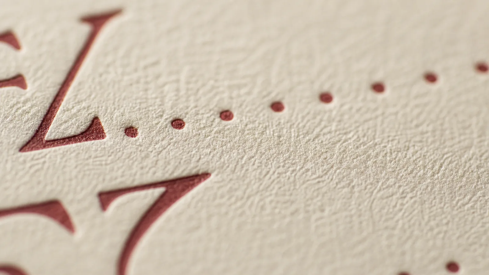
The body face sets dish names and descriptions, the text guests actually read. It must have a generous x-height, distinct numerals and hold up at 10.5 to 11.5 pt on cream paper. Good candidates: a humanist sans (Figtree, Source Sans) for modern rooms, a transitional serif (Source Serif, Libre Baskerville) for classic ones.
Then pick a heading face with character
Headings are few and large, so they can afford personality: a high-contrast display serif (Fraunces, Playfair Display), a condensed grotesque (Oswald) for a chalkboard café, an art-deco face for a cocktail bar. Contrast in style with the body face; never use two similar serifs.
Eight pairings that work
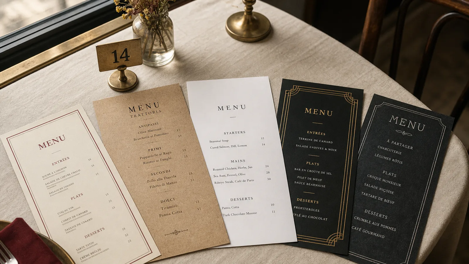
- Bistro: Fraunces (headings) + Source Serif (body)
- Trattoria: Lora + Figtree
- Modern minimal: Inter (both) with weight contrast
- Cocktail bar: Cinzel + Cormorant Garamond
- Café chalkboard: Oswald + Nunito
- Fine dining: Cormorant Garamond + Figtree light
- Sushi: Noto Serif + Noto Sans
- Mediterranean: Playfair Display + Lato
Size and contrast for real rooms
Measure your room’s light at dinner. Below 100 lux (candle and sconces), set body text at 11.5 pt minimum and use near-black ink on light paper, or cream on near-black. Avoid mid-grey text: it looks elegant on screen and disappears at the table.
Numerals
Prices are numerals, so check them. Lining numerals (all the same height) align cleanly in a column; old-style numerals (varying heights) look softer inside a sentence. Use tabular figures if prices line up vertically.
Licensing for print
Fonts used in a printed menu must be licensed for print embedding. Menu Atelier’s library only contains open-licensed families (SIL OFL) that embed in the PDF, so your printer never asks for the font files.