Greek taverna menu design: blue, white and the grill section
How to design a Greek taverna menu that feels authentic without cliché: structure by mezze, grill and oven, colour and type choices, pricing by weight, and transliteration.
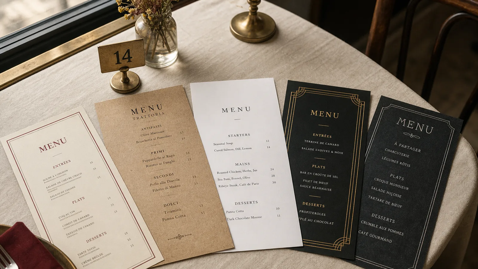
The Greek taverna menu has a problem of its own making: everyone already knows what it looks like. Blue border, white background, a column illustration, a laminated sheet with sixty items and three fonts. Guests recognise it instantly and expect nothing from it. Yet the taverna's food is one of the most sharable, sociable cuisines in Europe, and its menu should make ordering for the table easy and appetising. This guide takes the taverna card apart, section by section, and rebuilds it with the right structure, restrained colour, honest typography and the pricing conventions that Greek cooking actually needs.
Structure the way people eat
A taverna meal is ordered for the table, in waves, not as three courses per person. The menu should reflect that. The strongest structure follows the kitchen: cold mezze, hot mezze, salads, from the grill, from the oven, fish, sides and bread, sweets. That is seven or eight sections, and it maps to how the table will actually order: “a few dips and a salad now, then the grill”.
Put mezze first and give them room; in most tavernas they are 40 percent of what is ordered. The grill section is the heart of the card and deserves the largest heading, but do not let it sprawl. Fifteen grilled items with variants is too many; ten is right. Put the fish section next to the grill so the two proteins are compared side by side, and keep the oven dishes, moussaka, pastitsio, kleftiko, together because they are the slow, generous plates guests share.
Blue and white, used like a designer
The Aegean palette is not the problem; the way it is usually applied is. A blue border around a white page with blue headings and blue prices is monotone and loud at once. Use the colour as accent, not as wallpaper.
- One blue, chosen carefully. A deep cobalt or the greyed blue of painted shutters, around 100/70/0/20 in CMYK, reads as Greek without shouting. Avoid the pure cyan-heavy blue of tourist signage.
- White as paper, not as ink. An off-white or warm white uncoated board of 300 to 350 g carries the palette on its own. Do not print a white background; let the paper be white.
- Blue only on section headings and one rule per section. Dish names, descriptions and prices stay in near-black for legibility; blue text at 10 pt on cream loses contrast.
- One texture, if any. A single motif drawn from the room, a tile pattern, a fishing net, an olive branch, used once as a header element. Not repeated as a border, not behind text.
Tavernas away from the sea, in the mountains or in a city, can leave blue behind entirely. Terracotta, olive green and the warm grey of stone are equally Greek and immediately less generic.
Type: Greek without fake Greek
The single most damaging habit of taverna menus is the “Greek-looking” Latin typeface, where the E is drawn like a sigma and the A like a lambda. It is illegible, slightly insulting and makes the food look like a theme park. Use a real typeface with a real Greek character set if you show any Greek words, and set the Latin transliteration in a clean serif or humanist sans at 11 pt minimum.
Decide the transliteration system once and apply it everywhere: tzatziki not tsatsiki, gigantes not yigandes, souvlaki not suvlaki. Where a dish name in Greek adds warmth, set it in a smaller size after the transliteration, in the Greek alphabet, and make sure the font actually contains the glyphs; a missing character shows as a box on the printed card and nobody will notice until the run is delivered. A short one-line description in the menu's language does more for sales than any decoration: “Slow-roasted lamb shoulder with lemon, garlic and oregano” sells kleftiko to a guest who has never heard the word.
Pricing by weight and by the piece
Greek menus have pricing conventions other cuisines do not. Fish is often sold by the kilo, with the day's fish and price on a board or written by hand. Grilled meats can be by the portion or by the piece; a souvlaki skewer, a lamb chop. Mezze come in small and large. The card needs to make each of these unambiguous, because a guest who orders a 1.2 kg sea bream expecting a plate price is a guest who leaves angry.
- Print “per kg” or “per 100 g” beside every weight-priced item in the same size as the price, not as a footnote, and add one line explaining that the kitchen will weigh the fish and confirm the price before cooking.
- For by-the-piece items, print the unit: “per skewer”, “per chop”, and state how many pieces make a portion.
- For mezze in two sizes, use two aligned price columns with headings, not a slash between figures.
- Sharing platters for two or four should state the number of people and list every component; they are the most-ordered and the most-complained-about item on the card.
- Bread and the cover charge, where you apply one, go in small type at the foot of the first page. Guests accept it when it is visible and resent it when it is discovered on the bill.
Allergen coding matters more than usual here: many mezze contain nuts, sesame, dairy or gluten in forms guests do not expect. Use the fourteen-allergen letter codes of Regulation 1169/2011 after each dish with the legend at the foot of the card, and remember that the codes need to cover the sauces and the bread too.
Format and paper for a taverna
Tavernas have long menus and busy tables covered with small plates, so the card should be compact when closed and clear when open. An A4 bifold, 210 × 297 mm closed, four panels, holds a 55-item card at 11 pt with room for descriptions. Print on 300 to 350 g uncoated board; a matte finish is essential for a terrace by the sea where glare is constant, and a soft-touch surface survives oily fingers better than plain uncoated stock. Skip the lamination and reprint every season; the summer card and the winter card differ anyway, and a new print beats a wiped plastic sheet.
For the fish of the day and the daily specials, keep a small A5 or DL insert on plain card, handwritten or printed each morning, tucked into the bifold. The main card stays stable and the daily part stays honest.
A taverna card that looks like the place
The best taverna menus look like the taverna: a whitewashed wall, one blue door, good bread on a plain plate. Structure by how the table eats, one accent colour, a real typeface, prices that cannot be misunderstood, and heavy matte paper. In Menu Atelier the Mediterranean style starts from exactly these principles, with a restrained palette, a serif with full Greek support and aligned two-column pricing for small and large mezze; paste your dishes with their weights and units, describe the room in a sentence, check the bifold in 3D and export it with 3 mm bleed and crop marks, or have us print it on 350 g matte board with a soft-touch finish and a scored fold.