Serif or sans-serif for a menu? How to choose
When a serif earns its place on a restaurant menu, when a grotesque is clearer, and why mixing them badly is worse than picking the “wrong” family.
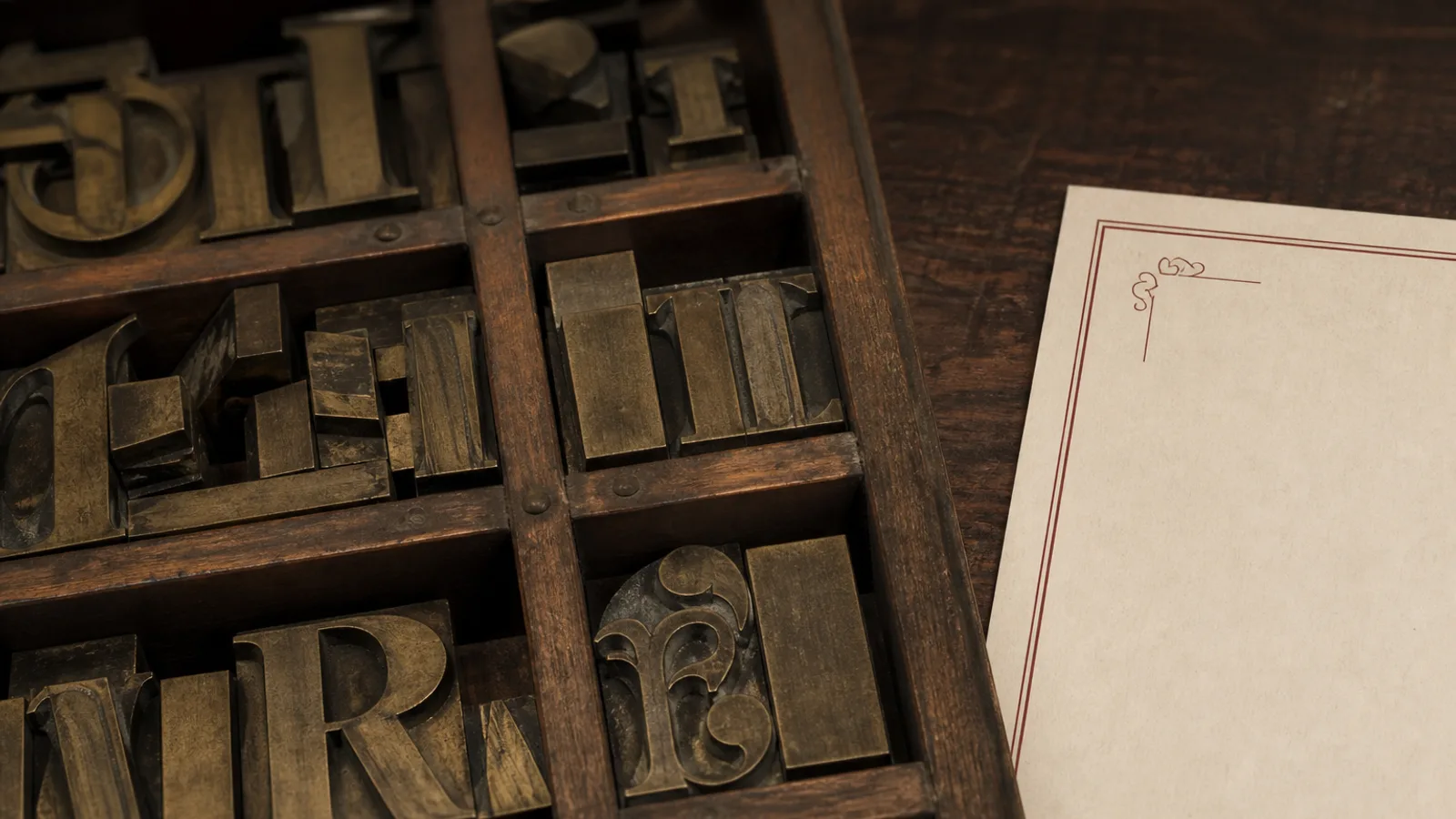
Owners ask for a serif because they want the room to feel older, or for a sans because they want it to feel newer. Guests do not read history in the terminals of a letter. They read whether the sea bass is 11 pt and whether the price sits still. Serif versus sans is a contrast and paper decision, not a brand story. Choose the one that holds on your stock, under your lights, at the length of your dish names. Then stop decorating the choice.
What a serif is actually doing
Serifs are the small terminals that finish a stroke. On a menu they do two useful jobs: they tie a line of text together, so a two-line description feels like a sentence rather than a stack of words, and they carry a little more ink, which warms a cream board. They do a third, useless job when the hairlines are too thin for 350 g uncoated or for reversed type on a dark field. Then the serif is a liability. A Garamond that looks literary on screen can lose its thins at 11 pt on a matte board under a pendant.
Use a serif when the card is mostly words: a bistro list, a wine-heavy room, a fine dining sheet with short descriptions. Use a workhorse (Lyon, Freight, Miller, a good Source Serif) rather than a fashion face. Old-style figures belong in running text; lining tabular figures belong in the price column. If the family cannot give you both, you do not have a menu serif yet.
What a sans is actually doing
A sans-serif (a grotesque, a humanist, a geometric) is a letter without those terminals. It looks even, it packs a little tighter, and it survives reversal and cheap digital prints better than a thin serif. That is why lunch rooms, ramen counters, and modern wine bars default to it. The cost is a card that can look like a settings menu if you set everything in one weight at one size. A sans needs a clearer size ladder than a serif: 15 pt medium for the section, 11 pt regular for the dish, 10 pt for the line underneath.
Humanist sans (Meta, Source Sans, Atlas) have a bit of writing in them and sit well next to food. Geometric sans (Futura, Avenir, a true Gotham if you licence it) look designed and go cold if you set body copy in a thin weight. Never set a menu in Ultra Light. Never set a long Italian primi list in a condensed gothic: the names will wrap and the card will look like a timetable.
The paper and the light decide more than the mood
Uncoated cream loves a serif with some colour in the stroke. Coated soft-touch loves either, but punishes hairlines. A dark board loves a sans or a serif with sturdy thins, reversed at 12 pt. A laminated sleeve loves neither at 9 pt. Print a paragraph of each candidate at 11 pt on the stock you will actually buy, fold it, and read it at table 4. The winner is the one you can still parse when someone has poured water on the corner.
- Serif first: white cloth, long descriptions, wine on the same card, warm light.
- Sans first: short names, many items, daylight or a bright lunch, a card that reprints often.
- Either: a 28-item A5 with 12 mm margins. Neither: a 70-item trifold in 8 pt.
Mixing them is a system, not a compromise
A serif for dishes and a sans for section labels is a classic and it works if the contrast is obvious: the sans is small, tracked, and used only for ANTIPASTI-sized words. A sans for dishes and a serif for a cover wordmark can work if the serif does not reappear in the descriptions. What fails is two text faces of similar colour fighting for the same 11 pt line. Guests feel the restlessness even if they cannot name it.
If you only have time for one family, pick it and use two weights. That card will look more expensive than a clever pairing executed with system fonts. Pairing is a second step, after the room has a default.
Myths that waste a reprint
- Serifs are for expensive rooms. Plenty of cheap rooms set a bad serif and still feel cheap. Paper and size do the luxury.
- Sans is more modern. A 2014 geometric set tight looks older than a 1970s text serif set with air.
- Sans is always more readable. At 11 pt, a good serif and a good sans are both readable. At 8 pt, neither is.
Cornell-style menu studies talk about placement and description, not about serifs. Do not hide a pricing decision behind a type ideology. If the dish is a plough horse, a different family will not save the margin.
Make the choice once per season
Write the decision on the brief: serif body, sans labels, or sans throughout. Print the proof at 100 %. If you still want to switch families after the first fold, you were choosing a mood, not a system. Lock it, reprint, and spend the next hour on the list rather than on another type specimen.
In Menu Atelier each starting style has already taken a side so you are not pairing from a blank page: Bistro Classic and Fine Dining Editorial lean serif; Modern Minimal and Sushi Zen lean sans; you can still switch A4 to A5 in one click and see, in 3D, whether the thins survive the fold on 350 g board.