Typography for French bistro menus: the chalkboard look on paper
How to translate the Parisian chalkboard into a printed bistro menu: typefaces, capitals with accents, the formule block, price conventions and the details that feel French.
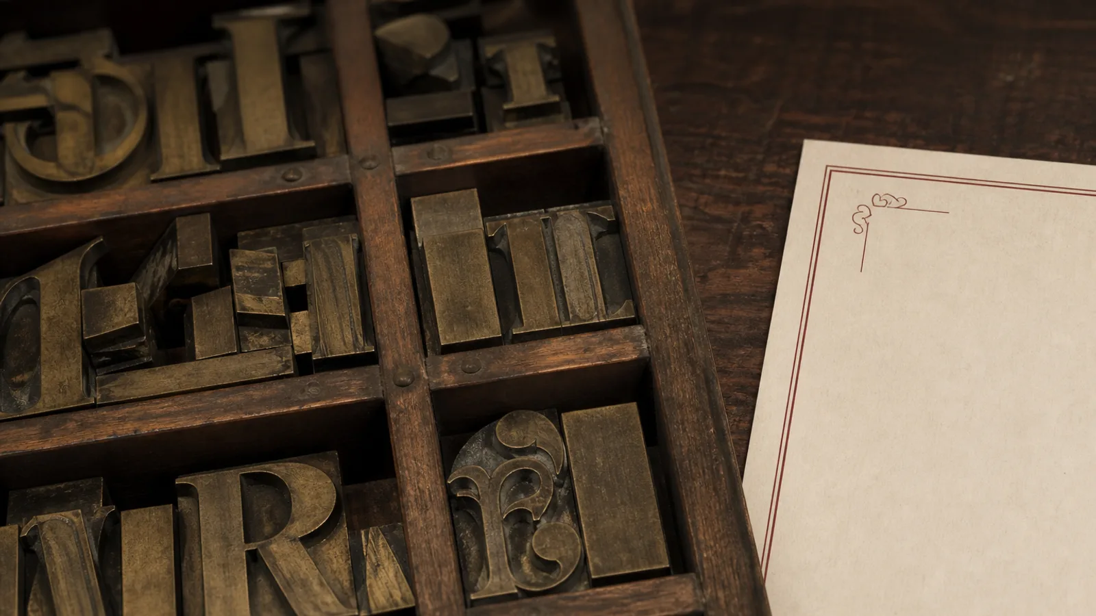
The Paris bistro menu is a chalkboard: a slate propped on a chair, the day's dishes in white capitals with a red line under the plat du jour, prices scrawled at the end of each line. Owners everywhere want that feeling on a printed card and most attempts end up looking like a chain restaurant that bought a chalk font. The board works because of a set of habits, not a typeface, and those habits translate to paper very well once you name them.
What the chalkboard is actually doing
Look closely at a good bistro slate and you will see a consistent system. Everything is in capitals, because chalk lowercase is slow to write and hard to read across a room. Lines are short, three to six words. There is almost no description: the dish name is the description (Blanquette de veau, riz pilaf). Prices end each line with no symbol or a small F or € tail. Section words (Entrées, Plats, Desserts) are underlined once, by hand. One or two items are boxed or written in a second colour.
The board is also temporary. It says the menu changed today and will change tomorrow, which is the promise of a bistro. A printed card cannot make the same promise unless it is visibly a short-run daily print, so the design needs to signal freshness in other ways: a dated formule block, a plat du jour line left for handwriting, or a small inserted sheet.
Typefaces: chalk hand versus condensed grotesque
There are two honest ways to carry the board onto paper. The first is a well-drawn chalk-hand face with real irregularity: contextual alternates so that repeated letters differ, slightly uneven baseline, textured edges. Used at 14 pt or above in capitals for dish names, it can be charming. Used for a forty-item menu at 10 pt, it becomes noise; the texture that reads as chalk at heading size reads as bad printing at text size.
The second way is the one I recommend for most bistros: a condensed grotesque or a French-flavoured sans in capitals, tracked, in one or two colours on a warm off-white or dark board. It borrows the structure of the chalkboard (caps, short lines, prices at the end, underlined sections) without imitating chalk. Typefaces in the tradition of the French poster and sign-painting hand work particularly well: sturdy condensed sans faces, or a slab like Clarendon for the name.
- Restaurant name: a slab or a bold condensed sans, possibly in an arch or with a hand-drawn ornament, 28 to 40 pt.
- Section headings: the same sans in caps, 13 to 15 pt, tracked 100, with a single hand-drawn or thin rule under it.
- Dish names: caps or small caps at 11 to 12 pt, medium weight, tracked 60 to 80.
- Plat du jour, formule, suggestions: a second colour (bistro red, dark green) or a chalk-hand face at 16 pt for these few lines only.
- Legal and allergen text: a plain regular weight in sentence case at 8 pt; never in the chalk face.
French typographic conventions you must respect
The details that make a menu read as French are small and non-negotiable. Capitals take accents: ENTRÉES, CRÈME BRÛLÉE, PÂTÉ EN CROÛTE; a French menu with unaccented capitals looks like it was typed abroad. The euro sign follows the number with a non-breaking space: 14 €, never €14 and never 14€ jammed together. Decimals use a comma: 12,50 €. The formule (a fixed-price combination) gets its own block with the prices for entrée-plat, plat-dessert and entrée-plat-dessert stated clearly.
French punctuation uses a thin space before the colon, semicolon, exclamation and question marks, and guillemets for quotations. On a menu these mostly appear in a line like Nos viandes sont d'origine française : bœuf de Normandie. Set the space before the colon, and use a real œ ligature in bœuf and œuf: it is a letter in French, not a stylistic option, and cheap fonts often lack it.
The formule block
The lunchtime formule is the most read element of a bistro menu and it deserves a dedicated block: a light box or a coloured band at the top of the card, the three prices in a small table (Entrée + Plat 19 €, Plat + Dessert 19 €, Entrée + Plat + Dessert 24 €), the time window (le midi, du lundi au vendredi) and the day's choices left as blank lines if the card is reused across days.
Colour, paper and the board effect
You can go two ways on colour. Dark board (a deep slate grey or near-black, 85 to 95 % K with a little cyan) with cream type gives the most literal chalkboard feeling and prints well on 350 g matte board; keep type at 11 pt or more and medium weight, because reversed text fills in. Light board (a warm cream or kraft-tone paper) with dark charcoal type and one red accent gives the same bistro register with better legibility and a cheaper feel of daily printing.
Avoid the imitation: no photographic chalk smudges, no fake wood frame around the page. The frame belongs to the object; on paper the edge of the card is the frame. If you want texture, choose an uncoated or lightly textured paper rather than a printed texture, and print a solid colour that lets the paper show through.
Structure and length
- Formule block at the top, then Entrées, Plats, Fromages, Desserts as four sections; wines on the back or a separate card.
- Six to eight items per section maximum; a bistro menu longer than 25 items stops reading as a bistro.
- Dish name only, plus one short line for the garnish if needed: Onglet de bœuf, échalotes confites, frites maison.
- Prices at the end of each line, right-aligned in a column or inline after two spaces, whole euros where possible.
- One line at the bottom for origin of meats (mandatory in France for beef) and the allergen notice required under Regulation 1169/2011.
Print like the board changes
A bistro card is not a monument; it should be reprinted often and cheaply. Design for a single A4 or A5 sheet, one or two colours, and a paper that does not look precious, then reprint whenever the carte changes rather than laminating a menu that will still list a winter dish in June. The chalkboard promise (this is what we cook today) is kept by frequency, not by fonts.
Menu Atelier's Café Chalk and Bistro Classic styles are built on exactly these habits: capitals with proper French accents, a formule block, prices after the number with a non-breaking space and the euro sign, and a dark or light board option; when the carte changes you edit the dishes, regenerate and download a fresh print-ready A4 or A5 in minutes, or order a short reprint of 20 menus delivered in 5 to 8 working days.