Typography for Italian restaurant menus: tradition, accents and legibility
Typefaces, heading conventions, accented capitals and the coperto line: how to typeset an Italian restaurant menu that looks authentic without falling into cliché.
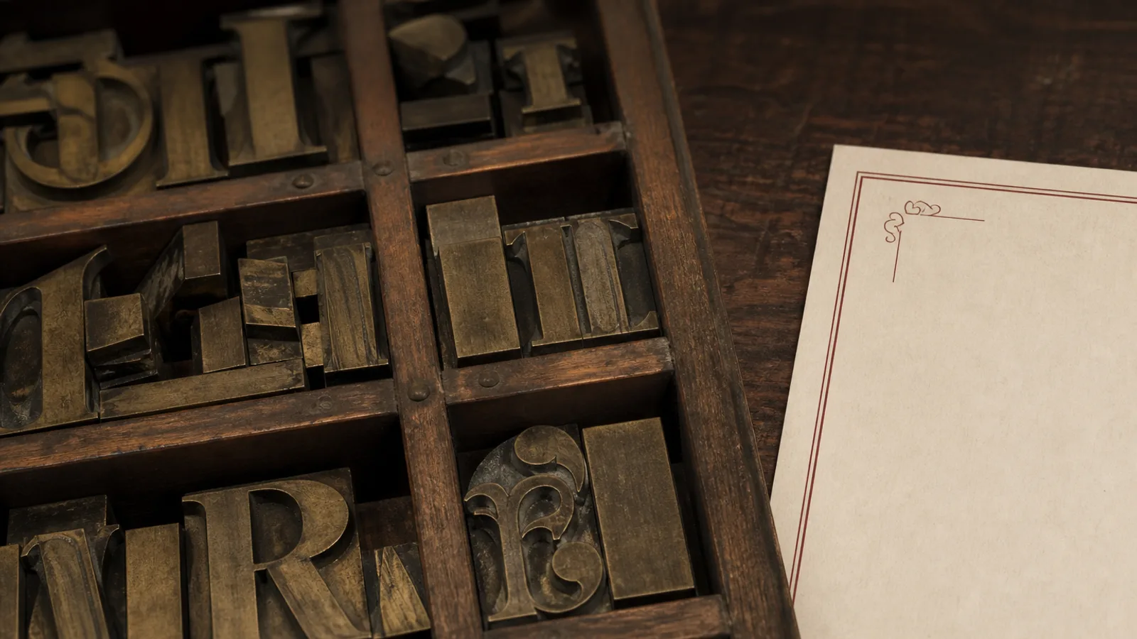
Italian restaurants outside Italy suffer from a specific typographic disease: green-white-red stripes, a font that imitates a Vespa logo, and the word Trattoria set in a brush script that no trattoria in Bologna would ever use. Real Italian menus are quieter and more structured than their imitations, and their typography follows a handful of conventions that are easy to respect once you know them. This is a practical guide to setting an Italian menu that a Roman would recognise as legitimate and a guest in Lyon or Madrid would find easy to read.
What Italian menus actually look like
Walk into a good osteria and the menu is usually a single sheet or a bifold on plain card, often printed daily, with a clear vertical sequence: antipasti, primi, secondi, contorni, dolci. Headings are modest, dishes are named in Italian without translation, descriptions are short or absent, and the price sits at the end of the line. The typography is usually a serif in the tradition of Bodoni or Garamond, or a plain grotesque. The design is inherited from printed menus of the 1950s and 1960s, not from tourist pizzerias.
The lesson for a restaurant abroad: authenticity comes from structure and restraint, not from decoration. Skip the tricolour, skip the Vespa, and invest in the sequence of courses and the correctness of the words.
Typeface choices with an Italian pedigree
Italy gave typography two of its great families. Bodoni, cut in Parma at the end of the 18th century, is the obvious reference for an elegant, slightly formal Italian menu: high contrast, vertical stress, very refined at 14 pt and above. Its weakness is legibility in small sizes and low light, where the hairlines disappear; use Bodoni for the name and headings, and a sturdier text face for dishes.
For the body, humanist serifs derived from the Venetian and Aldine printers (Jenson, Bembo, Garamond and their free descendants like EB Garamond or Cormorant Garamond) carry the same heritage with far better legibility at 10 pt. If you prefer a sans, the Italian rationalist tradition suggests a geometric or grotesque face with tight, even proportions rather than a soft humanist sans.
- Formal ristorante: Bodoni or Didot for the wordmark and section headings, Garamond or Minion for dishes at 11 pt.
- Trattoria or osteria: a single old-style serif family (EB Garamond, Crimson, Alegreya) for everything, with small caps for headings.
- Pizzeria: a robust slab or grotesque, with pizzas listed by name in bold and toppings in regular underneath, 10 pt minimum.
- Modern Italian: a clean grotesque throughout, generous spacing, dish names in lowercase, headings in tracked caps.
Accents, apostrophes and the capital È
Italian uses grave and acute accents on final vowels (caffè, tè, perché, più) and these must be typeset correctly. The most common error on menus printed abroad is E followed by an apostrophe instead of a real È or è, a habit from Italian keyboards that has no place in print. Every professional font has È, é, ì, ò and ù; make sure your layout software is not silently substituting a fallback face for them, which shows up as a slightly different weight on one letter.
Apostrophes should be typographic (curly) and are frequent in Italian: all'aglio, all'arrabbiata, d'oliva, dell'orto. A straight typewriter apostrophe looks wrong immediately. Ligatures of fi and fl are not traditional in Italian typesetting and can be turned off without loss.
Accented capitals in headings
Accents on capitals are mandatory in Italian, not optional as in some French usage. CAFFÈ and PIÙ in caps headings need vertical room; give a caps heading with accents 10 to 15 % extra space above so the accent does not clip against a rule or the previous element.
Structure: courses, headings and the order of the meal
The Italian meal has a fixed order and the menu must follow it. Antipasti, primi (pasta, risotto, soups), secondi (meat and fish), contorni (side dishes, priced separately), formaggi, dolci. Pizza gets its own section, often split into rosse (with tomato) and bianche (without). Do not merge primi and secondi under a heading like Main courses when the menu is in Italian; that structure is exactly what signals authenticity to anyone who knows the cuisine.
Headings are best set in small caps or lightly tracked caps at 12 to 14 pt, in the same face as the dishes. Italian menus rarely translate the heading; leave Antipasti as is and, if you need a second language, set it underneath in a smaller italic.
Dish names, descriptions and the question of translation
Italian dish names are already descriptions: Tagliatelle al ragù, Saltimbocca alla romana, Branzino al sale. Set the name in the regular or medium weight of the text face at 11 to 12 pt, and use a description only when the name does not explain the plate. When you add a translation for foreign guests, set it in italics one point smaller, directly under the Italian name, never in brackets on the same line.
Capitalise only the first word of a dish name and proper nouns: Spaghetti alla carbonara, Bistecca alla fiorentina, Tiramisù. Capitalising every word (Spaghetti Alla Carbonara) is an English habit that looks translated.
Coperto, service and the fine print
Italian menus carry a coperto (cover charge) line, typically 1.50 to 3 € per person, and it must be visible: Italian consumer law requires it to be stated on the menu, and guests everywhere read it as a sign of honesty when it is clear and as a trick when it is hidden. Set it at the bottom of the last page in the same size as the descriptions, not in 6 pt grey. The same goes for the allergen notice required under Regulation 1169/2011 and for the frozen-product mention Italian regulations impose when applicable.
- Coperto and service: one line, full sentence, 9 pt minimum, bottom of the menu.
- Allergens: the 14 EU allergens referenced with a numbered key or an explicit line per dish, in a clean sans at 8 pt or more.
- Frozen or deep-frozen products: the required mention, if any, next to the affected dishes with an asterisk and a footnote in full.
- Prices in euro after the number with a space: 12 €, and the decimal comma: 12,50 €.
Sober, correct, unmistakably Italian
A well-set Italian menu does not need a single flag or a single ornament. It needs the courses in order, an Italian typeface tradition behind the letters, correct accents and apostrophes, small-caps headings, prices at the end of the line and a coperto stated in plain view. Do those six things and the card will read as Italian to Italians, which is a much higher bar than reading as Italian to tourists.
The Trattoria Rustica style in Menu Atelier follows these conventions out of the box: old-style serif, small-caps headings, primi and secondi kept as separate sections, a coperto line in the footer, and full accent and apostrophe support in the Italian version of your menu, which you can check in 3D before exporting the print files.