Uppercase, small caps or title case for menu headings
How to choose between all caps, small caps and title case for section headings on a restaurant menu, with tracking, size and weight settings for each.
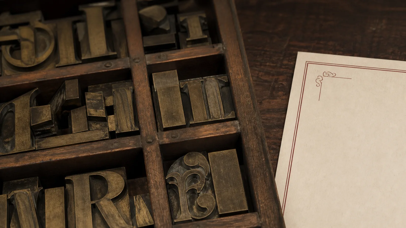
STARTERS, Starters or Starters in small caps: the same six letters, three completely different menus. The case you choose for section headings sets the register of the whole card before a guest has read a single dish, and it also changes the technical settings you need for tracking, size and spacing. Below is how I decide between the three, with the numbers that make each option look intentional rather than default.
What each case says before anyone reads the word
All caps reads as formal, architectural and a little loud. It is the voice of the brasserie sign, the Art Deco cocktail list, the steakhouse. Title case (a capital on the first letter of each main word) reads as editorial and relaxed, close to how a magazine sets a headline. Sentence case, with only the first letter capitalised, is the quietest and most modern; it treats the heading as a line of text rather than a label.
Small caps occupy a special position. They are capital letterforms drawn at roughly x-height, so they carry the formality of caps without the volume. They say tradition, wine list, fine dining, old hotel. They also have a strict technical requirement: they must be real small caps from the font, not scaled-down capitals.
All caps: rules that keep it from shouting
Capitals were designed to start words, not to form them. Set next to each other at the font's default spacing they look cramped, because the sidebearings assume a lowercase neighbour. Capitals also all have the same height, so a word loses the ascender-descender silhouette that lets us recognise it at a glance. Both problems have simple fixes.
- Track caps at 80 to 150 units (thousandths of an em). Smaller sizes need more; at 24 pt, 60 to 80 is enough.
- Use a lighter weight than you would for title case. Bold caps at 16 pt overpower a page; a medium or regular weight at the same size holds the same authority.
- Keep headings short: two words at most in caps. FISH AND SEAFOOD FROM THE ATLANTIC COAST in caps is a wall; the same in title case is a heading.
- Never set caps in a script or a heavily contrasted didone below 20 pt; the thin strokes vanish.
- Check the accents: É, À and Ñ in caps need vertical room, so add a little leading above a caps heading that contains them.
One more caution: all-caps headings above dish names that are themselves in caps produce a page with no hierarchy. If your headings are caps, your dish names must be in title or sentence case, or in small caps of a different size.
Small caps: the elegant option with a trap
Real small caps are separate glyphs, drawn slightly wider and with slightly heavier strokes than the full capitals so they match the weight of lowercase text. Fake small caps, produced by a word processor that simply shrinks capitals to 70 %, are visibly thinner and lighter than the text around them, and every designer spots them instantly. If your font does not have a small-caps feature (in OpenType this is the smcp feature), do not use small caps.
Set small caps with 50 to 100 units of tracking. They pair very well with old-style figures for prices, and they are the natural choice for a wine list, where the grape or region can be in small caps and the producer in italics. On a menu, small caps work for section headings and for the first word of a dish name in an editorial style, but they slow reading if you set entire descriptions in them.
Where to find real small caps
Most professional serif families (Garamond Premier, Minion, Sabon, Baskerville by good foundries) include them, as do a number of well-made free fonts such as EB Garamond, Cormorant, Source Serif and Alegreya. Many popular free sans fonts do not; check the glyph palette before you commit.
Title case and sentence case: the reading choice
Title case is the option that asks for the least technical adjustment: zero tracking, the default weight, and the natural word shape is preserved. Its weakness is that it needs another signal to read as a heading, because it looks like a dish name. Give it size (at least 1.4 times the dish name), or a different weight, or space above it, or a different colour, but at least two of these.
Sentence case is the quietest, and the one that most often needs help: at the same size as a dish name it disappears. It works best in a minimal design where the heading is set in a much larger size or a display face, and where the dish names are themselves small and uniform.
The capitalisation rules for title case differ by language. English capitalises main words; French, Italian and Spanish capitalise only the first word and proper nouns. A menu in four languages therefore has different heading rhythms per language, which is one reason many multilingual menus choose caps or small caps: they look identical in every version.
Choosing by style and by menu length
- Bistro, brasserie, steakhouse: caps at 12 to 14 pt, tracked 120, regular or medium weight, with a thin rule underneath if the style permits.
- Fine dining, wine-led, hotel restaurant: small caps at 11 to 13 pt, tracked 80, no rule, generous space above.
- Café, bakery, modern casual: title case in a heavier weight, 16 to 20 pt, no tracking.
- Minimal or Scandinavian design: sentence case at 20 pt plus, light weight, plenty of space, dish names small and uniform.
- Long menus with eight or more sections: caps or small caps, because repeating a large title-case heading eight times eats the page.
Consistency beats any individual choice
There is no wrong option among the three, but there is a wrong mixture. A menu that sets STARTERS in caps, Main courses in sentence case and Desserts in small caps looks like it was assembled by three people. Pick one case, one size, one tracking value and one spacing above and below, and apply it to every section including drinks and the back page. Then check the capitals with accents at 100 % on a printed proof; the accent on the É of ENTRÉES is the first thing that gets clipped by a tight heading box.
In Menu Atelier every style commits to one heading case and keeps it across all sections, so that Bistro Classic uses tracked caps, Fine Dining Editorial uses real small caps and Modern Minimal uses sentence case; when you add a section, the new heading inherits those settings, and the accents of French, Italian and Spanish headings are rendered from the actual font so they survive the print export.