Autumn menu design: warm palettes, heavier paper and game season
Autumn menu design ideas beyond a pumpkin illustration: CMYK values for warm palettes, paper and finish, type for longer dishes, and how to introduce game on the card.
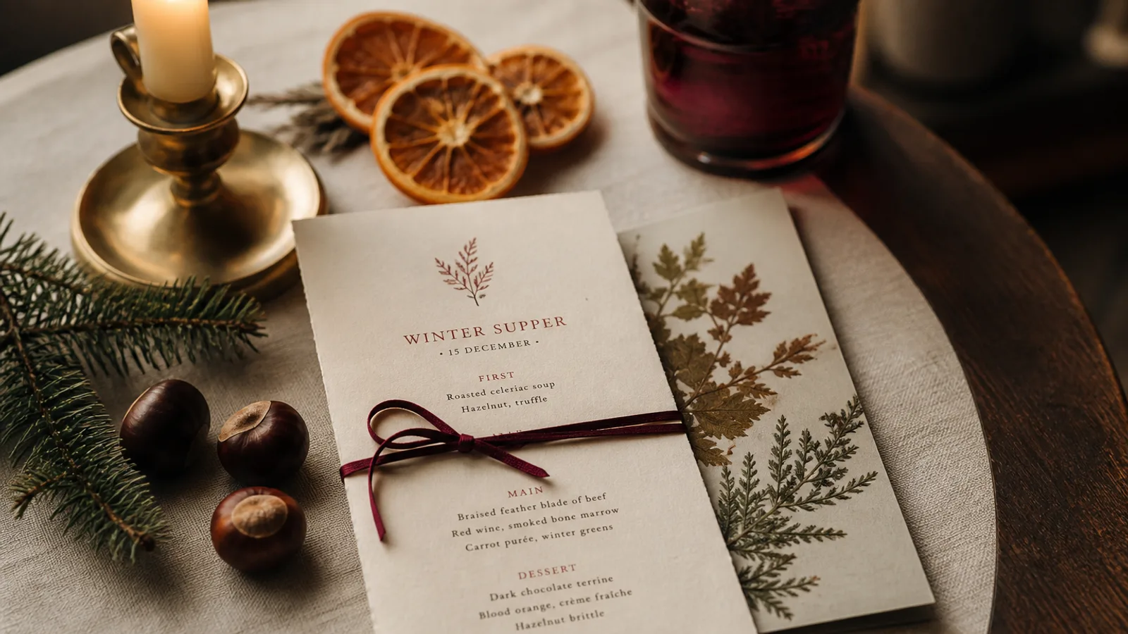
Autumn is the season when a restaurant's menu naturally gets longer, richer and more expensive, and when the temptation to put a maple leaf on the cover is strongest. Resist the leaf. The change of season can be expressed through colour values, paper, type and the way the dishes are grouped, and it will look like a restaurant rather than a school newsletter. Here are the choices that make an autumn card feel warm on the table in October and still look right at the end of November.
A palette built from the ingredients, in CMYK
Autumn colours are the easiest of the year to get right on press because they are already low-saturation and warm. The trick is to pick them from the plate, not from a stock photo of a forest. A chestnut brown for titles, a mushroom grey-beige for secondary text, a single accent in squash orange or bordeaux. In CMYK terms, a chestnut around 40/65/80/40, a warm stone around 15/20/30/5 for tints, and an accent orange near 10/60/95/5 print reliably on Fogra39 / ISO Coated v2 without turning muddy.
Avoid pure orange and pure red together; on paper they vibrate and look like a fast-food chain. Two warm neutrals and one accent is the rule. If your brand colour is cool (a teal, a navy), keep it for the logo and let the seasonal warmth come from the paper and the accent.
Paper does half the work
The most convincing autumn signal is tactile. A switch from a smooth white 300 g board to a 350 g uncoated stock in cream or light kraft, or to a soft-touch matte finish, tells the guest something has changed before they read a word. Uncoated papers absorb ink and soften colours slightly, which suits the palette above; check dark browns on a proof, because they can lose contrast on very absorbent stock.
If your menus live in a cover or a leather holder, the paper switch is even simpler: the insert changes, the cover stays. That is a 40 to 80 € seasonal update rather than a new set of holders.
Type for longer dishes and richer descriptions
Autumn dishes have more components and longer names: a braise with three garnishes, a game bird with its sauce and a fruit, a cheese course. Descriptions grow from 8 words to 15 or 18. Plan for it in the layout: if your summer card ran two columns at 10 pt, the autumn card may need a single wider column, or the same two columns at 9.5 pt with tighter leading. Do not squeeze; move to a bifold or an extra face instead.
Serif typefaces with generous x-heights and old-style numerals suit the season, but the strongest move is often to keep your typeface and change its rhythm: slightly larger section titles, a little more space between courses, italic for the origin of the game or the producer. Small changes in hierarchy read as care, which is what autumn cooking is about.
Bringing game onto the card
Game is the autumn menu's signature and its trap. Many guests are curious but hesitant; a card that lists "venison, hare, pheasant, wild boar" without context can feel intimidating. Group game in its own short section with a one-line introduction stating where it comes from and when the season runs; keep the descriptions concrete about cooking (roasted, braised, served pink) and name the accompaniments guests already know: celeriac, pear, chestnut, red cabbage.
- Name the animal plainly and add the cut where it matters: venison loin, not "forest delicacy".
- State the origin if it is a selling point (Scottish grouse, Alpine chamois, local estate), in italics under the dish.
- Mark availability honestly: "subject to the day's hunt" is better than a dish that is off half the time.
- Allergens still apply under Regulation 1169/2011; game with a bread sauce or a nut crust needs the same marking as any other dish.
- Price game higher without hiding it; the section heading has already signalled that these are special dishes.
Structuring the seasonal change
There are two ways to run an autumn menu: rewrite the whole carte or add a seasonal panel to a stable core. The full rewrite gives a cleaner card and suits restaurants that change 60% or more of their dishes. The seasonal panel, a boxed section or a separate insert titled with the month, suits restaurants whose classics stay year-round. The panel approach has a practical advantage: you can print the insert in small batches every four weeks as the season moves from mushrooms in September to truffle in November.
Whichever you choose, date the card. "Autumn 2026" in the footer or a month in the header gives guests a sense of freshness and gives you a reason to retire the card when the season turns.
Timing and print quantities
The autumn card should be on the tables in the last week of September; guests are back from holidays, the produce has turned, and the weather makes a braise appealing. That means content frozen by 10 September and files at the printer by the 15th, allowing 5 to 8 working days for short-run printing on 350 g board with delivery. Print for eight to ten weeks of use: for a 50-seat restaurant, 30 to 40 copies of the main card plus 60 to 100 inserts if you use the panel approach.
In Menu Atelier the seasonal switch is mostly a matter of words: describe the mood (warm, cream uncoated paper, chestnut titles, one bordeaux accent), paste the new dishes, and the layout regenerates in the same style as your summer card. If the longer descriptions push you over one face, switching from A4 single sheet to A5 bifold takes one click and the 3D preview shows the fold before anything is printed; print and ship on 350 g matte soft-touch board is 99 € plus 10 € per menu.