Pop-up restaurant menus: fast to make, memorable to keep
How to design a pop-up menu you can reprint in two days: a short list, a dated card, space to strike a dish, and a look that still feels like a restaurant, not a flyer.
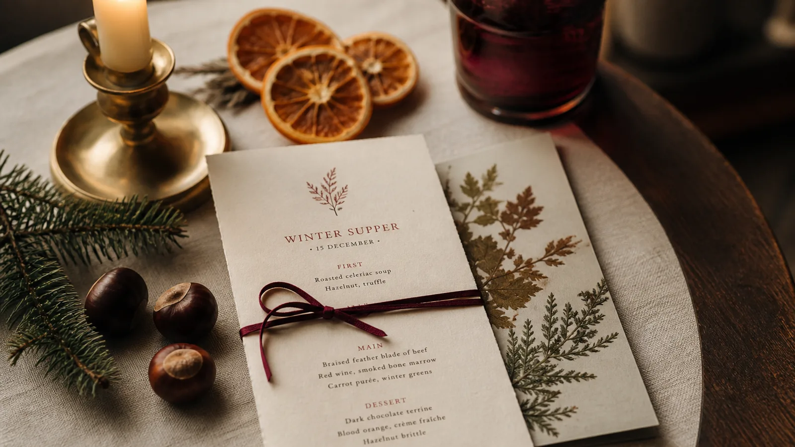
A pop-up has a clock. Six weeks in a market hall, three nights in a borrowed dining room, a Sunday residency: the menu will change, the logo may not exist yet, and you cannot wait for a studio. The temptation is a flyer from the office printer, or a laminate that outlives the project and looks like it. The better object is a short, dated card you can regenerate twice, printed on a board people might keep. This article is the brief for that card.
Design for reprint, not for posterity
Assume two reprints. Write that into the first decision: a single A5 face, or an A5 bifold with food on one spread and drinks on the back, not a stitched booklet. 16 to 22 dishes is the useful maximum. If the list will move weekly, leave two lines as "market" or a dated insert rather than locking 40 names you will have to reprint on Thursday when the fish changes.
Name the file with an end date (popup-halle-2026-08-15). When you reprint, change the date on the card as well as in the filename. Last week's card in a new stack is how a guest orders a dish you pulled. Staff should be able to see the date from the pass.
A look without a finished brand
If you do not have a logo, set the name in a real typeface at 18 to 22 pt and stop. Do not generate a crest. A pop-up that lasts a month does not need a monogram; it needs a readable name and a date. If you have three photos of the space (plywood, string lights, the pass), those are enough to pull a palette: warm wood, a dusty bulb yellow, a near-black. One type pairing. One rule weight. That is a brand for six weeks.
Refuse the marketplace defaults: kraft cliché, chalkboard, a script heading. Those say "temporary" in the cheap sense. A clean serif on cream board says "we meant this". Guests keep the second kind. They photograph the first and never come back to a room that no longer exists.
- A5, 16–22 dishes, date on the face, filename with the same date
- Name in a real typeface if there is no logo; no generated crest
- Two spare lines or a small insert for the dishes that will move
- 350 g for a residency of weeks; 250 g if the project dies on Monday
Space to strike a line
Build 4 to 5 mm of space under each dish, or a right-hand margin of 12 mm, so a clean strike-through still looks designed. A pop-up that never crosses a dish is lying about how kitchens work. A handwritten substitute in the same x-height, in a dark pencil or a fine pen, is honest. A sticky note on a designed card is a photograph you will regret.
If you change more than three dishes, reprint. At 99 € plus 10 € a copy, a run of 20 is a Tuesday, not a crisis. That is the whole point of a short card and a source you still have. A laminate you cannot edit is the wrong object for a room that will not exist in September.
Drinks and the borrowed licence
Many pop-ups inherit a bar. Print the drinks you actually pour, not the host's full list. Six wines, four beers, two cocktails is a pop-up drinks face. Set it in the same type as the food. If the host wants their list on the table as well, that is their card; do not merge the two and produce a document nobody owns.
Legal lines in a temporary room
Regulation 1169/2011 follows you into a market hall. A numbered allergen key at 8 pt, high contrast, on every version. If you take a service charge or a cover because the host does, say so on the card. Guests in a pop-up are already slightly lost; surprise fees on the bill will be the review.
Print enough for the first ten days, not for the rumour of a queue. You can reprint. You cannot unprint a stack of 200 that still says June when you are in the second week of July. Soft-touch 350 g is a nice keep-sake for a three-night supper club; it is waste on a stall that resets every morning. Match the board to the length of the room.
Make it fast, make it keepable
A dated A5, a real typeface, room to strike a line, a reprint you can afford. That is a pop-up menu. The flyer is faster on day one and uglier on day twelve. The keepsake is slower to start and is the thing people still have when the plywood has gone back to the market.
In Menu Atelier you paste a short list, write one sentence about the hall, skip the logo if you do not have one, switch to A5, and order a small run you can replace in two days; the 3D preview is useful when you have never stood in the room, because a card that looked fine on a laptop can be wrong on a 60 cm market table.