Bifold menu design: cover, inside spread and back, face by face
How to plan the four faces of a bifold restaurant menu: what belongs on the cover, how guests read the inside spread, what the back is for, and the fold measurements.
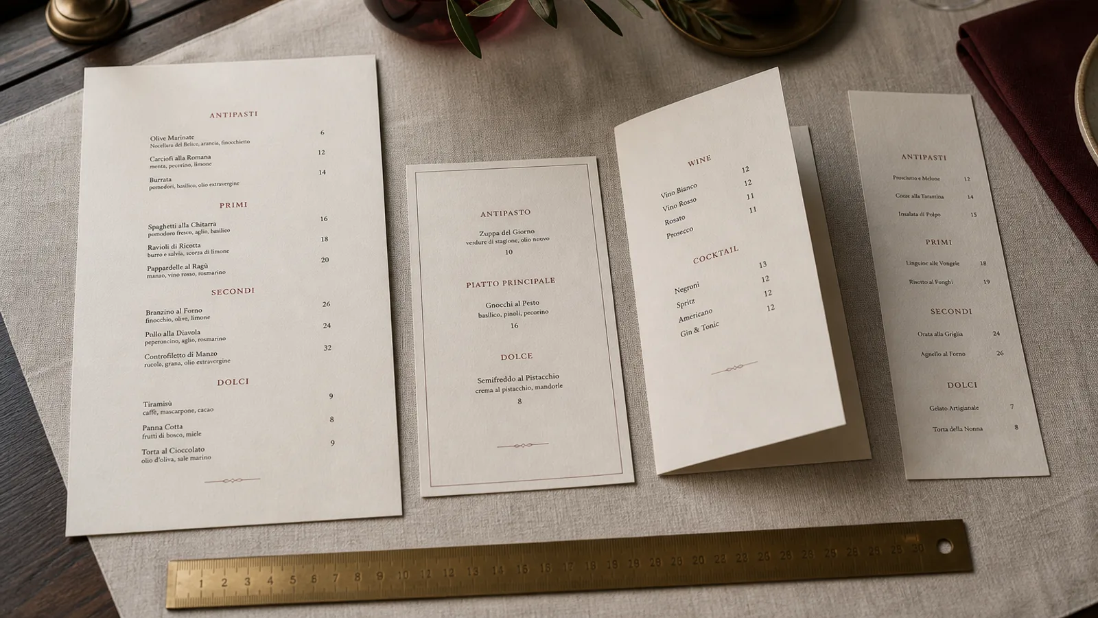
A bifold is a single sheet folded once, which gives you four faces of equal size: a cover, two facing pages inside, and a back. It is the most common restaurant menu format in Europe for good reason, and also the one most often designed as if it were four separate posters. The faces have different jobs and different reading times. This is a walk through each of them in the order a guest meets them, with the measurements a prepress operator would check before sending it to print.
The sheet, the fold and the numbers
An A4 bifold is a 297 × 420 mm sheet folded to 210 × 297 mm; an A5 bifold is an A4 sheet folded to 148 × 210 mm. Whatever the size, the file is two spreads: outside (back on the left, cover on the right) and inside (left page, right page). Add 3 mm bleed on all four sides of each spread, keep a safe margin of at least 5 mm inside the trim, and treat a 6 mm strip either side of the fold as a no-go zone for text and fine detail.
Paper matters more on a bifold than on a flat sheet because the fold is a stress point. Between 300 and 350 g is the sweet spot: stiff enough to be held in one hand, heavy enough to feel considered, and it will need a crease before folding. Lighter than 250 g and the menu flops; heavier than 400 g and the spine cracks and the closed menu will not stay shut.
The cover: one job, three seconds
The cover has to say whose menu this is and set the tone, nothing more. Guests look at it for about three seconds before opening it. That argues for the restaurant name or logo, perhaps a short line such as the neighbourhood and the year of opening, and a lot of space. A single photograph or an illustration can work if it is excellent; a mediocre one is worse than plain board.
Keep the word Menu off the cover unless the brand needs it: people know what they are holding. Position the logo in the upper half or centred, sized so its width is 30 to 45 % of the cover width, and remember that heavy dark covers show every fingerprint and crack at the fold, so a cream or coloured uncoated board often ages better than a black solid.
The inside spread: where the ordering happens
Once open, the menu is a single landscape surface of two pages, and guests read it as one. Eye-tracking work on menus is less conclusive than the folklore suggests, but the reliable finding is that people scan for section headings first, then read within the section that matches their appetite. So the spread is organised by course, in eating order, with headings that can be found in a second.
- Left page: starters and small plates at the top, then salads or soups, then anything shareable. Give the first section the most generous spacing; it is the one everyone reads.
- Right page: main courses, with the dish you most want to sell first or last in the list rather than buried in the middle, then sides, then a short dessert section or a pointer to the dessert card.
- Prices: aligned in a column or set immediately after the description without dotted leaders, in the same weight as the text, so the eye does not price-scan.
- Descriptions: one to two lines, at 10 to 11 pt, with 3 to 4 pt of extra space between dishes and 8 to 12 pt above each heading.
Do not let content cross the gutter. A section that starts on the left and finishes on the right reads as a mistake, and a heading sitting on the fold will crack. If mains do not fit on the right page, the list is too long, not the page too small.
The back: the page everyone forgets
The back is read in two moments: when the closed menu is lying on the table face down, and when a guest turns it over looking for something specific. It is the right place for information that must be present but should not interrupt the ordering: the allergen key required under EU Regulation 1169/2011 with its 14 allergens, a line about service or cover charge, opening hours, address, social handle, and whether card payment is accepted.
It is also the natural home for the drinks list on a compact menu, or for a short paragraph about the restaurant's sourcing if that is part of the identity. Set the back at a slightly smaller size, 9 to 10 pt, in a calmer layout than the inside, and put the logo small at the bottom so a face-down menu is still recognisable.
Face by face: a checklist before sending to print
- Outside spread: back on the left, cover on the right. Check this twice; the most common bifold error is a swapped outside.
- Fold at exactly half the sheet width, marked as a guide, with 6 mm clear either side.
- 3 mm bleed on every edge of both spreads, crop marks on, all images at 300 dpi, colours in CMYK with a Fogra39 or ISO Coated v2 profile.
- Body type not smaller than 10 pt on the inside, 9 pt on the back, headings clearly larger, prices in the same weight as descriptions.
- A printed mock-up folded by hand and placed on your smallest table under evening lighting.
Why the bifold keeps winning
The bifold gives a kitchen exactly what it needs: a stable cover and back that carry brand and legal information, and a changeable inside spread that carries the food. It sits in one hand, closes to protect the content, and costs little more to print than a flat sheet. Its only real demand is that you respect the fold and resist filling all four faces edge to edge.
Menu Atelier lays out bifolds as two proper spreads with the fold, bleed and crop marks placed automatically, and the 3D preview lets you open and close the menu to check the cover and the back before you download the print files or order the printed copies on 350 g board with a pre-scored fold.