Bistro menu design: chalkboard spirit on printed card
How to keep the chalkboard energy of a bistro on a printed card: short lists, a formule block, one accent colour and paper that looks daily, not precious.
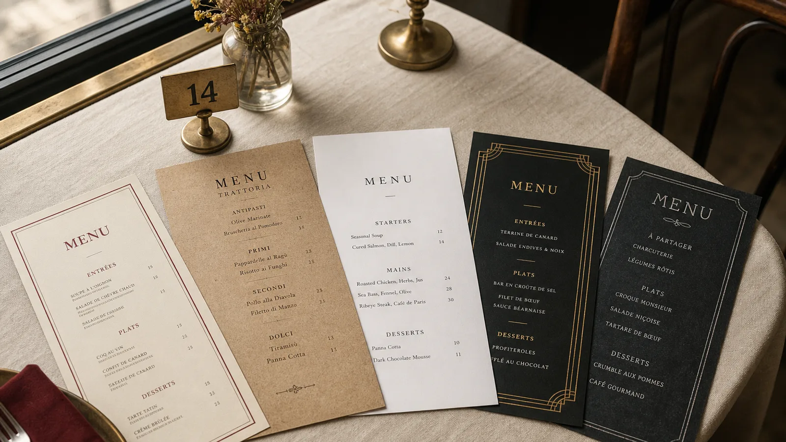
A bistro card has one job that a hotel menu never has: it must look as if someone wrote today's dishes this morning. The chalkboard on the pavement does that work for free. The printed card on the table has to earn the same feeling without smudging, without a fake chalk font at 9 pt, and without listing forty dishes that no kitchen of this size actually cooks. The ideas that work are structural, not decorative.
Keep the list short enough to be believed
A real bistro cooks a short list and changes it. Twenty to twenty-six dishes across the whole card is the honest range: six or seven starters, eight or nine mains, a cheese line, four or five desserts. Past thirty items the card starts to read as a brasserie that froze its offer in 2014. Guests notice. They order the steak-frites and ignore the rest, which is exactly what a long card trains them to do.
Write each dish as the board would: name, two or three components, price. "Blanquette de veau, riz pilaf, 18 €" is a bistro line. A paragraph about grandmother and Sunday lunches is a website. If a garnish is the point, put it in the name; if it is not, leave it off. The empty space between lines is part of the design. It says the kitchen is not hiding.
Give the formule its own architecture
Lunch is how a bistro lives, and the formule is the most read block on the card. It is not a footnote. Put it in a band at the top of the first face or in a box on the cover: the three prices in a small table (starter plus main 19 €, main plus dessert 19 €, three courses 24 €), the hours (weekday lunch, noon to 2.30), and today's choices either printed or left as three ruled lines for a pen. A guest who came in from the street should see the lunch offer before they see the à la carte.
If the formule changes daily and the rest of the card does not, print the card as a stable A5 and drop in a dated A6 slip. That is more honest than reprinting twenty-four dishes because the plat du jour moved. The slip should use the same typeface and the same red as the card, or it will look like a till receipt.
One accent colour, one paper temperature
Bistro colour is not a palette. It is one dark (charcoal or a warm black), one paper (cream, ivory, or a kraft that is not trying to look rustic), and one accent: a bistro red, a bottle green, or the yellow of a mustard pot. Use the accent for the restaurant name, the formule prices, and the plat du jour line. Everything else stays in the dark. Two accent colours on a bistro card look like a cocktail bar that lost its way.
- Dark type on cream 350 g matte board is the default that reads in daylight and under a 25 W bulb.
- Reversed cream on a slate-grey face works for a cover or a drinks side; keep body type at 11 pt or above so the letters do not fill.
- A single thin rule under each section word (Entrées, Plats, Desserts) is enough ornament. Boxes around every dish are not.
Type that behaves like chalk, without pretending to be chalk
A condensed grotesque in capitals, tracked, does more chalkboard work than any font named after a stick of chalk. Use it for section words and dish names at 11 to 13 pt. Save a chalk-hand face, if you use one at all, for the restaurant name and the plat du jour: two lines, large, never the forty-item list. Accents stay on capitals (ENTRÉES, CRÈME BRÛLÉE). The euro follows the figure with a space: 14 €. French guests read an unaccented capital as a foreign card.
What belongs on the card and what belongs on the board
The printed card holds the stable offer and the formule frame. The board on the pavement or by the bar holds the day's meat, the fish that came in, and anything you would be embarrassed to still be printing on Thursday. Point to the board from the card with one line: "Today's dishes on the slate by the door." A guest seated with their back to the slate still needs to know it exists. Write the board in one colour, in the same word order as the card, five dishes maximum.
Wines can live on the back face: eight to twelve bottles, a short by-the-glass list with the measure in cl (12.5 or 15), house carafe in 25 cl and 50 cl. A bistro that needs a separate wine book has become something else and should admit it. Coffee and a digestif line at the bottom of the dessert section is enough; a full drinks essay is not.
Allergens without killing the chalkboard mood
Regulation 1169/2011 still applies when the card looks handwritten. Fourteen allergens have to be identifiable. A numbered key after each price, with the legend in 8 pt on the back face or the lower edge, keeps the front clean. Do not hide the key inside a QR code and call it atmosphere. For the board, pin a printed allergen sheet beside it; chalk cannot carry the legend at a readable size.
In France, beef origin must appear. Put it once at the foot of the mains, in the same 8 pt as the allergen notice, not as a patriotic paragraph. Guests who care will find it; guests who do not will not have it shouted at them.
Print it as if it will change next week
The chalkboard promise is frequency. Design for A5 double-sided or a single A4 sheet, two colours, 350 g matte with a soft-touch finish so the card can be wiped after a steak-frites service. Skip lamination: a sealed winter card in June is how bistros lose trust. Reprint when the list moves, not when the corners curl. A short run on a card that looks daily is cheaper, in reputation, than a beautiful object that lies.
In Menu Atelier the Café Chalk and Bistro Classic styles are built for this register: condensed section words, a formule block you can lock at the top, and one accent colour. You switch A5 and A4, single sheet or bifold, in one click, check the card in 3D, and download a 300 dpi PDF with 3 mm bleed or order the run printed on 350 g matte board with a soft-touch finish.