Breakfast menu design: speed, comfort and the coffee upsell
How to design a breakfast card that a half-awake guest can order from in a minute: short plates, a coffee ladder that sells the next size, and type that works at 8.00.
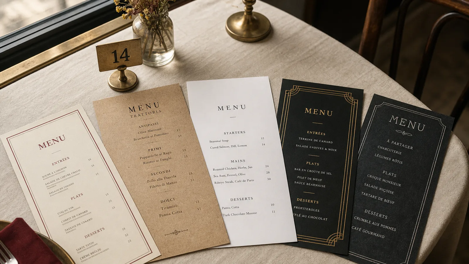
Breakfast is ordered by people who have not had coffee yet. That is the brief. A card that asks them to read eighteen adjectives, compare three egg styles and decode a juice programme will lose to "the usual" or to whatever the person in front of them said. Speed is hospitality here. Comfort is the second job: the guest who wants eggs and toast should find them without feeling they walked into a wellness studio. The third job is the coffee upsell, which pays the rent and should sit where the eye lands first.
Open with coffee, not with a manifesto
Put the coffee ladder at the top of the first face or in a band on the cover: espresso, macchiato, cortado or noisette, americano, cappuccino, flat white, filter, with sizes and prices on the same line. "Cappuccino 3.20 € / 3.70 €." One line at the foot of the ladder for milk alternatives and an extra shot. Tea as a short second group (three or four, not a leaf library). Juice as two or three lines, not a cold-press essay. The guest who came for breakfast will order a drink before they order food; give that decision the best light and the largest type on the card, 12 pt at least.
If you have a house filter or a guest espresso, name it once. Do not print a tasting note. At 8.15 the note is noise. The upsell is the larger cup and the pastry, not a story about altitude.
Food in three speeds, not in fifteen plates
A breakfast card works when it offers three speeds: something you can eat with one hand (pastry, yoghurt, a toast), a plate that takes a knife (eggs, a full plate, avocado if you must), and a set that removes choice (pastry plus coffee, or eggs plus coffee plus juice). Six to ten individual items and two or three sets is enough for a café. A hotel can go to twelve items if the room service card is separate. Past fifteen lines, people order toast and feel they failed the menu.
- Sets at the top of the food block, priced as a bundle that is visibly cheaper than the parts: "Coffee + croissant 5.50 €" against 3.20 plus 2.80.
- Eggs as two or three lines (scrambled, fried, omelette), not as a build-your-own matrix of eight extras.
- Sweet and savoury in two short groups so the guest who wants granola is not reading bacon first.
The hotel problem
Hotel breakfast cards often try to describe a buffet and an à la carte on the same sheet. If the buffet is the offer, print a simple card of the stations and the hours, and keep à la carte for a second slip or for room service. A buffet described as thirty dishes with prices of 0 € is a novel nobody asked to read while queuing for the coffee machine.
Type that works before the first sip
11 to 13 pt on everything a guest must decide. A sturdy grotesque for drinks and prices, a serif or a second weight for plate names. No script, no chalk face at 9 pt, no light-on-cream that vanishes under a 3000 K downlight. One accent (the colour of the cups, a warm terracotta, a forest green). Avoid photographs of eggs: they look like a chain and they stain the card in the guest's mind if the plate does not match.
A5 double-sided is the right object for a café table; a tall narrow card in a stand works at the counter. Hotels can use A4 if the type stays large. Laminate only if the card is a permanent hotel document; a café should reprint when the pastry list moves, on 350 g matte that wipes after a buttery thumb.
Hours, last kitchen and the cut to lunch
Print the hours on the card: breakfast until 11.00 or 11.30, last hot plate at 11.00. If the same card becomes lunch, design a clear cut (a rule, a colour change, a second face) so the 10.50 guest is not reading the croque-monsieur as a breakfast option. Weekend brunch is a different document; do not bolt sixteen extra plates onto the weekday breakfast card and call it Saturday.
Allergens at the hour when people are least patient
Milk, gluten, egg, nuts and sesame sit on most breakfast lines. Regulation 1169/2011 still applies when the guest is late for a train. A numbered key after each price, legend on the back in 8 pt, is the only system that survives a queue. Do not hide the key in a QR code next to the till; that is how you get the gluten conversation at the worst moment of the morning.
Print it like Monday will look like Friday
Breakfast lists are stable. Design the coffee ladder and the sets as a plate you reprint only when prices move, and the pastry line as a short strip you can reprint weekly or leave as three ruled lines for a pen. Soft-touch 350 g, cream stock, two colours. The card should feel like a calm room, not like a festival poster for granola.
In Menu Atelier the Café Chalk and Modern Minimal styles both hold a coffee ladder and a short food list without shouting. You lock the drinks band at the top, switch A5 and A4 in one click, check the card in 3D, and download a 300 dpi PDF with 3 mm bleed or order the run on 350 g matte board.