Brunch menu design: eggs, bowls and the queue outside
How to design a brunch menu that turns tables fast: section order, egg builds, bowl pricing, drink pairing and the layout choices that keep the Sunday queue moving.
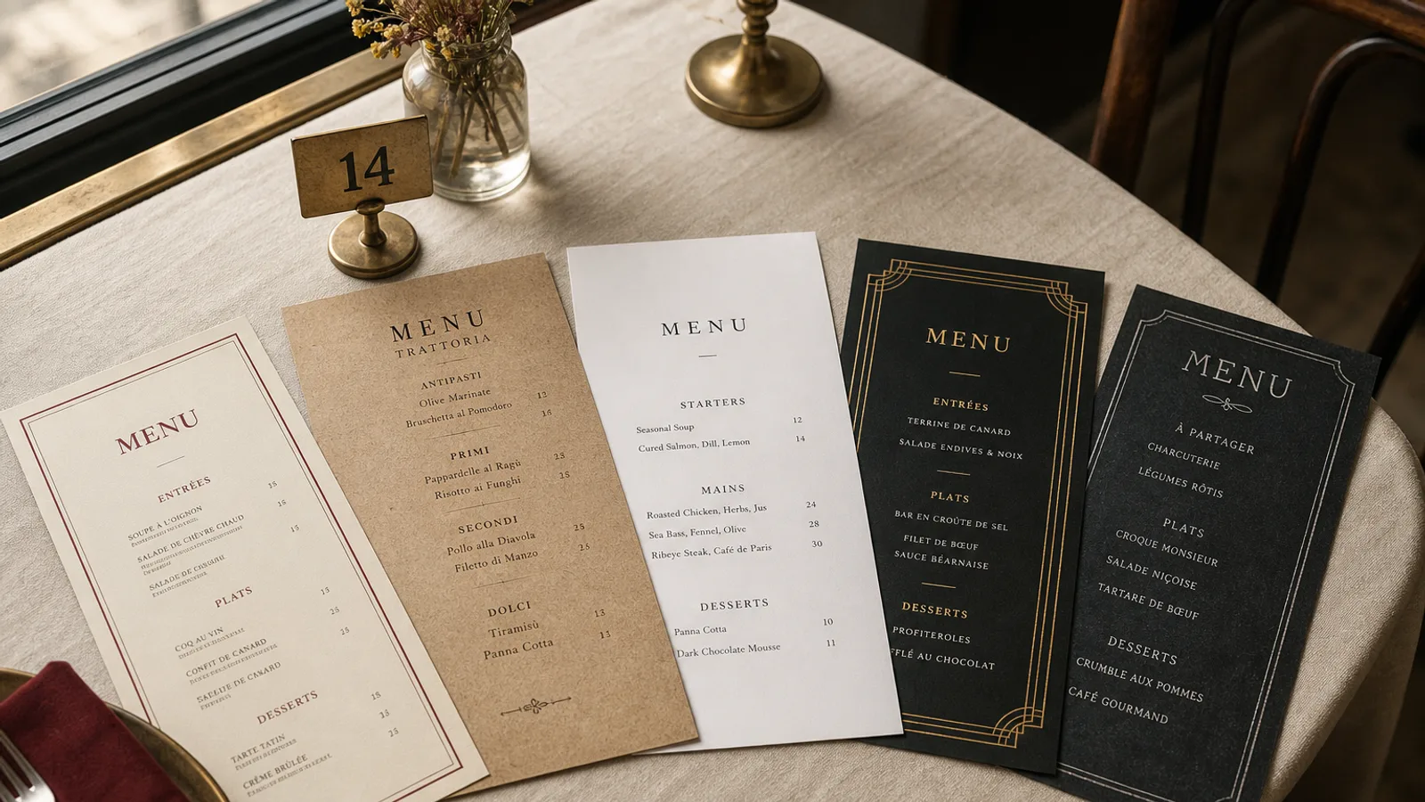
A brunch service has one economic fact that no dinner service shares: the queue is outside and it is visible. Every minute a table spends deciphering a cluttered card is a minute the party of four on the pavement watches the café across the street. This guide covers how to order the sections, how to write egg dishes and bowls so they are chosen in seconds, where the drinks belong, and which format survives maple syrup.
Start from the ticket time, not the recipe book
Before laying out anything, sort your dishes into three columns: under 8 minutes on the pass, 8 to 15 minutes, and slow items like shakshuka in a cast-iron pan or a full stack of pancakes for two. A brunch card that pushes slow dishes to the top of the page floods the kitchen at 11:30 and empties the room of turnover. Give the fast, high-margin dishes the most visible positions: the top of the first column and the top right of a bifold spread.
This does not mean hiding the showpieces. It means placing them where a guest finds them after deciding the mood, typically the middle of the card, with a short descriptor that sets expectations: "baked to order, allow 15 min" costs you nothing and saves you complaints.
Section order that matches how people actually eat brunch
Brunch guests decide sweet or savoury first, then hot or cold, then whether they want a drink with alcohol in it. The card should follow the same logic. A sequence that works in almost every venue we have set up:
- Coffee and juices at the very top, in a compact strip, because nine tables out of ten order a drink before they have read anything else.
- Eggs and savoury plates, the core of the offer and usually the best margins.
- Sweet plates: pancakes, French toast, waffles, granola.
- Bowls and lighter dishes, positioned after the indulgent items so they read as a choice rather than a compromise.
- Sides and extras in a tight two-column list.
- Brunch cocktails and sparkling wine at the bottom, with a small heading, so they are the last thing seen before the guest closes the card.
Keep every section to between five and eight items. A card with fourteen egg dishes reads like a spreadsheet and slows ordering; twelve savoury items across two sections read as generous.
Writing eggs so nobody has to ask a question
The most common brunch problem is the server-led interrogation: how do you want your eggs, which bread, do you want the hollandaise. Every question adds thirty seconds per table and slows the whole floor. Solve it on the card. Write each egg dish as a complete build with the default already decided: "Two poached eggs, sourdough, avocado, chilli crisp, lime" is a decision; "Eggs your way with toast" is a conversation.
Set descriptors in the same typeface as the dish name, one weight lighter and one size smaller: 11 pt name, 9.5 pt descriptor is a comfortable pairing on A4, 10 and 8.5 pt on A5. Keep descriptors to one line, two at most, and drop the adjectives. "Farm-fresh, delicious eggs" sells nothing; "eggs from Ferme Dupont, 6 km away" sells trust.
The add-ons line
Extras are where brunch makes its margin: a slice of smoked salmon, halloumi, an extra egg, a side of hash. Group them in one visible block with plain prices: "Add smoked salmon 4 €, halloumi 3 €, extra egg 1.50 €". Under Regulation 1169/2011, allergen information for the 14 listed allergens must be available to the guest; on a brunch card the cleanest solution is a small key at the bottom of the extras block plus a note that staff hold the full allergen matrix.
Bowls, granola and the price question
Bowls sit uneasily on a brunch card because guests compare them to the eggs. A 14 € açaí bowl next to a 12 € eggs Benedict invites a bad comparison. Two fixes help. First, list bowls after the sweet section, as a separate lighter category, so they are compared to granola rather than to eggs. Second, describe the components as a list of real ingredients with quantities implied: "coconut yoghurt, roasted oats, seasonal fruit, bee pollen" earns its price better than "superfood bowl".
Price placement is the same across the whole card: right after the descriptor, no dotted leaders, no currency symbol in a column of its own. A price column aligned at the right edge turns brunch into a bargain hunt and pushes guests to the cheapest line.
Drinks that pay for the slow tables
A table that lingers for ninety minutes over one flat white is the real cost of brunch. The card should make the second drink and the boozy drink easy. Put the coffee list at the top so it is ordered immediately, and put mimosas, spritzes and Bloody Marys at the bottom, with two or three options only. A 9 € mimosa written as "Prosecco, fresh orange, a splash of Aperol" is chosen twice as often as a line that just says Mimosa.
- Offer a bottomless or pitcher option only if your kitchen can hold ticket times; otherwise it becomes the slow table.
- List non-alcoholic specials (kombucha, house lemonade) at 4 to 6 € between the coffee and the cocktails.
- Keep the drinks typography identical to the food typography; a different font for drinks makes the card feel like two documents stapled together.
Format, paper and the syrup problem
Brunch cards live a hard life: syrup, hollandaise, coffee rings, children. An A4 single sheet in a thin 150 g paper will look tired by the second weekend. Our recommendation for most venues is an A5 bifold on 350 g board with a matte finish, reprinted every six to eight weeks as the seasonal fruit changes. The A5 closed size sits between two plates, and the four faces give you a front for the name and the coffee strip, two inner faces for food, and a back for cocktails and the allergen key.
Set outer margins at 12 mm minimum and keep prices at least 8 mm from the fold, because a scored fold on a busy brunch card is where the thumb goes. If your volume is high, laminating is tempting; a soft-touch matte finish is more pleasant to hold, photographs better for social media and survives coffee if wiped quickly.
A brunch card you can reprint every season
The card that works is the one you can change without a designer on a Thursday night when strawberries arrive. Build it on a fixed grid, keep the section order stable so regulars know where to look, and swap only the seasonal lines and the specials. When you hold a new card, test it the brutal way: hand it to someone who has never eaten with you and time how long they take to pick a dish and a drink. Under forty seconds is the target.
In Menu Atelier, a brunch card built in the Café Chalk or Modern Minimal style can be switched from A4 single sheet to A5 bifold in one click and checked in 3D before you order, and the print files come out with the bleed and crop marks already in place on 350 g board.