Café menu design: the counter card, the table card and the board
How a café should split the offer across a counter card, a table card and a wall board so the queue moves and the table still has something to read.
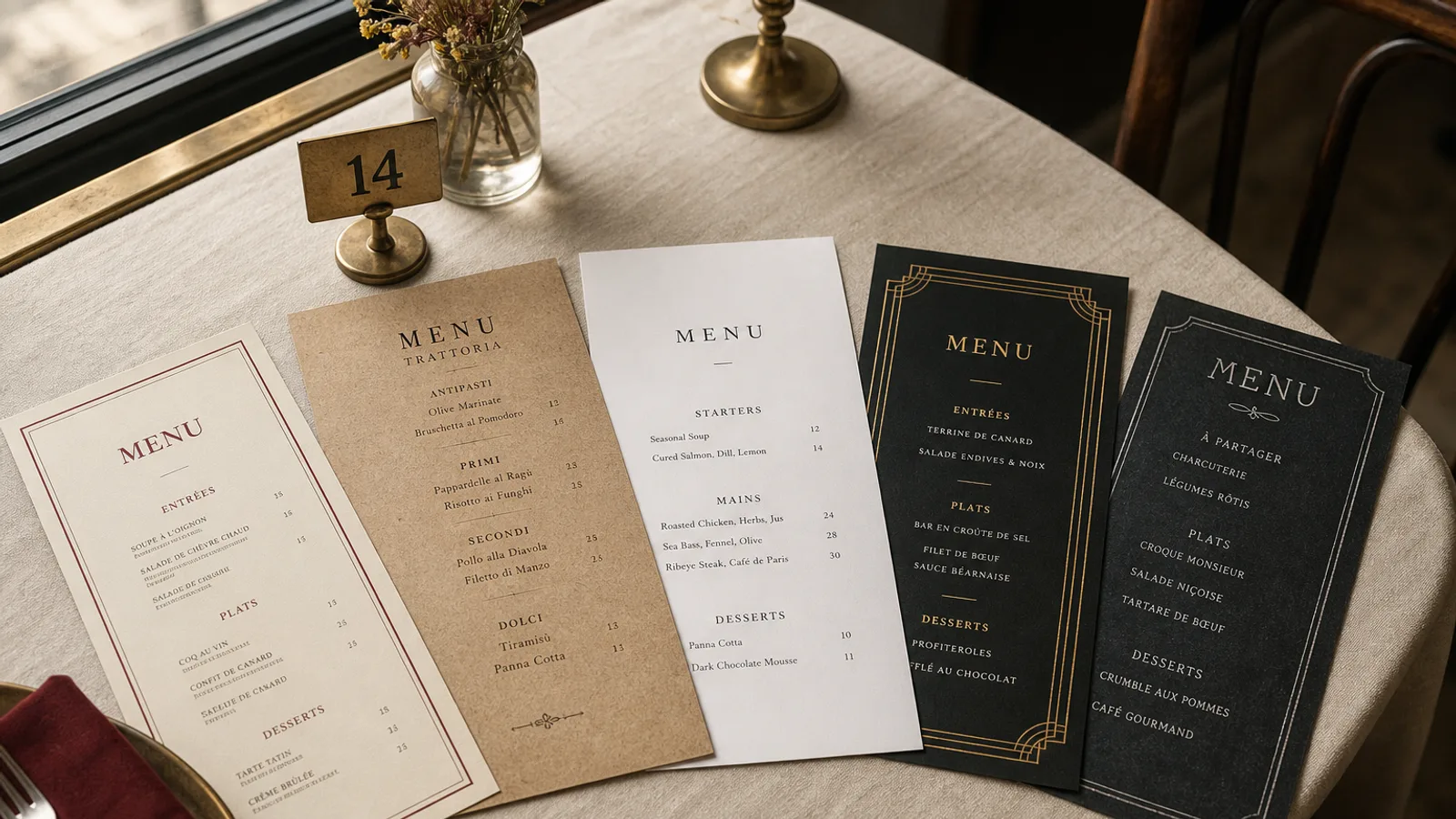
A café does not have one menu. It has three surfaces that guests meet in the wrong order: the board they half-read in the queue, the card they grab at the counter when the board is behind someone's backpack, and the table card they discover after they have already ordered a filter and a pastry. Design each surface for the moment it is used, and stop trying to print the entire offer on all three.
The board is for the queue, not for the novel
People in a café queue have eight to twelve seconds of useful attention, often with a phone in one hand. The wall board or the hanging slate should carry the coffee ladder (espresso through flat white, with sizes and prices), three or four food headlines ("toasted sandwich, soup of the day, two cakes"), and nothing that requires a paragraph. Letter height of 4 to 5 cm for drink names, 3 cm for prices, one colour of chalk or one vinyl colour. A board in three pastel markers is a mood board, not a menu.
If you change milk alternatives or a seasonal drink every week, give them a reserved strip at the bottom of the board, dated. Do not rewrite the whole espresso list because the mocha became a hot chocolate with orange. The queue should recognise the ladder from last Tuesday.
The counter card is the closer
The card that sits on the pastry case or is handed across the counter is where the guest who did not read the board finally decides. A5, one face or a light bifold, 11 pt minimum on drinks, prices in a right-hand column. Group drinks the way the barista builds them: espresso drinks, filter, tea, then cold. Food in a second column or on the back: breakfast until 11.30, lunch plates, sweet. Twelve to eighteen lines of food is a café; thirty is a restaurant that forgot to hire a waiter.
- Print sizes next to the drink, not as a footnote: "Cappuccino 3.40 € / 3.90 €" with S and L stated once at the top of the group.
- Allergen marks belong on this card. The board cannot carry Regulation 1169/2011 at a readable size; a numbered key on the back of the A5 can.
- A pastry name without a price on the counter card is how you get the "how much is the tart?" conversation that stalls the till.
What the counter card should refuse to do
It should not list every syrup, every oat-milk surcharge and every extra shot as a paragraph. One line at the foot: "Oat, almond or soy +0.40 €, extra shot +0.50 €." The rest is spoken. A counter card that tries to be a franchise operations manual is unread in the queue and ugly on the marble.
The table card is for the second order
Once people sit down, the job changes. They might add a second coffee, a glass of wine at 17.00, or the cake they walked past. The table card can be smaller (A6 or a tall narrow card in a stand) and quieter: the full drink list including wine and beer if you serve them after eleven, a short food list, and the Wi-Fi line if you must have one, in 8 pt, not as a headline. Do not reprint the entire coffee ladder in 18 pt on a table that already faced the board; use the space for the things the board omitted.
If you run a lunch formule (soup plus sandwich at 12 €, plate of the day at 14 €), the table card is the right home for it. The queue does not need the formule; the person who sat down with a laptop does. Date the formule or print it as a weekly slip so Monday's soup is not still on the card on Thursday.
Type, colour and the café register
Cafés go wrong in two directions: chalkboard pastiche on every surface, or a sans so thin it vanishes under a 2700 K bulb. Pick one grotesque for drinks and prices, one serif or a second weight for food names, and stop. 10.5 to 12 pt on the printed cards; never a script for the coffee list. One accent (a terracotta, a forest green, the colour of the awning) for headings and the logo. The paper should be cream or a warm white, 350 g matte, so it can be wiped after a flat white rings the table.
Match the three surfaces without cloning them. Same type family, same accent, same way of writing a cappuccino (not "Capp" on the board and "Cappuccino, whole milk, 6 oz" on the card). Guests who look up from the queue and then down at the A5 should feel they are still in the same shop.
When the offer outgrows three surfaces
A café that adds evening wine, a brunch list and retail bags of beans will try to bolt them onto the counter card. Don't. Retail beans get a small shelf talker. Brunch on Saturday gets its own A5, used only those hours, in the same type. Evening wine (six by the glass, eight bottles) can share the back of the table card. The moment you need a booklet, you are no longer running a café menu; you are running a restaurant service with café furniture.
Print the cards as often as the cakes change
Pastry and soup rotate faster than espresso. Design the drinks side as a stable plate and the food side as a short-run face you can replace. A5 double-sided on 350 g matte with a soft-touch finish is enough for most rooms; reprint the food face weekly rather than laminating a spring list into July. The board takes the daily shock; the cards take the week.
In Menu Atelier the Café Chalk style is built for this split: a compact drinks ladder, a food column, and a format you can flip from A5 table card to a taller single sheet for the counter. You see both in 3D, export a 300 dpi PDF with 3 mm bleed, or order the run printed on 350 g matte board.