Cocktail bar menus: dark, small and still legible by candlelight
How to design a cocktail bar card that reads under 15 lux: small format, reversed type, short lists, and a paper that does not vanish when the candles go down.
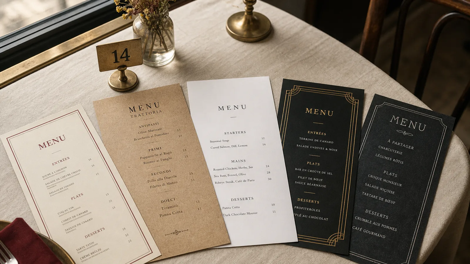
Most cocktail bars print a card that looked handsome under the designer's desk lamp and disappears at 22.00. The room is at 10 to 20 lux, the table has a candle or a 15 W Edison bulb, and the guest is holding a card printed in 9 pt grey on black. They order the second drink on the list because they can just make it out. Darkness is a design constraint, not a mood board. Design for the lux you actually run.
Shrink the object, not the type
A cocktail list of twelve to eighteen drinks belongs on A5 or a tall narrow card (roughly 105 × 210 mm), not on an A4 booklet that flaps on a tiny table. Small format feels like a bar. It also forces you to cut. If the list needs A4, the list is a restaurant wine book pretending to be cocktails. One drink, one name, one line of structure (spirit, two modifiers, glass), price. Descriptions longer than twelve words are for the bartender to say, not for a guest to decode in the dark.
Keep body type at 11 to 12 pt, medium weight, never light. On a dark card the x-height has to work harder; a hairline sans at 10 pt is a rumour. Section words (Signatures, Classics, Low ABV) can go up to 13 pt in small caps. Prices in the same size as the name, not a timid 8 pt that vanishes first.
Reversed type has rules, or it fills
Cream or warm off-white type on a near-black face is the cocktail-bar default, and it only works if you print it as a real solid. Specify a rich black (typically 60/40/40/100 or the house standard) rather than 100 K alone, which looks thin and brown under tungsten. Keep reversed type at 11 pt or above and avoid hairline rules: they disappear or they moiré. A 0.4 pt gold or copper rule between sections is enough jewellery.
If you print on dark board rather than flooding a cream sheet with black, the edges of the card stay dark when they scuff, which they will. Soft-touch lamination or a soft-touch coating on 350 g hides fingerprints better than uncoated black, which shows every thumb. Test a proof under the actual lamp, not in the kitchen at noon.
- One accent: a copper, a deep burgundy, or the neon of the sign, used for the bar name and perhaps the signature section word. A rainbow of category colours is a nightclub flyer.
- Skip photographs of drinks. A cocktail in a coupe photographed on marble looks like an advert and costs you a face of the card.
- Skip QR codes as the only list. A code that fails in low light, or that opens a page the guest will not pinch-zoom, is how you lose the second round.
What the card must hold, and what the bartender holds
Signatures first, six to eight, then a short classics block (four to six) so the guest who wants a Negroni is not made to feel uncool. Low-ABV and no-alcohol as a real section, not a pity line at the bottom: three to five drinks with the same care as the rest. Beer and wine, if you serve them, on the back face in a compact list: four wines by the glass with the measure in cl, four bottles, two beers. A cocktail bar that needs a separate wine book has become a restaurant.
Spirit lists (the 40 whiskies, the mezcal flight) do not belong on the cocktail card. They belong on a second, even smaller card or in the bartender's head until asked. Putting them on the same face as the signatures trains the guest to shop by brand instead of by drink, which is the opposite of why you hired a bartender.
Allergens, sulphites and the egg white
Egg white, milk (in the cream drinks), nuts (orgeat), and sulphites in wine are the usual 1169/2011 traps. A numbered key after the price, legend in 8 pt on the back or lower edge, is enough. Do not print a skull icon next to the Last Word. If you use raw egg, a one-line note at the foot of that section is clearer than a paragraph of legal prose on the cover.
Paper, fold and the wet table
Bar tables are wet. Condensation rings, spilled soda, citrus oil. A 350 g matte board with a soft-touch finish survives; 170 g uncoated does not last a Friday. Single sheet or a scored A5 bifold: if you bifold, put signatures inside left and classics inside right, drinks without alcohol on the back. Avoid metal corners and leather covers unless the room is built for them; they photograph well and slow the table down.
Reprint when the list moves, which in a serious bar is monthly or when a bottle runs out for good. Design the signatures as a block you can swap without redrawing the classics. A card that still lists last winter's amaro special in May is telling the guest the bar is on autopilot.
Light the proof before you print the run
Before you sign off, sit in the room at service lighting with a printed proof, not a phone screen. If you cannot read the third signature without tipping the card into the candle, raise the type or lighten the field. The Art Deco Cocktail register (a condensed serif, a single gold line, plenty of dark field) is a bar card. A busy illustrated poster is a souvenir, and souvenirs are not how people order a second drink.
In Menu Atelier the Art Deco Cocktail style is built for low light: dark field, cream type, a compact list you can set on A5 or a tall single sheet. You check the card in 3D, switch format in one click, and download a 300 dpi PDF with 3 mm bleed or order the run on 350 g matte board with a soft-touch finish.