Double-sided menus: what goes on the back, and how to make guests turn it over
How to use the second face of a double-sided restaurant menu: which content belongs there, how to signal it exists, show-through and registration, and layouts that work.
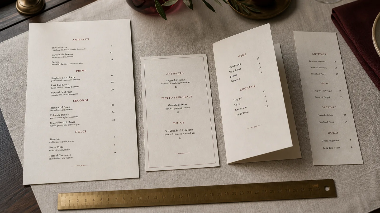
Half the double-sided menus in circulation have a back that nobody reads. The sheet lands face up, the guest orders from the front, and the drinks or the desserts printed behind might as well not exist. Printing on both faces of a sheet is nearly free, so the question is not whether to use the back but how to make it count. This covers what belongs there, how the front should announce it, and the two production issues, show-through and registration, that make or break a two-sided card.
The back is a second page, not a spare one
Think of a double-sided sheet as a two-page menu whose pages you cannot see at the same time. That has a consequence: content that a guest needs while choosing a main course must not be on the other face. Starters and mains stay together on the front. The back takes whatever is consulted separately or later: drinks, desserts, the children's menu, the set lunch, allergen details, the story of the house.
The strongest arrangement for a bistro is food on the front and drinks on the back. Guests order drinks first, flip, then order food, and both faces get read. Restaurants with a dessert card handled separately can instead give the back to a short wine list and coffee. What does not work is splitting the food list across both faces, which forces constant turning and makes the menu feel longer than it is.
Tell people there is a back
A guest will not flip a menu on the off chance. Two signals are enough: a small line at the bottom of the front, such as Drinks and desserts overleaf, set at 8 to 9 pt in the same typeface, and a design that visibly continues, for example the same coloured band running across the top of both faces. If the front is very full and the back very sparse, the guest reads the imbalance as an afterthought; give both faces the same margins and the same grid.
- Put the overleaf note in the bottom right corner of the front, where the hand naturally grips to turn.
- Repeat the restaurant name small on the back so a sheet lying face down is still identifiable.
- Use the same heading style on both faces; a back set in a different typeface reads as a different document.
- Orientation: keep both faces the same way up, head to head. Head-to-foot imposition is for tent cards, not flat menus.
Show-through: the problem you see at the table
Show-through is the ghost of the back face visible through the front. It happens with thin or bright white paper and heavy ink coverage behind. On a 120 g sheet a black band on the back will shadow the front; on 300 g board it will not. Below 250 g, avoid dark solids on either face, and check the sheet under a table lamp, not office lights, since restaurant lighting is directional and shows the ghost more.
Paper opacity is listed on the datasheet as a percentage; anything above 95 % is safe for a double-sided menu with normal text. Coated papers are more opaque than uncoated at the same weight, but for a menu that has to lie on a table and be handled, a 300 to 350 g uncoated or matte board solves the problem outright, with the bonus that the sheet stays flat.
Registration: front and back have to line up
Duplex printing puts the two faces on the sheet in separate passes, and they can be offset by 0.5 to 1 mm relative to each other. On most designs this is invisible. It becomes visible when elements are meant to align through the sheet: a border on both faces, a coloured band that should sit at the same height, or a full-bleed background on one side and a white margin on the other. Any misalignment shows as an uneven edge on the trimmed sheet.
Design around it: use full bleed on both faces or on neither, keep borders at least 5 mm from the trim so a small shift is not obvious, and avoid designs where a line on the front must meet a line on the back at the edge. Supply the file as a two-page PDF with 3 mm bleed on both pages and crop marks, and ask for head-to-head duplex explicitly if the ordering form does not make it clear.
Three layouts that work
- Food front, drinks back: the bistro standard. Front in a single column with sections; back split into wine, beer and soft drinks in two columns with prices flush right.
- Menu front, story back: for restaurants whose identity sells. Front carries the whole food list; back carries a photograph, three short paragraphs about sourcing, the allergen key and opening hours.
- Lunch front, dinner back: a single sheet turned over between services. The face on top tells guests which service they are in, and one print run covers both.
In each case the back is set slightly lighter than the front: body text at 9.5 to 10 pt instead of 10.5 to 11, more white space, no heavy solids. The front is the working page; the back is the page people linger on.
One sheet, twice the room, if you plan it
A double-sided sheet costs almost the same to print as a single-sided one and doubles your space. The price you pay is planning: deciding what is read together and what is read apart, signalling the back, choosing a board heavy enough to kill show-through, and designing edges that tolerate a millimetre of shift.
Menu Atelier treats single-sided and double-sided as a one-click switch on the same design, exports both faces as a properly imposed two-page PDF with bleed and crop marks, and the 3D preview lets you flip the sheet on a virtual table to check that the back reads as part of the same menu before you print.