Easter brunch menus: pastel palettes done tastefully
How to design an Easter brunch card that feels seasonal without looking like a greeting card: restrained pastels, a clear brunch structure, and type that still reads at 11 am.
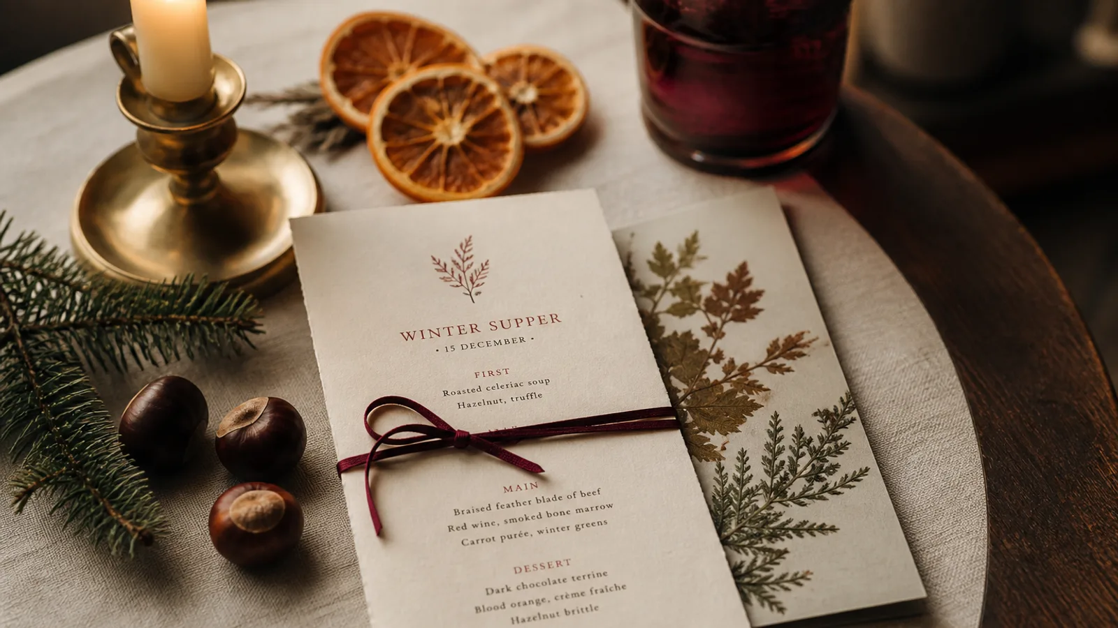
Easter brunch is a trap for taste. The room fills with families, the light is cold and late-morning, and every marketplace template offers mint, lilac, and a rabbit. A card that looks like a greeting card will make a serious kitchen look like a hotel buffet. A card that ignores the day entirely will feel stubborn. The job is a seasonal shift of a few degrees: a warmer cream, one soft colour in the rules, a structure that is brunch (not dinner with eggs added). This article draws that line.
Pastel is a tint, not a costume
If you use colour, use one. A dusty rose or a pale sage, at 15 to 25 percent, on the rules and the heading, not as a full-bleed background. Full-bleed pastel on 350 g matte looks like icing. Pair it with a warm off-white board, not a bright optical white that will fight the tint and the daylight. Ink stays near-black for dish names and prices. Guests still have to order; they are not decorating a table.
Drop the rabbits, the eggs as dingbats, the generated lilies. One small geometric mark, if you already use a fleuron on the house menu, is enough. A script heading that you do not use the other 364 days is a costume. Keep the house serif or grotesque and let the date do the seasonal work: "Easter brunch, 5 April" under the logo, 11 pt, same weight as a section heading.
Brunch is a different skeleton
Guests do not read brunch like dinner. They want drinks first (coffee, sparkling, a single cocktail), then a savoury block, then a sweet block, then a short list of extras. That is four sections, not the house eight. A prix-fixe brunch (38 to 65 €, two or three courses plus a glass) should show the skeleton under the title, as any set menu does. An à la carte brunch should still group tightly; a 40-line card at 11 am is a queue at the pass.
Children's plates, if you offer them, sit in their own short block, same type, smaller names, not in a cartoon face. Allergen keys stay. Easter brunch is full of eggs, nuts, and dairy; Regulation 1169/2011 does not pause for a bank holiday. A numbered key at 8 pt is enough if the descriptions stay honest ("hazelnut praline", not "our famous rock").
- One tinted colour on rules and heading, near-black on the dishes
- Four sections: drinks, savoury, sweet, extras — not the dinner map
- Date on the card; no rabbits, no script you do not use in March
- Kids' block in the same type family, not a second design
Type that survives daylight and a high chair
Morning rooms are brighter than dinner rooms and full of people who left their reading glasses at home. 11 pt for dish names, 9.5 to 10 pt for descriptions, 12 pt for prices. That is one step up from a dim dining room. Avoid pale grey. Avoid a low-contrast pastel on pastel. If you print on a cream that is already warm, a 70 percent black will look brown and tired; use a real black or a warm black you have tested on that board.
A5 bifold is the usual object: drinks and savoury on the spread, sweet and extras on the back, cover with the date. A4 single sheet works if the list is short. Do not go trifold; families already have enough paper on the table. Soft-touch 350 g is fine here, unlike a beer tent: the meal is sit-down, the glasses are smaller, the card may go home in a bag.
Drinks without a second menu
Coffee, tea, juice, one sparkling, one brunch cocktail. That is a drinks list, not a bar programme. Set it in the same type as the food, not in a faux-chalkboard. If you have a real wine list, leave it off this card or put three glasses on the back. The guest who wants a bottle can ask.
Print count for a single sitting
Easter is one day, sometimes two if you open the Monday. Print to covers plus 20 percent, not to a month of service. A 50-cover brunch at two sittings wants about 70 cards if they leave the table; fewer if you clear them. At 99 € plus 10 € a copy, a short run is the point. Date the file (easter-brunch-2026-04-05) and archive it on Tuesday so next April you start from last year's source, not from a PNG on someone's phone.
If weather pushes you onto the terrace, the same card must hold in cooler daylight. That is another reason to keep contrast high and pastel low. A mint that looked gentle in the dining room will vanish outside.
Seasonal, not sentimental
A date, one tint, a brunch skeleton, type a grandparent can read. That is an Easter card that still looks like your restaurant. The rabbits can stay on the window. The menu has work to do between 11 and 3.
In Menu Atelier you keep the house style, shift the palette a few degrees warmer, rewrite the list as brunch, switch to A5, and turn the card in 3D before ordering a one-day run on 350 g matte board; Monday you archive the version and dinner is dinner again.