Fine-dining menus: the tasting card and the à la carte
How to design the two cards a serious dining room actually uses: a tasting sequence that reads as one evening, and an à la carte that does not compete with it.
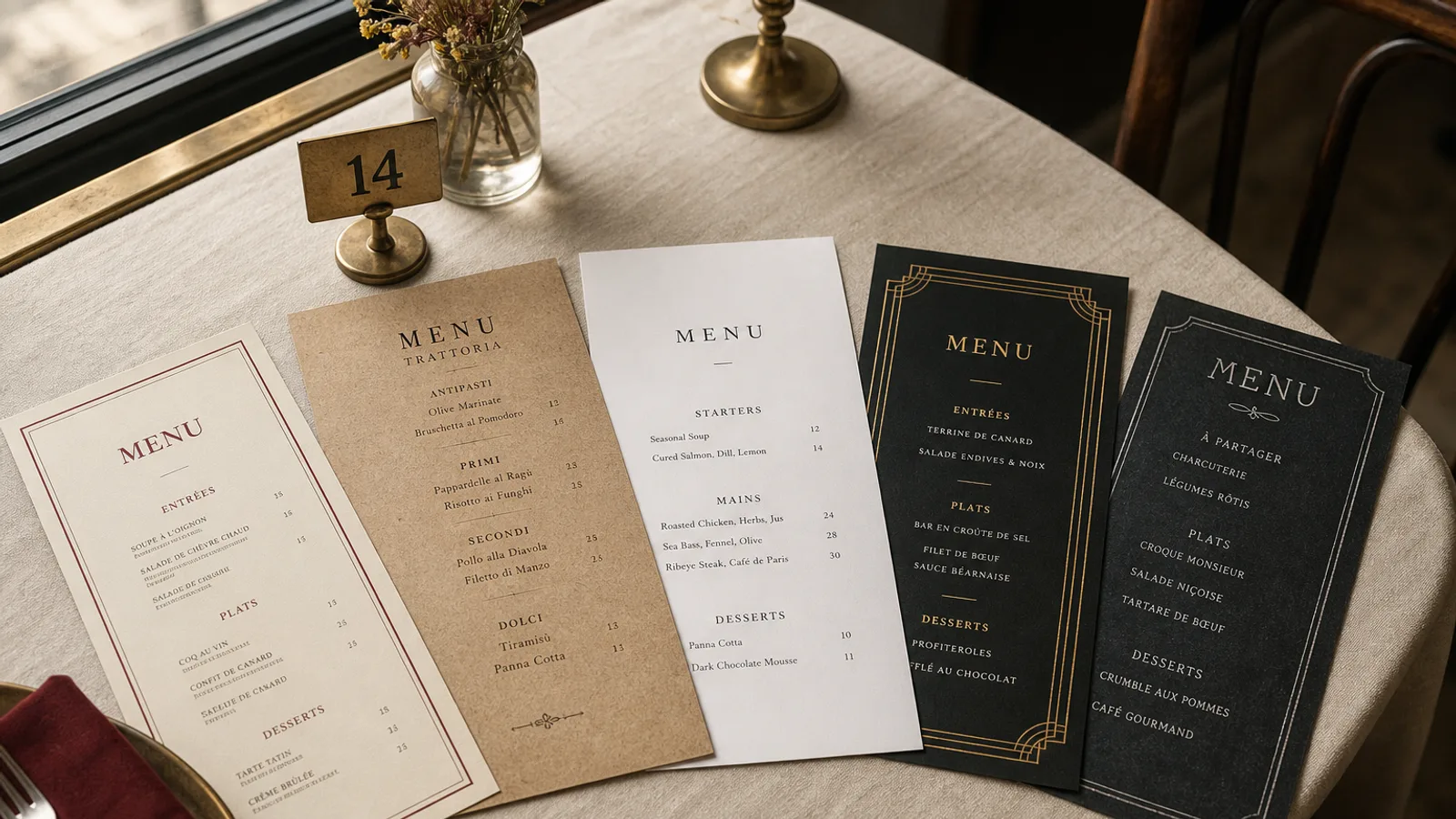
A dining room that takes itself seriously usually runs two documents, not one. The tasting card is a sequence: seven or nine or eleven lines that must feel like a single evening. The à la carte is a map: fewer dishes than a bistro, more silence between them, prices that look like decisions. Rooms that print both on the same A4, in the same type, with a little box saying "or choose à la carte", train the guest to shop. Fine dining is not shopping.
Two objects, two jobs
Give each offer its own card. The tasting card can be narrower and taller, or a single A5 face, so the eye travels down a list without glancing sideways at a 48 € main. The à la carte can be an A5 bifold or a larger single sheet. Same paper, same type family, same blind-embossed mark if you have one; different architecture. When a waiter asks "tasting or à la carte?", they should be holding two objects, not pointing at two columns.
If you only print one card, print the tasting. Put the à la carte on a second sheet the waiter brings when asked. The opposite (à la carte as the default, tasting as a footnote) is how tasting menus die in rooms that are not full on Tuesday.
The tasting card is a score, not a catalogue
Each course is a short title and, if needed, one supporting line. "Scallop, bergamot, fennel pollen" is a course. A 40-word paragraph about the dive boat is a press release. Set titles in a serif at 12 to 14 pt, the supporting line at 9.5 to 10.5 pt in italic or a lighter weight. No prices next to each course if the menu is a fixed price; the price lives once, at the top or the foot, with the wine pairing as a second figure ("125 €, pairing 80 €"). Per-course prices on a tasting card turn the evening into a spreadsheet.
Optional supplements (the caviar add-on, the cheese extra) sit below the last course, in the same type, not in a gold box. Dietary variants (pescatarian, no alcohol in the pairing) get one line: "A pescatarian sequence is available; please tell us when you book." Do not reprint the entire tasting twice on the same card; it doubles the length and halves the authority.
Duration and the guest who is afraid of nine courses
State the number of courses and the approximate length once, in 9 pt, near the price. "Nine courses, about two and a half hours." Guests who need to leave for a train will thank you; guests who want to linger will ignore it. A tasting card that hides the length is how you get the walk-out at course six.
À la carte: fewer dishes, more air
A fine-dining à la carte is twelve to twenty dishes, not thirty. Three or four starters, four or five mains, a cheese line, three or four desserts. Descriptions stay at the tasting length: name plus two or three components. Prices right-aligned, in the same serif, without a column of dotted leaders that belongs on a brasserie card. If a dish is also on the tasting, do not mark it with a star; the kitchen already knows, and the guest does not need a badge.
Sides, if you serve them, are a short list of three or four, not an afterthought in 8 pt. Bread and the welcome bite do not belong on either card; they are service, not merchandise.
- Wine pairings live on the tasting card as one price, or on a separate pairing card the sommelier brings. A full wine list is a third document.
- The chef's name, if it appears, belongs once, in small caps, on the cover or the foot, not as a signature under every dish.
- A short note on provenance (the farm, the boat) is allowed once per card, not as a caption under each line.
Type, paper and the quiet luxury that actually prints
One serif for titles, the same family in italic for supporting lines, a discreet sans for the legal line. No script. No coloured plates behind dishes. Paper is 350 g, warm white or a very pale ivory, matte, with a soft-touch finish that feels like cloth and wipes after a buttery finger. Letterpress or a blind deboss on the mark is worth it if the run is small; a flood of gold foil on every heading is not. Fine dining that shouts in foil looks like a hotel launch.
Margins of 18 to 22 mm. The empty field is the luxury. A card crammed to 8 mm of the trim, even in a beautiful typeface, reads as anxious. Print CMYK to Fogra39 / ISO Coated v2 if you use colour at all; most tasting cards need only black and the paper.
Allergens without a medical pamphlet
Regulation 1169/2011 still applies. A numbered key after each à la carte dish, and a single line on the tasting card ("please inform us of allergies when you book; the sequence can be adjusted"), plus a full key the waiter can produce, is the grown-up system. Printing fourteen pictograms beside a three-word course title destroys the score.
Reprint with the season, not with the mood
Tasting cards should change when the sequence changes, which in a serious kitchen is every four to eight weeks. Design a template you can refill: same margins, same type, new titles. À la carte can last a season if the core is stable and two dishes rotate. Date neither card on the face; the date belongs on the file name and the printer's job ticket, not as a souvenir the guest photographs instead of the first course.
In Menu Atelier the Fine Dining Editorial style is built for this pair of cards: wide margins, a serif hierarchy, a tasting list that reads as a sequence. You can set the tasting on a tall A5 and the à la carte on an A4 bifold, check both in 3D, and download a 300 dpi PDF with 3 mm bleed or order the run on 350 g matte board with a soft-touch finish.