Food truck menu design: read from three metres, ordered in ten seconds
How to design a food truck menu board that sells from the queue: type sizes for distance, a five-item core, combo pricing, materials that survive weather and daily transport.
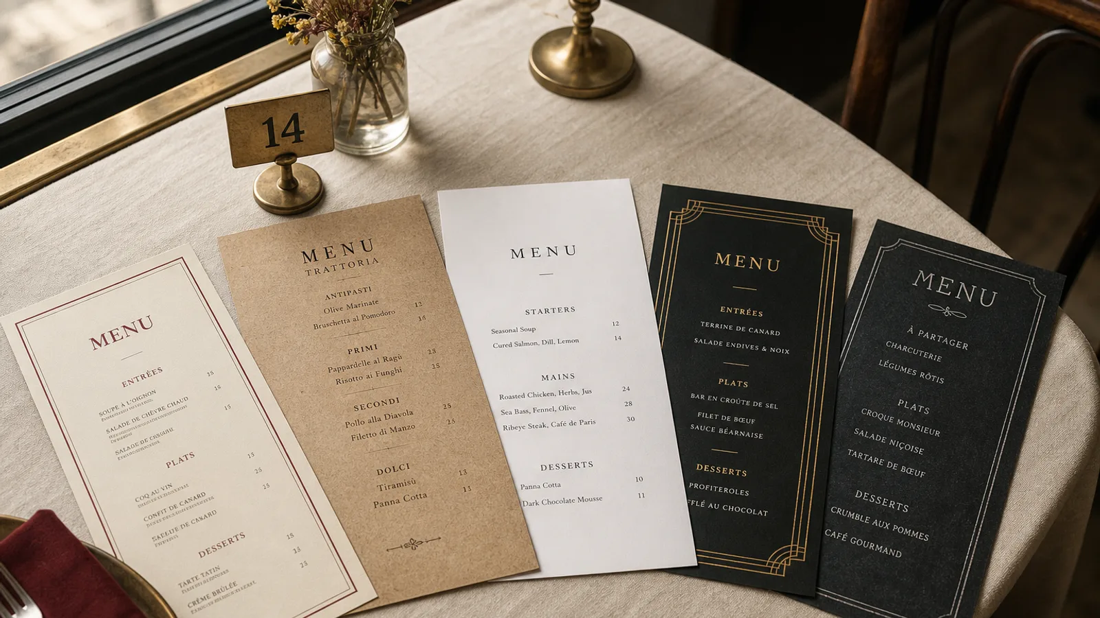
Stand where your customers stand. Three metres back from the hatch, in daylight, with a friend talking in your ear and a phone in your other hand. Can you read the menu? Can you decide in ten seconds? For most trucks the honest answer is no, and the result is a queue that stalls at the window while each person asks what the special is. This is a guide to the board that fixes it: sizes, hierarchy, the number of items, the combo line, and materials that survive rain, sun and a motorway.
Legibility at three metres is a number, not an opinion
Wayfinding designers use a simple ratio: about 1 cm of letter height for every 3 metres of viewing distance for comfortable reading, and 1 cm per 2 metres when the light is poor or the reader is moving. A truck board read from 3 metres therefore needs dish names with capitals at least 10 to 12 mm tall, which on a typical board means 60 to 72 pt. Prices should be at least as large as names. Descriptors, if any, can drop to 30 pt, and nothing below 24 pt belongs on the outside of a truck.
Contrast matters as much as size. Dark text on a pale board or pale text on a dark board both work; coloured text on a coloured board rarely does. Test the board in full sun: a glossy black panel becomes a mirror at noon, which is why matte finishes and light backgrounds win outdoors.
Five to seven items, and mean it
A truck is not a restaurant with wheels; it is a kitchen with one or two pairs of hands and a service window. Every extra item costs prep space, speed and legibility. The trucks that run the longest queues fastest usually sell five to seven core items, one or two sides, three drinks. If your board currently lists eighteen things, the board is not the problem; the offer is.
Order the core items by margin and speed, not by category. The dish you want to sell most, and that leaves the pass fastest, goes top left or dead centre in a larger size. Signature items get a short descriptor line; everything else gets a name and a price.
The combo is the whole business model
One line on the board does more for the average ticket than anything else: "Any main + fries + drink 14 €". Put it in a box, make it the largest text on the board after the truck name, and keep the maths obvious: the combo should save the customer 1.50 to 2.50 € against buying separately, and the saving should be visible without a calculator. Combos also cut ordering time because the customer stops composing and starts choosing.
Layout: one column, no leaders, prices attached
Indoor menus can spread across two or three columns. A truck board cannot: the eye scanning at distance loses its place between columns. Use a single column of items per panel, left-aligned names, price set immediately after the name or on the same line right-aligned within a narrow measure. Never use dotted leaders outdoors; at distance they read as a line of grey noise.
- Keep 40 to 60 mm of clear space between sections so the eye can group them from afar.
- Round prices to the half euro. A 9.50 € reads instantly; 9.45 € slows everyone down and makes change a chore.
- Write allergens as a single line at the bottom, or on a separate A4 card at the hatch: Regulation 1169/2011 applies to street food exactly as it does to a restaurant, and a printed matrix by the window is the cleanest way to comply.
Materials that survive weather and a motorway
A paper menu is a bad idea on a truck. Rain, grease, wind and vibration will finish it in a week. The board options that hold up:
- A printed panel on 3 to 5 mm aluminium composite or PVC, bolted to the truck, with a matte anti-glare laminate. Cost around 60 to 150 € per panel in A1 or A0 size. Best for a stable menu.
- A framed panel with interchangeable printed strips for prices, so a price change costs a new strip rather than a new board.
- A chalk or marker board for specials only, never for the core menu, because a hand-written price is the first thing a customer doubts.
- A small A5 card at the hatch, on 350 g board, repeating the menu for the person who has reached the front and is now reading at arm's length.
Whatever you choose, check the sun angle at the pitches you work most. A board that faces west will be unreadable from 17:00 in summer unless it is matte and light-coloured.
The hand-off between the big board and the small card
The board sells from the queue; the card at the hatch closes the sale. They must show the same items in the same order with the same names, and the card can carry what the board cannot: descriptors, the allergen key, a line about where the meat comes from, the card machine minimum. Keep the card to one face of A5 with the same typeface and colours as the board, and reprint it whenever the board changes.
In Menu Atelier the hatch card is the easy part: design it once in A5, see it in 3D, and download a 300 dpi PDF with bleed and crop marks, or have it printed on 350 g matte board and shipped in 5 to 8 working days. Then match the board to the card, not the other way round.