Gastropub menu design: classics, specials and the beer list
How to design a gastropub menu that keeps the pub and earns the gastro: a short classics core, a matching specials board, beer on the food card and hardy paper.
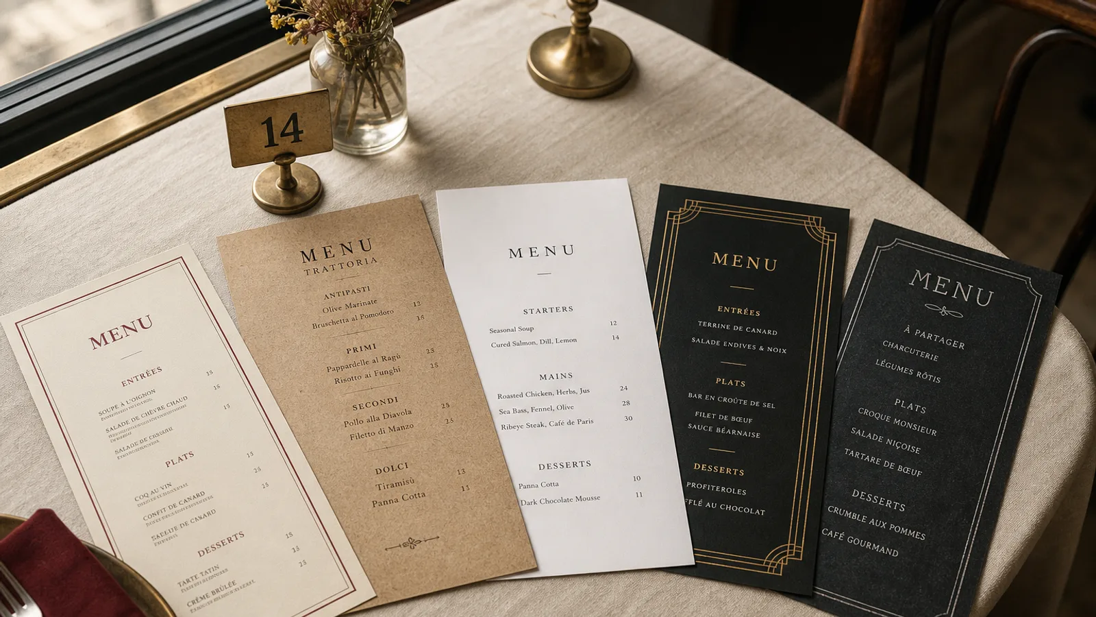
A gastropub has to be two things on one card: a pub, where the regular finds the pie and the pint without thinking, and a restaurant, where the Friday couple finds a reason to book again. Cards that lean too far either way fail. Too much gastro and the regular feels priced out; too much pub and the couple orders fish and chips and never returns. The layout is where you hold the balance: what goes on the printed card, what goes on the board, and how beer earns a place next to the food.
The classics core: eight dishes, never moved
Regulars navigate by memory. Give them a block of six to eight classics that never changes position on the card: the pie, the burger, the fish and chips, the Sunday roast line, a sausage and mash, a ploughman's or a cheese plate. Same order, same corner, every reprint. Prices can move; the positions cannot. Write them with the same care as the specials, one line each, with provenance where it is real ("Cumberland sausages from the butcher on Church Street").
Set the classics on the left inner face of an A4 bifold or the front of an A5 double-sided card, in a serif at 11 pt with a two-column layout if they fit. This is the anchor of the card, and it should feel like one.
The specials: board and card in agreement
Most gastropubs run specials on a chalkboard by the bar. The board is fine; the problem is when the board and the card disagree in tone. A card in a handsome serif and a board in three colours of chalk capitals belong to different pubs. Three rules keep them in step:
- The board lists a maximum of five dishes with prices, written in the same word order as the card (dish, two or three components, price). No adjectives that would not fit on the card.
- The card carries a small block headed "From the board" or "Today" with a pointer: "ask us or see the board by the bar". Guests seated with their back to the board need to know it exists.
- One person writes the board, in one colour, in a hand that is legible from three metres. A 4 cm letter height is the minimum for a board read across a bar room.
If your specials are stable enough to last a week, print them instead: an A5 insert on 160 g paper in the same typeface as the card, dated, slipped inside the bifold. A printed specials sheet reads as intention; a chalkboard reads as whatever is left.
Beer belongs on the food menu
Pubs traditionally keep beer on the bar and food on the table. A gastropub card should bring a short beer list onto the food menu, on the back face or in a column beside the mains: six to ten beers, each with style, ABV and the price for the standard measure, with a second price for the half if you serve it. "Pale ale, 4.8 %, 5.80 € pint, 3.10 € half" is enough. A one-line pairing under two or three mains ("good with the stout") sells more beer than any separate drinks list ever has.
Keep cask and keg in separate short groups if that distinction matters to your regulars, and give the rotating guest beer a line that says "guest cask: ask at the bar" so the card does not go out of date the day the barrel changes.
Wine and the rest
A gastropub wine list is short and priced by the glass with the measure stated in cl: 12.5 cl, 17.5 cl and the bottle. Six to eight wines, one line each. Soft drinks and coffee in a compact block. The drinks should take no more than one face of the card; if they need more, they need their own document.
Sunday and the set lunch
Sunday roast is usually the best-selling and most-photographed dish of the week, and it deserves a treatment of its own: a boxed block on the card with the roasts, the price, and the sides included in plain words. If you run a weekday set lunch (two courses at 18 €, three at 22 €), give it the same treatment on the cover or the top of the first face. Set menus in a gastropub work because they reassure the guest who came for a pint and stayed for lunch.
Allergens and the pub kitchen
Pub kitchens use gluten, milk, egg, mustard and sulphites (in the gravy, the beer batter, the ale in the pie) across most of the card, and Regulation 1169/2011 requires all 14 allergens to be identifiable. A numbered key after each price, with the legend on the back face, is the standard. For the board, print a matching allergen sheet and pin it beside the board; a chalkboard cannot carry the key legibly.
Paper for a table that has seen pints
Pub tables are wet and pub cards are handled by people who have been drinking. A 350 g matte board with a soft-touch finish survives a rings-of-beer table better than anything uncoated, and it can be wiped. A4 bifold gives room for classics, mains, board pointer, Sunday block, beer and wine; A5 double-sided works for a smaller kitchen with twelve to fifteen dishes. Avoid the plastic sleeve and the ring binder, which say pub and not gastro.
In Menu Atelier the Bistro Classic style gives a gastropub card the right weight, with a serif for the dishes and a compact sans for the beer list; you can lay out the classics block so it stays fixed, switch between A4 bifold and A5 single sheet in one click, check it in 3D, and download a 300 dpi PDF with bleed and crop marks or order the run printed on 350 g matte board.