Matte, gloss or soft-touch: choosing the right finish for a menu
How matte, gloss, silk and soft-touch finishes change the look, feel and lifespan of a printed menu, with the lighting, photography and durability trade-offs of each.
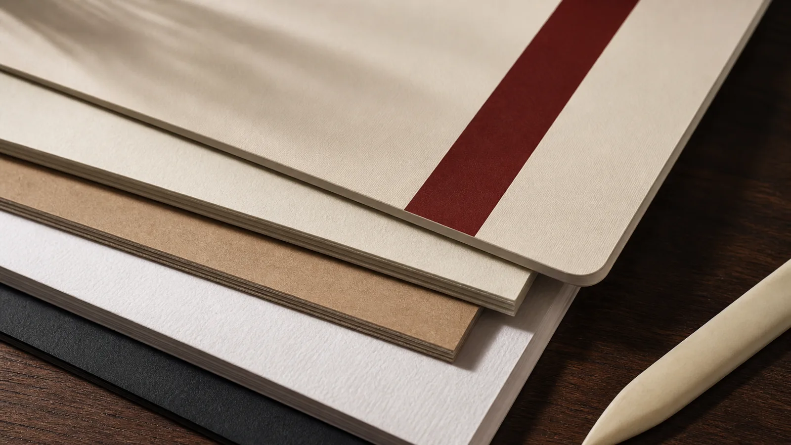
The same design, printed on the same 350 g board, can feel like two different restaurants depending on the finish. Gloss makes food photographs pop and reflects the pendant lamp straight into the guest's eyes. Matte reads calm and expensive and shows every fingerprint on a dark background. Soft-touch feels like nothing else in the guest's hands and costs more. None of these is the right answer for every venue; here is how each behaves and how to choose.
What a finish actually is
A finish is either a property of the paper itself or a layer applied after printing. Coated papers come from the mill with a smooth surface that is matte, silk or gloss; the coating fills the fibre and gives the ink a flat, even surface to sit on. Post-print finishes are added on top: a varnish or aqueous coating that is thin and cheap, a UV coating that is thicker and very glossy, or a laminate, a plastic film bonded to the sheet, which is the most protective and the most expensive.
For menus, the realistic options are a coated or uncoated paper with no further treatment, or a laminate in matte, gloss or soft-touch. Varnishes add little protection against the two things that kill menus, moisture and finger grease, so they are rarely worth specifying.
Gloss: brilliant colour, brutal glare
Gloss finishes give the highest colour saturation and the deepest blacks, because the smooth surface reflects light specularly rather than scattering it. Photographs of food look their best. Gloss laminate also wipes clean and resists moisture well, which is why it dominates in fast-casual and chain menus.
The problem is the room. Restaurants are lit from above with warm, directional light, and a glossy menu held at reading angle reflects that light straight back. Guests tilt the menu, squint, and read less of it. Gloss also shows scratches as white lines within weeks and, on a dark design, every fingerprint. If your design is text-led and your room is dim, gloss is the wrong choice regardless of how good the photos look on screen.
Matte: legibility first
Matte surfaces scatter light, so there is no glare at any angle and text is comfortable to read under the mixed lighting of a dining room. Colours are slightly less saturated than on gloss and blacks are a shade less deep, which suits typographic designs, illustrations and muted palettes. Matte is the default for bistros, wine bars and anything aiming at understated.
Matte laminate has one real weakness: on large areas of dark ink it shows fingerprints and can scuff, leaving a slightly shiny patch where the surface has been rubbed. Designs with a dark background need either a soft-touch laminate, which hides this better, or a lighter background. Uncoated matte paper without laminate has none of the scuffing issue but absorbs moisture and stains, so it suits venues where menus are replaced often.
Silk and satin: the compromise
Between matte and gloss sits a family of finishes called silk, satin or semi-matte depending on the mill. They have a low sheen that lifts colour a little without producing hard reflections. Silk-coated papers are widely stocked, print well and are often the cheapest coated option. For a menu with a mix of photography and text, silk is a sensible middle ground when you would rather not laminate.
The drawback is that silk is neither one thing nor the other. It does not have the tactile presence of a matte laminate or the punch of gloss, and under strong directional light it still produces a soft glare. Treat it as the safe default rather than a design statement.
Soft-touch: the finish guests notice with their hands
Soft-touch, sometimes sold as velvet or peach-skin laminate, is a matte film with a microscopically textured surface that feels like suede. It is the one finish that guests comment on. It has the no-glare legibility of matte, hides fingerprints better than plain matte, and adds a perceptible weight and softness to a 300 or 350 g board. For a menu that is meant to signal care before a word is read, it is hard to beat.
Costs and constraints: soft-touch laminate typically adds 0.50 to 1.50 € per A4 sheet over unlaminated board at short-run prices. It slightly mutes colour, so photographs lose a little vibrancy compared with gloss; the effect is often welcome on food shots that would otherwise look over-saturated. It can be scuffed by very sharp objects, but ordinary handling does not mark it. Bifolds in soft-touch must be scored before folding, as with any laminated board.
- Photo-heavy design, bright room, high turnover: gloss laminate, accepting the glare, or silk paper without laminate.
- Text-led design, warm or dim lighting, mid to upscale venue: matte or soft-touch laminate on 350 g.
- Dark background with large solid areas: soft-touch, not plain matte.
- Menus replaced weekly: uncoated or silk paper, no laminate; the protection is not worth paying for.
Test under your own lights
A finish that looks right on a printer's sample table can fail in your dining room. Take samples, ideally printed with your own design, to the tables at service time. Hold them at reading angle under the actual lamps. Put a wet glass on one and wipe it. Run a thumb over a dark area. Ten minutes of this tells you more than any specification sheet.
Menu Atelier prints on 350 g matte board with a soft-touch finish because it is the combination that reads well under restaurant lighting, hides handling, and feels substantial without adding bulk. If your design relies on photography and you want a glossier result, the export is a standard print-ready PDF with 3 mm bleed and crop marks that any printer can run on the stock and finish of your choice.