Boxes and chef's picks: emphasis that does not cheapen the menu
How to highlight a dish on a restaurant menu without turning the card into a flyer: one box, one mark, better type, and the emphasis habits that kill trust.
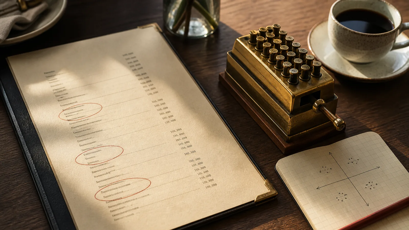
A box is a shout. Used once, it can sell a puzzle the kitchen is proud of. Used four times, it is a card that no longer knows what it wants. The same is true of ribbons, “chef's suggestion” stamps, little forks, and a second colour that appears only on the dishes you hope will move. Emphasis is a scarce resource. Spend it like type size: on the line that needs help, not on the burger that already has a queue.
What a highlight is for
Give the device to a high-margin puzzle, or to a new dish that regulars will skip because the name is opaque. Do not give it to a star. Stars do not need a frame; they need the first line of the section and a full sentence. Do not give it to a plough horse to “make it feel special”. Guests already know the carbonara. A box around it reads as a promotion, and promotions on a dining-room card feel like a chain.
One highlight per face is a hard ceiling. On an A5 single sheet that means one. On an A4 bifold you may have one on the inside spread, not one per section. If two sections both have a “must”, you have not finished the edit. Choose. The other dish can live on position two with a longer description, which is quieter and often more effective.
How to draw a box that still looks like a restaurant
A box is a rule, a little air, and the same type as the rest of the card. Stroke 0.3 to 0.5 pt in the same dark as the body, or a 8 to 12 % tint behind the block, not both. Padding inside the rule: 3 to 4 mm. Do not round the corners unless the rest of the room is already that soft. Do not drop a shadow. Do not put the price in a circle. Those are flyer habits and they survive on 350 g board as flyer habits.
- Keep the dish name in the same size as its neighbours. The box is the emphasis, not a jump to 16 pt.
- A short label (“Tonight”, “From the grill”) in 8 pt small caps is enough. “Chef's masterpiece” is not a label.
- If you tint the panel, mix the tint in CMYK and proof it under the house lights. A sunny yellow dies at 20:30.
- Never reverse a whole boxed description in 10 pt. Reversed type in a small panel fills in.
A thin rule under a heading is not a box. It is housekeeping. Use it if the section needs a floor, not if you are trying to sell the third starter. Photographs are a louder box: one image will outshout three rules. If you have a photo, do not also frame the same dish. Pick one thief of the eye.
Marks, stars and the language of “special”
A small mark (an asterisk, a drawn leaf, a single word) next to two or three dishes can work if the key is honest: vegetarian, spicy, or a true chef's pick. A constellation of five icons for gluten, nuts, dairy, spice and “signature” is a second menu. Put allergens in a consistent system required by Regulation 1169/2011 and keep marketing marks to one. Guests should not have to decode a legend to find dinner.
“Special” is a tired word. If the dish is on every reprint, it is not special. If it changes, put it on a chalkboard or in a dated line (“March: blood oranges”). Printed eternity plus the word special is how a card starts to lie. Regulars notice. They discount the next stamp too.
When emphasis should be type, not chrome
Before you draw a box, try a longer sentence, a better name, and position two. Those three moves sell more puzzles than a gold frame. If the dish still needs help after that, then draw. The sequence matters because chrome is easy and copy is work. The rooms that look expensive have done the work and barely used the chrome.
- Rewrite the puzzle in one sensory line. Move it to slot two. Wait two weeks of service if you can reprint later.
- If it still hides, add one device: a rule-box or a short label, not both.
- Print a proof. Cover the box with a thumb. If the section collapses, the rest of the hierarchy is weak.
- Remove every other badge on the face. Reprint with one shout.
One shout, then quiet
A menu that whispers except once is a menu guests trust. A menu that highlights everything is a leaflet. Spend the box on the dish the kitchen can actually fire with pride, then let the rest of the list breathe at 11 pt on honest board.
In Menu Atelier you can keep the highlight in the copy (a short extra line on the puzzle) and judge in 3D whether a bifold already gives that dish enough air. The styles stay quiet by default; you are not fighting a template full of stickers. When you export, the 300 dpi PDF with 3 mm bleed keeps a thin rule from vanishing at the trim.