Set menu vs à la carte: how to structure both on one page
How to lay out a set menu and an à la carte selection on the same menu without confusing guests: hierarchy, pricing logic, supplements, and the layouts that work.
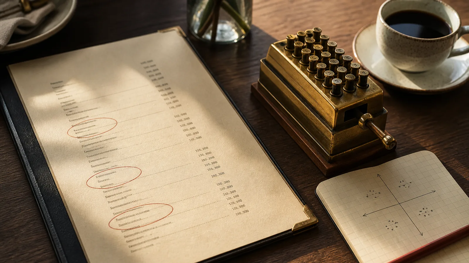
A guest opens the menu and sees two systems at once: a set menu at 29 € for three courses, and the same dishes listed again below with individual prices. Which applies? Can they mix? Is the set menu only at lunch? Every server has answered these questions a thousand times, and every one of them is a sign that the page did not do its job. Set menus and à la carte can live comfortably on one sheet, but only if the hierarchy tells the guest, before they read a single dish, what the two offers are and how they relate.
Decide which offer leads
The first design decision is not visual; it is commercial. Which do you want most guests to choose? In a neighbourhood bistro at lunch the answer is usually the set menu, because it moves volume, simplifies the kitchen and gets tables turned in 50 minutes. In the evening or in a destination restaurant the answer is often à la carte, with the set menu as an entry point for cautious first-time guests.
Whichever leads gets the top of the page, the larger heading and the price that is read first. The other is present, clear and slightly subordinate. Trying to give both equal weight produces the two-systems confusion above; a page can only have one first thing.
Three layouts that work
There are three structures that consistently read well, and the right one depends on how much overlap there is between the set menu and the full list.
- The block: the set menu is a self-contained box at the top or in the left column, listing its own courses in full, with a single price. Below or beside it, the à la carte runs as normal sections. Best when the set menu uses a different, shorter selection of dishes, so nothing is repeated.
- The marker: the à la carte is the whole page, and dishes available in the set menu carry a small symbol or a light rule beside them. A short line at the top explains: dishes marked with a dot form the 29 € menu, starter, main and dessert. Best when the set menu is a subset of the à la carte and you want to avoid printing dishes twice.
- The split: set menu on one face or panel, à la carte on the other. A bifold makes this natural, with the set menu on the inside left and the carte on the inside right. Best when both offers are long and the venue serves both at the same service.
The marker layout is the most compact and the most common in French and Spanish bistros, where the formule or menú del día draws on the same kitchen as the carte. It fails when there are supplements on some dishes, because the symbol has to carry a second meaning, so if you have more than one or two supplements, use the block instead.
Pricing the set menu so it sells without cannibalising
The set menu price should sit 15 to 25 % below the sum of its cheapest à la carte components. Less and the guest sees no reason to choose it; more and every à la carte guest feels overcharged. A common structure is two prices, 24 € for two courses and 29 € for three, with the three-course price only 5 € more so that dessert feels almost free. That 5 € is nearly all margin.
Show what the choice is. A set menu that says three courses from our à la carte with no restriction gives away your most expensive dishes at a discount. A set menu that lists three starters, three mains and two desserts, chosen for cost and speed, protects the margin and is honest about what is included. If some à la carte dishes can be taken as part of the set menu with a supplement, print the supplement next to the dish, in the same size as the price, never as a footnote.
Timing and conditions, printed once
The most common confusion is when the set menu applies. Lunch only? Weekdays only? Until what time? Print the conditions once, in one short line directly under the set menu heading: Tuesday to Friday, lunch, 12:00 to 14:30. Do not repeat it elsewhere and do not put it in a footnote; if the guest has to search for the conditions, they will assume the worst and ask.
If the set menu is lunch-only and the à la carte is all day, consider whether they belong on the same printed menu at all. Many restaurants do better with a separate single-sheet lunch menu, A5 or A4 single sheet, reprinted weekly and cheap, alongside a heavier evening carte. The lunch sheet can carry the day's dishes and the set price; the carte stays untouched. Guests never see the two systems together, and the confusion disappears.
Typography that separates the two offers
When both offers do share a page, three typographic tools keep them apart. First, a rule or a box around the set menu, thin and in the accent colour, so the eye sees a contained object. Second, a distinct heading style for the set menu, small caps or a different weight, used nowhere else on the page. Third, the set menu price set once, large, at the top of its block, while à la carte prices sit at the end of each line in text weight.
Do not use a second typeface for the set menu. Two families on one page, on top of two offers, is too much variation; hierarchy should come from size, weight and position. Keep the same margins, the same line spacing and the same dish description style across both offers so the menu still reads as one document written by one hand.
One dish list, two presentations
The practical difficulty is maintenance. A dish that changes in the kitchen has to change in two places on the page, and its supplement or set-menu marker has to move with it. In practice, menus drift: the set menu lists a dessert that left the carte a season ago, or a supplement is printed on one face and not the other. Whoever maintains the file needs the dish to exist once and appear twice.
That is how Menu Atelier treats it: a dish is a single item with its price and an optional set-menu flag or supplement, and the layout places it in the block, the marker or the split as you choose. Switching between a bifold with the set menu on one panel and a single sheet with markers is a format change you can preview in 3D, and the export carries both offers on a print-ready PDF with the bleed and crop marks already in place.