Linen, kraft, cotton: paper textures and the mood they set
Linen, kraft and cotton menu papers: what each texture does to mood, ink and durability, and which stock suits a bistro, a trattoria or a tasting room.
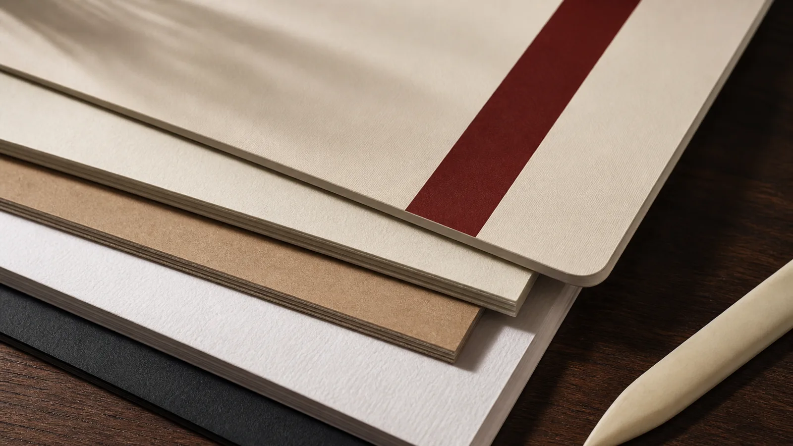
Guests touch the menu before they read it. The first piece of information is not the starter list; it is whether the sheet feels like a letter, a grocery bag or a hotel key folder. Texture is not decoration glued on afterwards. It is the surface the ink has to live on, and it decides how much contrast you get, how the fold behaves, and whether the object still looks like itself after a month of wet glasses. Linen, kraft and cotton are the three textures restaurant owners ask for by name. They are not interchangeable, and two of them will fight a full-colour photograph.
What you are actually feeling
Linen is usually a machine-made pattern pressed into the sheet: a regular grid of shallow ridges that catch the light. It is not woven fabric. The pattern is on one side or both, and it is shallow enough that type at 9 or 10 pt still reads if the ink sits on the peaks. Deep linen, the kind sold for wedding stationery, will break thin serifs. For a menu, ask for a fine linen or a felt mark rather than a deep wedding linen.
Kraft is a colour and a fibre before it is a texture. Unbleached sulphate pulp is brown, slightly hairy, and it shows the wire side if you look. The tooth is irregular. That irregularity is the mood: workshop, bakery, natural wine. It is also the printing problem. Brown is already a mid-tone. Anything you print on it loses a stop of contrast unless you print a white underlay first, which costs a pass and still never looks like white paper.
Cotton is rag content, often 25 to 100 percent, with a soft, slightly cloudy surface and no optical brightener if you buy it properly. It feels expensive because it is: the sheet is denser, it takes a letterpress bite, and it yellows slowly instead of going grey. A 350 g cotton card is a tasting-menu object. It is thirsty, so solids need more ink or they look hungry, and it scuffs if you skip a protective coat.
How each one takes ink
Holdout is the word. Coated silk holds ink on the surface; dots stay dots; photographs look like photographs. Linen, kraft and cotton are uncoated or lightly sized. Ink sinks. Fine halftones fill in. A 150 lpi photograph of a tartare will look like a stamp. Type in a thin hairline sans will look broken on deep linen and fuzzy on kraft.
Work with the sheet, not against it. On linen, use one or two spot colours or a restrained CMYK, keep photographs large and few, or drop them. On kraft, print dark brown, black, deep green or foil; avoid pastel type; if you need a pale panel, flood it in opaque white and accept that it will look printed, not paper-white. On cotton, letterpress or a heavy digital black looks honest; a four-colour sunset over the harbour does not.
Proof on the actual stock. A PDF on a bright office screen lies about all three. Kraft in particular shifts every warm colour toward mud. If your printer will not run a single sheet on the job stock, do not discover the shift on 60 copies.
Matching texture to the room
Linen suits rooms that want a little ceremony without going bridal: a brasserie that still irons the napkins, a hotel dining room, a seafood place that already lives in white and navy. Fine linen in warm white, 300 or 350 g, with a scored bifold, reads as considered. Pair it with a serif that has some weight in the hairlines. Café Chalk and Fine Dining Editorial are different moods; linen belongs closer to the second.
Kraft belongs where the cooking already looks like it came from a board and a fire: a trattoria, a sourdough bakery with tables, a natural-wine bar. Do not put kraft in a sushi room or under a tasting menu that costs 180 €; the sheet will argue with the bill. If you use kraft, keep the type large, the palette short, and the photographs off the card. A stamped logo or a simple wordmark is enough.
Cotton is the quiet luxury sheet. It fits a tasting sequence, a wine list that is a small book, a wedding supper, a room that already spends money on glassware. It does not fit a 40-cover lunch service that turns twice and wipes the card with a cloth that has seen bleach. Cotton shows every wipe.
- Fine linen, warm white, 300–350 g: brasserie, hotel, seafood; keep type above 9 pt and photographs rare.
- Kraft, 280–350 g: trattoria, bakery, wine bar; dark inks only, or white underlay; no pastel type.
- Cotton or cotton-blend, 300–350 g: tasting room, wine book, ceremony; protect it or accept a shorter life.
- Felt-marked uncoated white: the useful middle when you want tooth without the brown of kraft or the cost of rag.
Durability, folds and cleaning
Texture and wipeability pull in opposite directions. Uncoated tooth holds dirt in the valleys. A damp cloth pushes the dirt further in. Soft-touch film on top of linen kills the linen; you feel plastic with a faint pattern underneath, which is worse than either material alone. If you need to wipe, choose a smoother uncoated or a silk with a matt aqueous coat, and stop asking the sheet to be a tea towel.
Folds are kinder to some textures than others. Kraft at 350 g scores cleanly if the grain runs parallel to the fold. Cotton can crack on the fold if it is too dry or too thick and you skip the score. Linen hides a slightly ragged score because the pattern already breaks the surface. Always score; never fold 300 g by hand against a table edge and call it finished.
Humidity moves uncoated sheets more than coated ones. A stack of cotton left near a dishwasher will wave. Store menus dry, standing or interleaved, not in a sealed plastic sleeve that traps kitchen steam.
A practical way to choose
Hold three sample sheets in the room, under the same light the guest will have, with your logo printed or at least a black line of your menu type at the real size. If the type breaks, the sheet is wrong. If the brown of kraft makes your house red look like rust, the sheet is wrong. If you already know the cards will be wiped every service, none of these three is your first choice; they are weekend and tasting-room papers, not Tuesday-lunch papers.
Menu Atelier prints on 350 g matt board with a soft-touch finish: a smooth, protected sheet that photographs and type both survive, with a scored fold on bifolds. If you later want a linen or cotton run from your own printer, export the same design as a 300 dpi PDF with 3 mm bleed and crop marks and specify the stock on the ticket. The file does not change; the surface does. Choose the surface for the way the room is actually used, not for the texture you liked on a stationery website at midnight.