Menu pricing psychology: charm prices, anchors and the euro
What actually moves a guest on a printed menu: charm endings, a real anchor dish, where the euro sign sits, and the layout habits that cheapen a price.
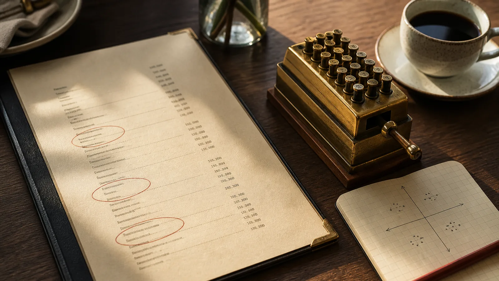
Pricing psychology on a menu is a small set of mechanical habits, not a dark art. Guests do not run a spreadsheet at the table. They compare the first expensive thing they see with the next plausible dish, they read the last digit more than they admit, and they flinch when a column of euro signs turns the card into a till receipt. You can use that without tricking anyone. You cannot use it to rescue a dog or to hide a 40 % food cost behind a pretty 9.
Charm endings are a dialect, not a law
In much of Europe, 19 and 19,50 read as hospitality; 19,99 reads as a supermarket. Fine dining often drops to 22 or 24 with no decimals. A neighbourhood bistro can live on ,00 and ,50. The useful distinction is not 9 versus 0. It is whether the ending matches the room. A tasting menu at 89 € with a 12,99 glass of wine on the same card is two shops stapled together.
Pick one dialect per card and keep it. If mains are whole euros, do not leave starters at ,90 because the old file did. If you use decimals, use a comma in FR/IT/ES markets and be consistent in the English file too if the room is in the eurozone. Align the figures in a tabular column so 8 and 18 share a vertical. A price that wanders to the right of a dotted leader is harder to compare, which is sometimes the point and often just sloppy typesetting.
Anchors only work if they are real dishes
An anchor is a high price that makes the next price feel reasonable. It works when the expensive dish is cookable, plated with pride, and ordered often enough that it is not a joke. A 48 € chateaubriand for two that the kitchen can execute will make a 28 € sirloin look like a decision rather than a splurge. A 62 € tasting they cannot staff on a Tuesday is not an anchor. It is a lie the regulars will mock.
Place the anchor in the section, not on a banner. First or second in the mains is enough. Do not box it in gold. The comparison should happen while the eye is still in the list. Cornell-style work on menus has always been clearer on descriptions and on reducing clutter than on magic triangles; treat the anchor as a neighbour in the list, not as a billboard.
The currency sign is a volume knob
A column of € 18,00 / € 22,00 / € 26,00 is loud. The same numbers as 18 22 26, with a single line at the foot of the card (prices in euros, VAT included), is quieter and still legal if your invoice and the allergen line do the rest. Removing the sign does not hypnotise anyone into spending. It removes a repeated symbol that makes every line look like a transaction. In rooms that already feel expensive, the quiet column fits. In a lunch formule or a tourist street, keeping € can be clearer for guests who are converting in their head.
- One convention per card: symbol before, symbol after, or no symbol and a footnote.
- Never mix 18 € and €18 on the same face.
- Do not set the sign in a weaker colour or a smaller point size. That looks like you are hiding it.
- If you drop the sign, say once, in 8 or 9 pt, that prices are in euros and include VAT.
Layout habits that make a price feel cheaper
Dotted leaders from the end of the dish to a far-right price turn the card into a railway timetable. They also drag the eye to the number before the description is finished. A price sitting a single word-space after the dish, or a discreet right-aligned column with no dots, keeps the name in charge. Do not put the price on its own line under a short name; you have just made a poster for the number.
Do not bold the cheap dishes and lighten the expensive ones. Do not run a “from 14 €” on a dish that is never 14. Do not add +2 € for a side in 7 pt after a 24 € main if the side is effectively mandatory. Those are the habits guests remember as stingy, which is a stronger emotion than a charm ending.
What to test before you reprint
- Rewrite endings so one dialect rules the card, then wait two weeks of till data before you touch the design.
- Name one real anchor per section and put it in position one or two.
- Print a proof with and without the euro sign and read both at a table. Choose the quieter one that still feels honest for your street.
- Kill dotted leaders. Re-proof. If the card looks empty, your descriptions were doing no work.
None of this replaces costing. A charm 9 on an underpriced plough horse still loses money per plate. Do the matrix, then dress the numbers. Psychology is typesetting for people who are hungry, not a substitute for a recipe book.
Set the numbers like a grown-up
The card should make comparison easy for the dishes you want compared, and slightly slower for the ones you do not need to advertise as cheap. That is the whole game. When the dialect, the anchor and the column are decided, stop adding badges.
In Menu Atelier you paste prices with the dishes, so the column width is honest before you generate, and you can switch a cramped A4 with leaders to a quieter A5 bifold in one click. The 3D view is useful here: if the price is the first thing you see when you tilt the card, the layout is still shouting.