New Year's Eve menus: the set menu card that justifies the price
How to design a New Year's Eve set menu card that makes a 120 to 250 € dinner feel earned: course structure, wine pairings, timing, paper and printing deadlines.
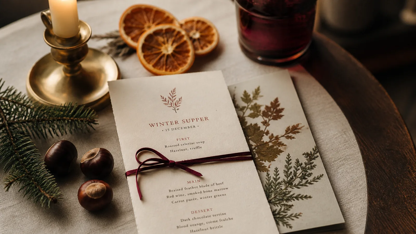
On 31 December a guest pays two to three times your usual average spend, sits for four hours, and is handed a single sheet that has to make that number feel reasonable before the first course arrives. Most New Year's Eve cards fail this test by looking like the December menu with midnight added. The dinner is a different product: longer, more expensive, with a fixed sequence and a clock. Its menu card should be designed like the programme of an evening, and this article explains how.
A tasting menu reads vertically, one course per breath
The New Year's Eve dinner is almost always a fixed sequence of six to nine courses, with few or no choices. That calls for the tasting menu layout: a single centred or left-aligned column, one course per block, separated by generous space rather than rules. No prices per line, no dotted leaders, no two-column grid. The eye should travel down the card at the pace of the meal.
Set the course names at 11 to 12 pt and the short description below at 9.5 to 10 pt, with 6 to 8 mm of space between courses on an A5 card. Eight courses with two lines each fit comfortably on one A5 face; if you add wine pairings, the second face or a taller format such as a 105 × 297 mm slim card takes them without crowding. Old-style numerals for course numbers, if you number them, look at home in this context.
Making the price feel earned
The price of a New Year's Eve dinner is typically 120 to 250 € per person in a good independent restaurant, more with pairings. Guests accept it when the card shows the density of what they get. Name every course, including the ones that feel small: the amuse-bouche, the pre-dessert, the mignardises with coffee. Seven named moments justify a number that four would not.
State exactly what is included in one calm line under the price: welcome glass of champagne, water, coffee, service, the midnight toast. Then state what is not: further wine, spirits, supplements for caviar or truffle if you offer them. Ambiguity on this night turns into an argument at 1 am when the bill arrives, and the menu card is your evidence.
- Price set once, near the top or the bottom, in a size clearly above body text but below the title.
- Inclusions in one sentence, exclusions in the next, both in the same size as the descriptions.
- Deposit and cancellation conditions on the booking confirmation, not on the card; the card is for the evening.
- Allergen statement as required by Regulation 1169/2011, plus a line on how alternatives were arranged at booking.
The clock is part of the design
Unlike any other dinner, this one has a hard timestamp in the middle. Guests want to know when they will be standing with a glass at midnight and whether the main course arrives before or after. Put the timing on the card: seating at 20:30, first course at 21:00, midnight toast, dessert after. A short line of timing under the title turns the card into a programme and reduces the number of times your team is asked "how long until dessert".
If there is music, a DJ or a change of room after midnight, one line at the bottom is enough. It is not the place for the full party flyer.
Wine pairings on the same card
A pairing option sells better when it sits next to the courses than on a separate list. Two clean solutions: an indented line in italics under each course naming the wine, or a second column on a wider format aligned course by course. Keep the pairing price once, at the top of that column or in the inclusions line, and indicate the pour size (for example 8 cl per course) so the value is visible.
If the pairing is optional, make the visual hierarchy show it: the courses in the primary text colour, the wines in a secondary grey or in italics. Guests who have not taken the pairing should not feel they are missing half the card.
Paper and finish for a card people keep
Of all the cards a restaurant prints in a year, this is the one guests most often take home. Choose paper accordingly. 350 g board with a soft-touch matte finish photographs well under low light and does not glare; a 300 g cotton-textured stock gives a stationery feel that suits a gala. Cream or warm white rather than bright white, dark ink rather than black if your brand allows it, one metallic or dark accent at most.
Print one card per guest plus 15%, and add 10 to 20 extra to send to guests who ask afterwards or to photograph for next year's promotion. For a 60-cover dinner, 80 cards is a comfortable number. A hot-foil accent is attractive but adds 150 to 400 € of setup at these quantities; a well-chosen paper does most of the work for a fraction of that.
Printing before everything closes
The trap of New Year's Eve is that it comes right after Christmas, when printers run reduced hours and couriers are saturated. Files must leave by 10 December to be safe. That means the menu is finalised by 5 December, which in turn means the chef commits to the courses in the last week of November, when the Christmas menu is already in service. Plan the two together in October, or the New Year card ends up printed on the office printer at 5 pm on the 31st.
The digital version matters too: most guests book a New Year's Eve dinner after reading the menu on your website, in early December. In Menu Atelier the same design produces the web PDF and the print-ready file with bleed and crop marks in one export, and the 3D preview lets you check the slim tasting-menu card at real size before you commit. If you order the printing through the print and ship option, 99 € plus 10 € per card on 350 g soft-touch board, place the order in the first week of December to land comfortably within the 5 to 8 working days.