Pizzeria menu design: organising 30 pizzas so people still choose
How to lay out a pizzeria card with 25 to 40 pizzas so guests decide in under a minute: groups, names, prices, extras and a paper that survives tomato.
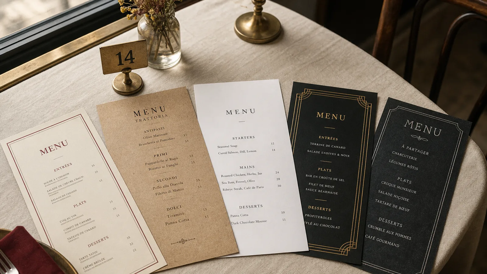
Thirty pizzas on a card is not a luxury problem; it is the default. A neighbourhood pizzeria that started with twelve has grown a list of specials, seasonal pies and the one with burrata that nobody will let you drop. Guests still have about forty-five seconds before they pick Margherita or ask the waiter. The design job is not to make thirty pizzas look fewer. It is to make the eye land on a group, then a name, then a price, without reading a novel of toppings.
Group by dough and story, not by a rainbow of boxes
The worst pizzeria cards treat every pizza as a unique product in its own coloured frame. The eye has nowhere to rest. Group instead: classiche, bianche, rosse, specials or the kitchen's own names ("from the wood oven", "from the plancha"). Four to six groups of five to eight pizzas is readable. A single numbered list of thirty-two is a takeaway flyer, not a table card.
Put the house pizza and two or three high-margin pies at the top of their group, not in a star-shaped badge. Badges on a pizza card age in a month. If you have a gluten-free or fried-dough section, give it its own short block with a one-line explanation of the dough and the surcharge, if there is one. Do not scatter GF icons through thirty lines and hope.
Names first, toppings second, in a type size that works at arm's length
The pizza name is the decision. Set it in a sturdy serif or a condensed sans at 12 to 13 pt, medium or semibold. The topping line sits under it at 9.5 to 10.5 pt, in a lighter weight, one line if you can, two if the pizza is a paragraph of cured meats. "Diavola — tomato, mozzarella, spicy salami, chilli oil" is enough. A third line of adjectives ("our famous", "chef's favourite") is noise that slows the next guest.
Number the pizzas only if the room uses numbers at the pass or on the phone. Numbers help takeaway and hurt the table: guests say "the 17" instead of "the one with 'nduja", and the card starts to look like a catalogue. If you number, keep the figures small and old-style, to the left of the name, not as the hero.
- Price on the same line as the name, right-aligned, or immediately after it with a 2 em space. Dotted leaders on a pizza card look like a railway timetable.
- One size is one price. If you sell 28 cm and 32 cm, print both figures in a compact pair (14 € / 18 €) under the name, labelled once at the top of the group.
- Extras (extra mozzarella, burrata, egg, chilli honey) live in a single block at the foot of the pizza list, not repeated under every pie.
Antipasti, fried things and the rest of the table
A pizzeria is not only pizza. The card fails when the fried courgette flowers, the burrata and the salads are treated as leftovers in 8 pt at the bottom. Give starters their own face or the top third of the first page, in the same type hierarchy as the pizzas. Six to ten antipasti is plenty. If you run a lunch formula (pizza plus drink at 14 €), lock it in a band at the top of the cover; weekday traffic will thank you.
Desserts and a short wine and beer list belong on the back or the last inner face. Eight wines by the bottle, four by the glass with the measure in cl, and four beers with style and ABV is a pizzeria drinks list. A second booklet for wine is for a room that has become a restaurant and should reprint as one.
Heat, tomato and a paper that can be wiped
Pizzeria tables collect oil, tomato and wet glasses. Uncoated 250 g paper looks warm for a week and then looks used. A 350 g matte board with a soft-touch finish wipes clean and still feels like a card, not a laminate pouch. A4 bifold is the honest format for 25 to 40 pizzas plus starters; A5 double-sided works only if you cut the list or move drinks off the card. Avoid the plastic sleeve: it yellows, it shines under the oven lights, and it says takeaway even when the room is booked.
If you reprint monthly because the specials move, design the specials as a dated insert on 160 g in the same typeface, slipped into the bifold. The main card stays; the insert dies on the first of the month. That is cheaper than reprinting thirty classiche because four seasonal pies changed.
Allergens on a card that is already crowded
Gluten, milk, egg and sulphites sit on almost every line. Regulation 1169/2011 still wants all 14 allergens identifiable. A numbered key after the price, legend on the back in 8 pt, is the only system that survives thirty pizzas. Pictograms next to every topping become a second language nobody asked to learn. For gluten-free dough, say so in words in that section, and keep the same key.
A card the room can run at Saturday night pace
The test is a full room at 21.30. If the waiter has to lean in and recite three specials that are not on the card, the card is late. If guests take four minutes to order because the groups have no names, the card is the bottleneck. Print the groups, print the extras once, print the lunch band, and leave the chalkboard for the four pies that arrived with this morning's delivery.
In Menu Atelier the Trattoria Rustica style holds a long pizza list without turning it into a flyer: name, topping line, price, and room for an extras block. You can lock the classiche group, drop specials onto a second face, switch A4 bifold and A5 in one click, check the fold in 3D, and download a 300 dpi PDF with bleed or order the run on 350 g matte board with a scored fold.