Ramen and noodle bar menus: bowls, toppings and add-ons
Designing a ramen or noodle bar menu: the bowl as a complete build, a broth-first structure, toppings and extras priced clearly, and Japanese terms explained.
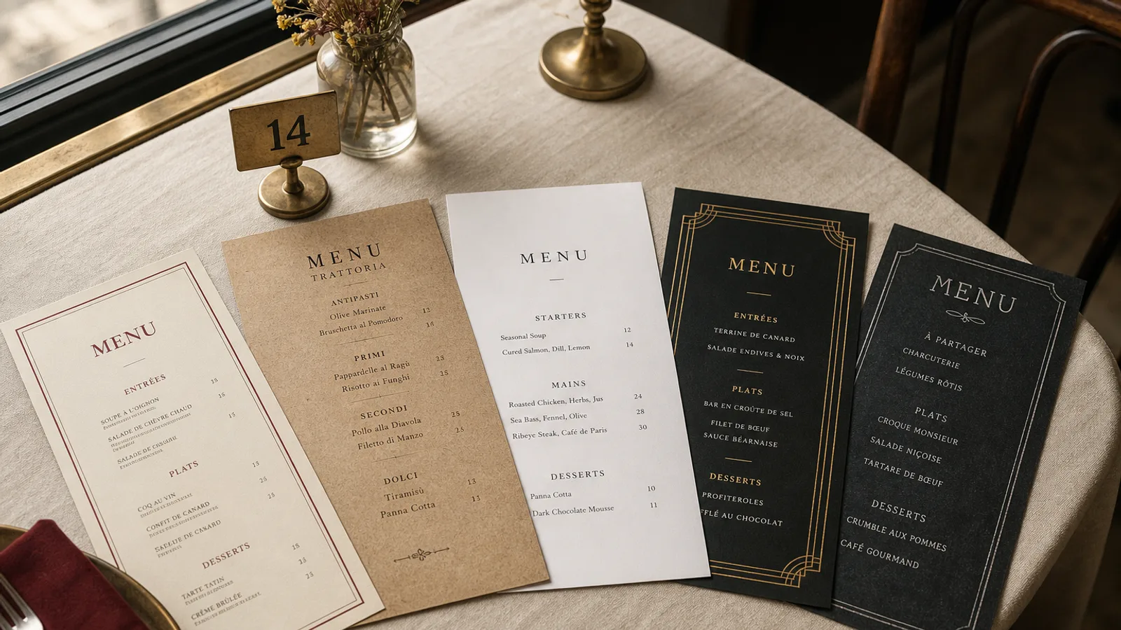
A ramen counter sells eight bowls and turns a seat every twenty-five minutes. The menu has to do three things in the ninety seconds between sitting down and the server's first visit: explain what a bowl is, let the guest pick one, and sell one topping. Anything else on the card is a cost. This article works through the structure that does exactly that, the way to write toppings so they add up rather than confuse, and the small typographic decisions that make Japanese words readable on a European table.
Broth first, then everything else
Guests who know ramen decide by broth; guests who do not need to be told that broth is the decision. Either way, the card should be organised by broth, not by protein or by price. Four or five headings (tonkotsu, shoyu, shio, miso, a vegan broth) each with one line describing the base in plain words ("pork bone broth simmered 18 hours, rich and creamy"), and under each broth the one to three bowls built on it.
Set the broth heading in your display face at 14 to 16 pt, the description underneath in 9 pt italic, and the bowls in 11 pt. This gives a card with visible rhythm and lets a first-timer read the five descriptions and decide the broth before looking at any bowl.
Write each bowl as a finished object
The most common ramen menu mistake is describing a bowl as a base plus a list of options. A bowl is a finished thing: "Tonkotsu chashu, 2 slices pork belly, ajitama egg, menma, spring onion, black garlic oil, 15.50 €". The guest should be able to order it with one word and know exactly what arrives. Options exist separately, and only for things guests really change: noodle firmness, spice level, extra portion.
- Name the bowl by its broth and its main topping, not with an invented title. "Midnight Dragon" needs explaining; "Spicy miso chashu" does not.
- Keep the ingredient list to six or seven items in order of importance; the noodles are implied and do not need listing unless they are special.
- Print the egg as a named component (ajitama) with a two-word gloss the first time it appears, then use the name alone.
Toppings and add-ons: the block that pays the rent
A ramen bowl has a tight margin; the toppings block is where the ticket grows from 15 to 20 €. Give it a clearly separate, visible block on the right-hand side or under the bowls, with a heading such as "Add to any bowl" and prices in a tight two-column list: extra chashu 3.50 €, ajitama 2 €, corn and butter 1.50 €, nori 1 €, kaedama (extra noodles) 2.50 €. Ten to twelve items maximum, most under 3 €, ordered from the most-added down.
Do not list toppings inside each bowl with a plus sign. The guest has to scan every bowl to find out what costs extra, and the bowls themselves start to look like spreadsheets. One block, one set of prices, and the bowl lines stay clean.
Sides that fit the rhythm
Gyoza, karaage, edamame and a pickle plate are the classic sides, and they arrive before the bowl. Set them in a small section above the broths, headed "While you wait", at 5 to 8 €, so they are ordered together with the bowl. Below the bowls, a rice section (chashu don, onigiri) for the guest who wants more than noodles.
Japanese words on a European card
Romanised Japanese is part of the appeal, but it has to be readable. Use the standard Hepburn spelling (shoyu not shouyu, chashu not chaashuu), keep macrons off the card because most typefaces render them badly, and gloss every non-obvious term once, in parentheses, at its first appearance: "menma (fermented bamboo)". After that, the word stands alone.
Japanese characters as decoration are fine in the masthead; using them for dish names on a card most guests cannot read is not. If you want kanji, pair each dish name with it in a lighter weight and smaller size, never instead of the Latin name. The Sushi Zen style gives you a typeface pairing that handles both scripts and a page with the calm a ramen card needs.
Allergens and the two hard ones
Ramen cards trip on two allergens under Regulation 1169/2011: gluten in wheat noodles and soy sauce, and egg in both the noodles and the ajitama. Fish (in dashi and in some tare) and sesame are common too. A numbered key per bowl and per topping is the workable approach; state clearly which broth is vegan and whether it is also gluten-free with rice noodles, since that is the question you will be asked most.
A format for a counter, not a table
Many ramen seats are counter stools with 35 cm of depth in front of a hot bowl. An A4 card does not fit. An A5 card, printed both sides on 350 g board, is the natural format: broths and bowls on the front, sides, toppings, drinks and the allergen key on the back. If you have tables as well, an A5 bifold with the same content gives you a cover for the name and a short paragraph on your broth, which is worth having.
Matte board resists the steam and the splash better than gloss, and a warm off-white page reads better under the low-hanging pendant lights most ramen bars use than a stark white. Margins at 10 mm, prices set right after the ingredient list, and one accent colour only.
Keeping the card as fast as the kitchen
Check the card against a stopwatch the way you check the pass: a new guest should have picked a broth in 20 seconds and a bowl in 45. If they take longer, the card has too many bowls or too many words. Trim before you decorate. Change the seasonal bowl every two months and reprint the whole card rather than adding an insert; on an A5 double-sided card there is nowhere for an insert to live.
In Menu Atelier the Sushi Zen style handles the broth-first structure and the toppings block naturally; you can lay out the A5 card, flip it in 3D to check that the back face carries the extras and the allergen key, and export a 300 dpi PDF with bleed and crop marks or order it printed on 350 g matte board.