Should you remove currency symbols from your menu?
When dropping the euro sign from a restaurant menu calms the card, when it confuses guests, and how to set a legal, quiet price column in print.
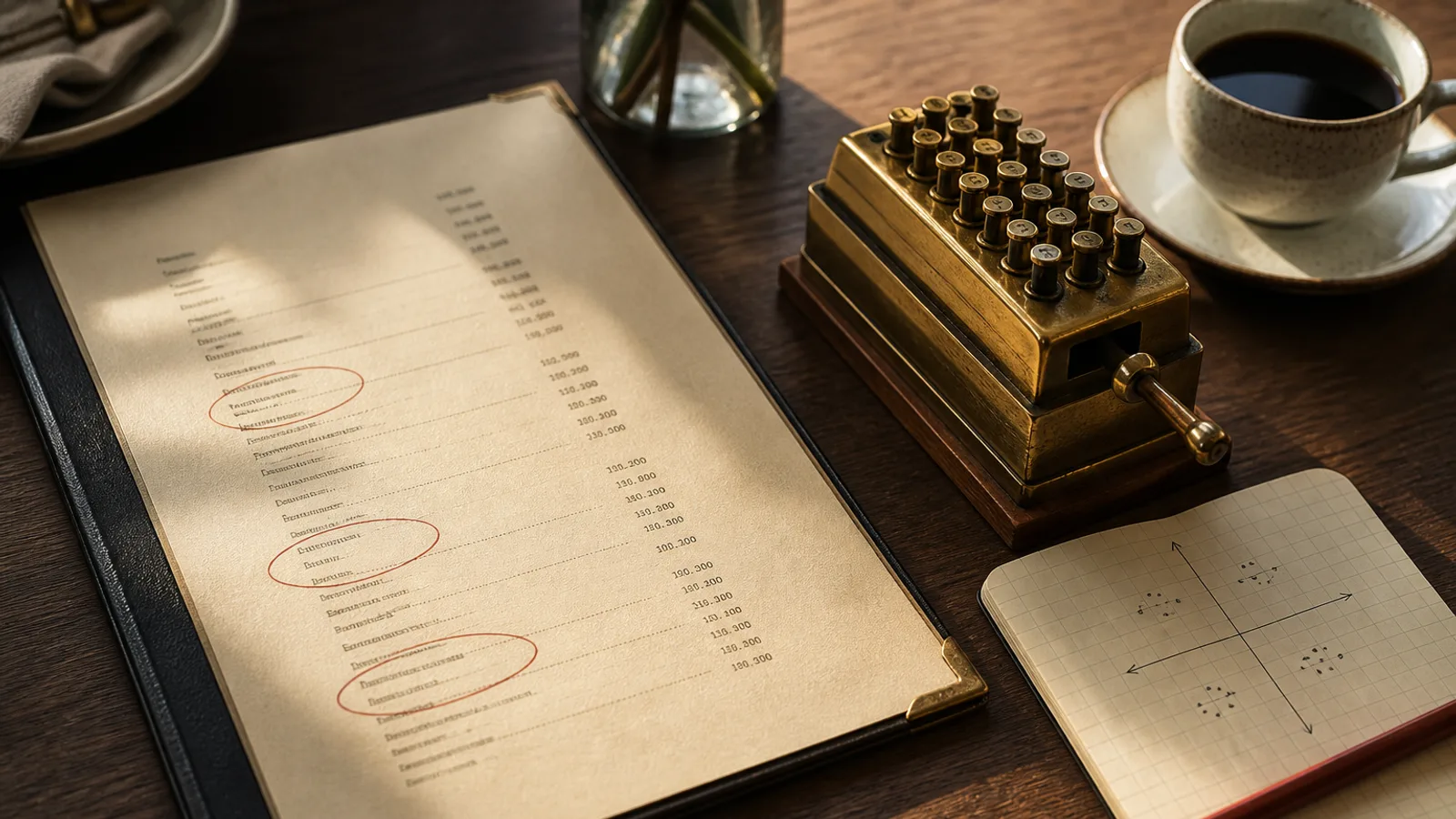
The advice to strip the € from a menu travels in hospitality slides as if it were a law of physics. The claim is that guests spend more when they do not see a currency. What they actually do is read a quieter column. Sometimes that helps a room that already feels expensive. Sometimes it makes a tourist ask the waiter what the numbers mean, which is a worse outcome than a printed sign. The decision is typographic and local, not mystical. You are choosing how loud a price looks, and whether your street still needs the word euro on every line.
What removing the sign actually does
A repeated symbol is visual noise. €18 €22 €26 is a till roll. 18 22 26, right-aligned in tabular lining figures, is a list of dishes that happen to have numbers. The guest still knows they are in the eurozone. They still see 22 next to the sea bass. You have not hidden the cost. You have stopped punctuating every line with a cash register. That is useful in a dining room where the object should feel like hospitality. It is less useful in a lunch window where people are converting from pounds or comparing two formules in a hurry.
Studies that get cited for “no dollar sign” are mostly American, often on campus or in casual rooms, and they measure small shifts. Treat them as permission to try a quieter column, not as proof that 2 % more margin will appear because you deleted a glyph. If your prices are wrong, the glyph is not the problem.
When to keep the euro
Keep the sign if the room sits on a tourist street, if you print an English face for guests who arrived yesterday, if you also list pounds or another currency (do not), or if your prices include decimals that already look like a receipt. Keep it on a takeaway card and on a breakfast list next to a bakery. Keep it if the staff are tired of explaining. Clarity is a form of hospitality too.
If you keep the sign, pick a side and stay there. In French, Italian and Spanish rooms, 22 € after the number is the vernacular. €22 before the number looks imported. Never mix both on one face. Never set the glyph in 8 pt grey while the number is 11 pt black; that is the cheap trick guests notice as a cheap trick. Same size, same colour, or no glyph.
How to drop it without looking sly
If you drop the sign, say so once, in a place people actually read: a footer in 8 or 9 pt, “Prices in euros. VAT included.” In the EU, VAT-inclusive pricing for restaurant service is the expectation; do not make a virtue of it in 14 pt. Allergen information (Regulation 1169/2011) can share that footer or sit in its own key. Do not hide either in a QR code that fails when the wifi is down.
- One footnote, not a paragraph of legal prose.
- Tabular lining figures so 8 and 18 share a vertical.
- No dotted leaders. The quiet column does not need a railway line to the number.
- No second currency. Conversion is the waiter's job or the guest's phone, not your 7 pt column.
Decimals: if you have already chosen whole euros, dropping the sign looks even cleaner. If you live on ,50, the comma is doing more work than the glyph. Do not switch to 19,99 on the same reprint that you remove the €; that is two dialects at once.
A proof you can run this week
- Set one section two ways, same type, same paper: with € and without.
- Read both at a table at 20:30. Ask two waiters which one they would rather explain.
- If anyone asks “is that euros?”, you need the sign or a louder footnote.
- If both feel fine, keep the quieter one and lock the convention for the season.
Measure units and margin for eight weeks. If nothing moves, you have a nicer column and that is enough. If spend drops, you chose the wrong street for a silent number. Put the sign back. There is no prize for orthodoxy.
Quiet is not the same as hidden
Guests forgive a price they can see. They do not forgive a card that feels like it is playing a game. Remove the euro when the room is already clear about money. Keep it when the room is a conversation between strangers. Either way, set the column like a typesetter, not like a marketer.
In Menu Atelier you type the number with the dish; whether you include the € in that string is your convention, and it stays aligned when you switch from a busy A4 to an A5 bifold. The 3D view is a good honesty check: if the column is the first thing you see when the card turns, the layout is still louder than the food.