Restaurant week and prix-fixe menus: design that sells the format
How to design a restaurant-week or prix-fixe card so the set price feels like a deal, the choices stay clear, and the house menu is not confused with a two-week offer.
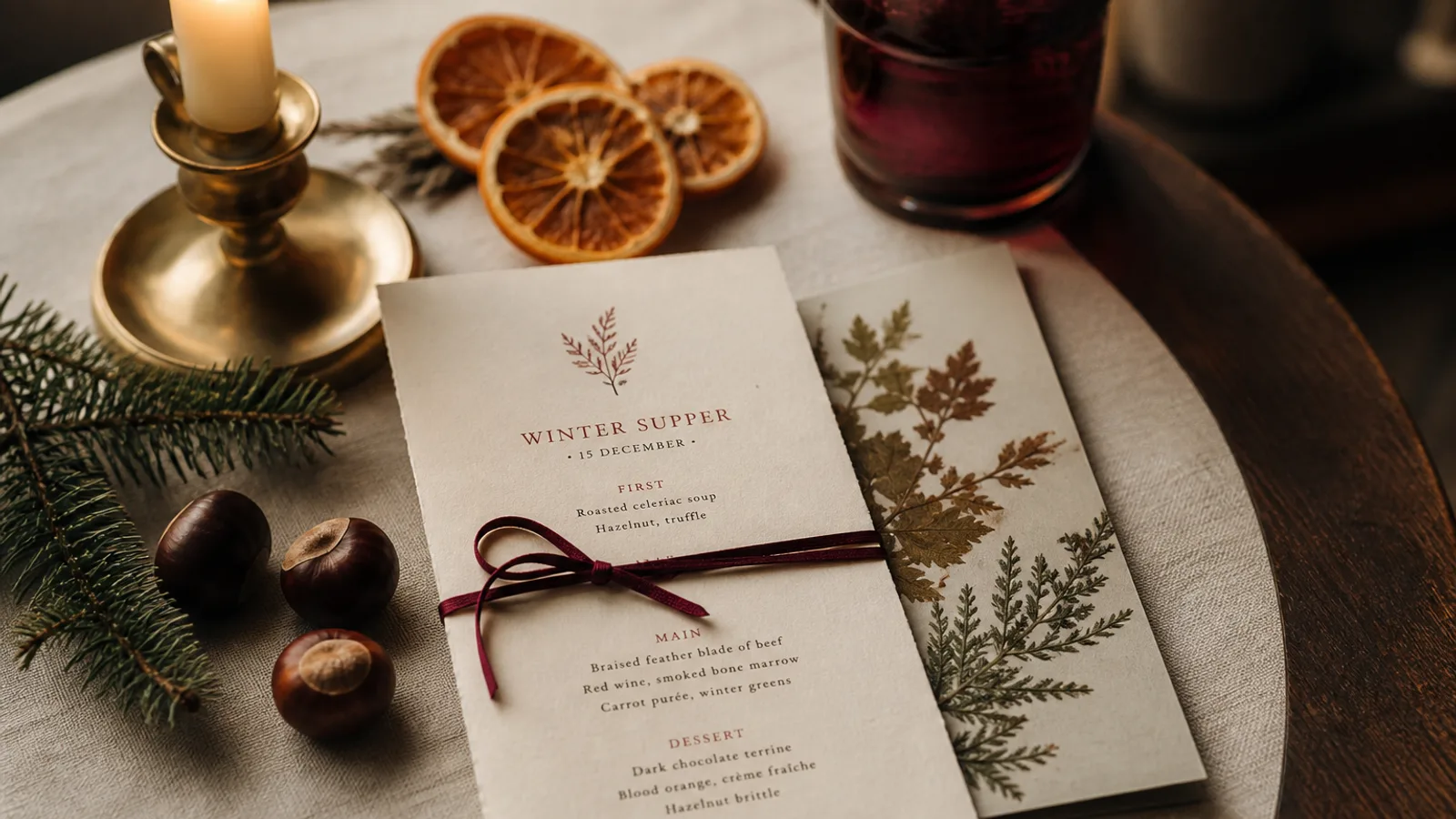
A prix-fixe card has one number to defend. Restaurant week, a winter formula, a 39 € lunch: the guest must see the structure (how many courses, what is included) before they see the dishes, or they will compare each plate to the à la carte and decide they have been shorted. Most of these cards fail by looking like a smaller dinner menu with a badge. They need their own object: a short programme, a loud price, and a clear end date. This article is about that object.
Show the skeleton before the food
Three courses, 39 €, coffee included, wine pairing +18 €. That block sits under the title, in type larger than any dish name, before a single plate is listed. Guests decide to stay or leave on that block. If you bury 39 € at the foot, next to a service line, you have hidden the only reason this card exists.
Then list by course, not by the house sections. Starter, main, dessert. Two or three choices per course is the useful maximum on a restaurant-week card. Five choices is an à la carte in costume and it will crush the kitchen at 1 pm. If a dish is also on the dinner menu, say so only if the portion or the garnish differs; otherwise you invite the comparison you cannot win.
Make the price look like a decision, not a discount sticker
Set the figure in the same type family as the rest of the card, two to three steps larger (18 to 24 pt on A5), not in a burst, a banner, or a red circle. A prix-fixe is a format, not a supermarket end-cap. Old-style numerals are fine at this size if you use them on the house menu; lining figures are clearer if the card will be photographed and cropped.
State what the number includes in one line: three courses, still water, coffee. State what it does not: wine, supplements, the cheese course if that is extra. Restaurant-week rules often forbid adding a 12 € supplement on the main; if you cannot resist, you should not have put lobster on a 39 € card. Honesty here is design.
- Skeleton first: number of courses, price, what is included
- Two or three choices per course, never a hidden à la carte
- Price in the house type, large, no burst or sticker art
- End date on the card so last week's offer cannot be served
Keep it from being mistaken for the house menu
Same type, same logo, same board: that is the family. Distinguish with one word and a date ("Restaurant Week, 3–16 March" or "Menu 39 €, until 30 January") under the name, and, if you can, a slightly smaller format. A5 for the offer, A4 for the house, is a physical cue staff can see from the pass. Do not print the offer on the back of the dinner card. Guests will order from the wrong face and you will spend the service apologising.
If the promotion is only at lunch, say so in the same line as the date. A dinner guest handed a 39 € card at 8 pm will either feel lucky or feel cheapened; neither is a feeling you should leave to chance.
Wine and the second number
A pairing at +18 € or a short list of three glasses is enough. Put it under the skeleton or on the back. Do not attach a 40-bin list to a restaurant-week card; it slows the table you are trying to turn. If the week is about discovery, one line of house wine included is a stronger offer than a cellar they will not read.
Paper, run length, and the Monday after
These cards live two weeks. Print on the house 350 g if the offer is a point of pride; print on a cheaper 250 g if you will throw them away on the 17th. Soft-touch is wasted on a stack that dies on a Sunday night. Number the run against covers, not against optimism: 80 copies for a 12-day lunch promotion in a 40-cover room is plenty if you reprint once. At 99 € plus 10 € a copy, a second 30 is cheaper than running out on the Saturday that was the point.
Put the end date in the filename (rivoli-rw-2026-03-16) and archive the file the morning after. The dish that was a loss-leader for the week should not linger on a PDF someone finds in July.
A short card that does one job
Skeleton, a few real choices, a price that looks like type, a date that ends. That is a prix-fixe. Everything else (badges, bursting stickers, a second menu hiding underneath) is how restaurant week starts to feel like a clearance. Design the card as if the 39 € were a tasting, not a coupon.
In Menu Atelier you duplicate the house design, cut the list to the three courses, lock the 39 € under the title, switch to A5, and order a short run; when the week ends you archive the version and the dinner card is still the dinner card.