Single-sheet menus: designing the format that changes every week
How to design a single-sheet restaurant menu that can be reprinted weekly: paper weight, one-column layout, type sizes, what to leave off, and how to keep it deliberate.
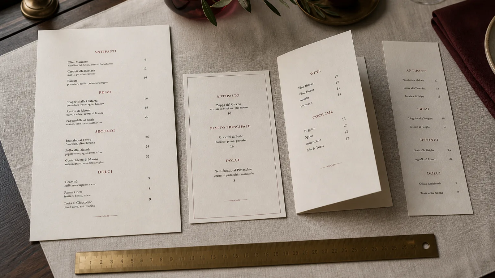
The kitchens that change their menu most often are the ones that print it on a single sheet, and they are often the ones whose menus look the most improvised: a Word document, Arial 11, prices ragged down the right. It does not have to be that way. A single sheet is a real format with its own rules, and a restaurant that changes its list every Tuesday can have a menu that looks as designed as a bound wine list. What follows is the method: paper, grid, type, content and the reprint routine.
Why a single sheet, and when it is the right call
One face, no fold, one print pass. The single sheet exists for menus that will not survive long enough to justify finishing: market-driven bistros, lunch menus that change daily, wine bars with a rotating list of ten plates, pop-ups and residencies. It is also the cheapest format to reprint, since there is no creasing or folding step, and the fastest, with production measured in one or two working days.
It is the wrong call when the list exceeds about 16 dishes with descriptions, when the brand needs a cover, or when the same menu will sit on tables for three months. In those cases the flat sheet looks like a compromise, and a bifold costs only marginally more.
Paper: the difference between a menu and a printout
Most of what makes a single sheet look like an office printout is paper weight. Copier paper is 80 g and translucent; you can see the table through it. At 200 g a sheet still bends in the hand. The threshold where a flat sheet starts to feel like a menu is around 250 g, and 300 to 350 g uncoated board is where it feels intentional and lies flat on the table without curling.
Uncoated stock is the natural choice here: it takes handwriting or a stamp for the date, it does not glare under spotlights, and it looks right next to a linen napkin. If the menu changes weekly, skip varnishes altogether; the sheet will retire before it wears out. A weekly run of 40 A4 sheets on 300 g board, printed digitally, typically costs 25 to 45 € in Europe, which is less than a single no-show.
One column, one axis
A flat A4 wants a single column of text, aligned left, with prices either flush right on the same line or set after the description in the same weight. Two columns on a single sheet are read as a takeaway flyer. The grid can be simple: a 20 mm margin on all sides, a heading area of 40 to 50 mm at the top for the name and date, then the list, then a 15 mm footer for allergens and a line about the kitchen.
- Restaurant name at the top at 18 to 24 pt, the date or the week (for example, week of 6 October) directly under it at 9 pt. The date is what tells guests this menu is alive.
- Section headings at 12 to 13 pt in small caps or a contrasting weight, with 10 to 12 pt of space above and 4 pt below.
- Dishes at 10.5 to 11 pt with 14 pt leading; descriptions on the same line or the next, never longer than two lines.
- Prices in the same typeface and weight as the dish, without a currency symbol repeated on every line if the footer states prices are in euros.
For A5 single sheets, keep the same structure and cut the list rather than the type size: 8 to 10 dishes, 10 pt minimum, margins of 12 to 15 mm. An A5 on 350 g board is the ideal daily lunch card, and it slips into a standard A5 menu holder.
Content: what earns a place on one face
With no cover and no back, everything competes for the same face. The list wins. Cut the paragraph about your philosophy to one sentence in the footer, drop the logo to a small mark rather than a hero, and let the dishes and the date carry the design. The allergen key required under Regulation 1169/2011 stays; set it at 8 pt in the footer with numbered allergens after each dish, which uses far less room than spelling them out.
Set menus and formulas belong at the top or in a boxed block, not scattered through the list. If the same sheet carries drinks, give them the bottom third with their own heading, and keep the wine to a short by-the-glass list; a full wine list belongs on its own card.
The reprint routine
A single-sheet menu only works if the reprint is boring. Build one master layout with locked styles, so that Tuesday's job is replacing text and not redesigning. Keep a spreadsheet of dishes with their allergen numbers so the footer never falls out of sync with the list. Export to PDF at 300 dpi with 3 mm bleed even if the sheet has no background, because trimmed edges are what make a sheet look printed rather than photocopied.
- Monday: kitchen sends the list and prices in one message, dishes numbered.
- Monday afternoon: text replaced in the master, proofread by a second person, PDF exported.
- Tuesday to Wednesday: sheets printed and trimmed; the previous week's sheets kept in a folder for reference.
- Every quarter: review the master itself, because typography and margins drift when many hands edit a file.
Deliberate, not disposable
The single sheet is disposable by nature, but it should never look it. Heavy uncoated board, one column, a visible date, generous space, and a footer that carries the legal and the practical: that is the whole recipe. Guests read a menu like that as a sign of a kitchen that cooks what is fresh, which is precisely the message.
In Menu Atelier a single-sheet design keeps its styles between edits, so replacing the week's dishes takes minutes and the layout stays as it was approved; the export includes the bleed and crop marks automatically, and if the list grows one week, switching the same design to a bifold is one click rather than a redesign.