The spring menu refresh: asparagus, colour and a lighter card
How to refresh a restaurant menu for spring without redesigning it: which dishes to rotate, how to lighten the palette and the page, and how to reprint as produce arrives.
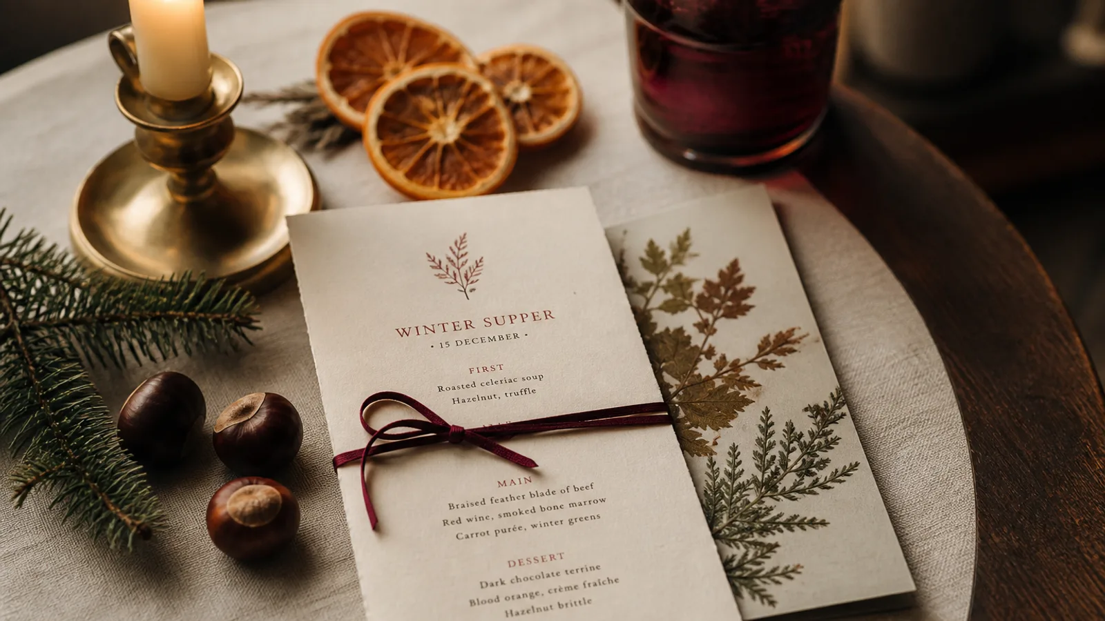
Spring is the season restaurants most often skip on the card. Winter runs long, the summer terrace menu is already being planned, and the first asparagus arrives while the menu still reads "braised shank, root vegetables". Yet the spring refresh is the cheapest seasonal change of the year to do well, because it is mostly about subtraction: fewer components, lighter colours, more air on the page. Here is how to turn the winter card into a spring one in a week, and why it matters for how much guests spend.
Why the card has to change before the weather does
Guests notice seasons on the plate a week after they notice them on the street. A card that still lists three braises in mid-April reads as tired even if the cooking is excellent. The reverse also works: a card that names asparagus, peas, wild garlic and rhubarb in the first days of the season signals attention and lets you charge for scarcity. The refresh is not decoration; it is the first visible sign that the kitchen is awake.
The kitchen usually knows exactly which dishes should go. The delay comes from the card: the fear that changing it means a full design job. It does not. A spring refresh replaces 30 to 50% of the dishes, keeps the structure, and changes two visual variables.
Subtract first: what leaves the card
Start by deleting. Remove the heaviest winter dishes, the ones with three garnishes and a long sauce, and the desserts built on chocolate and chestnut. Do not replace them one for one; a spring card can be 10 to 15% shorter than the winter card and feel more generous, because each remaining dish gets more room. A 48-line winter A4 becoming a 40-line spring A4 gains about 4 mm of leading per section, which the eye reads as freshness.
Then shorten the descriptions. Spring dishes are simpler and the words should be too: "asparagus, hollandaise, brown butter crumbs" is seven words and complete. Aim for 6 to 12 words per line where the winter card had 12 to 18.
Two visual variables, not a redesign
You do not need new typefaces or a new grid. Change the accent colour and the paper. A winter card with bordeaux section titles on cream uncoated board becomes a spring card with a soft green or a warm grey-blue on a brighter white. In CMYK, a sage green around 40/10/45/10 or a pale slate at 30/15/10/10 prints cleanly and stays elegant; avoid bright grass green and pastel pink, which look like Easter packaging.
For paper, move to a smoother, whiter stock than in winter, still 300 to 350 g so the card keeps its weight in hand. A matte or soft-touch finish is right in every season; gloss is never right. If your card sits in a holder, only the insert changes, and a run of 40 inserts on 300 g costs 60 to 120 € at short-run digital prices.
- Keep: typefaces, sizes, grid, logo position, footer, price notation.
- Change: accent colour (one), paper shade (slightly whiter), leading (slightly looser), dish list (30 to 50%).
- Add: a date or a season name in the header, so guests see that the card is current and you have a reason to retire it in June.
Rotating dishes as the produce arrives
Spring produce does not arrive on one day. Wild garlic comes in March, asparagus in April, peas and strawberries in May. A single spring card printed on 1 April will be wrong on both ends. Two solutions work. The first is a stable spring card plus a small "this week" insert or chalkboard for the three dishes that follow the market. The second is to print the spring card in two short runs, early April and mid-May, with a handful of dishes swapped between them.
The second approach costs about the same as one large run, because short-run digital pricing is nearly linear, and it keeps the card honest without crossed-out lines. Keep the design file ready to edit and treat the reprint as routine.
Prices and the spring premium
Early-season produce is expensive, and guests will pay for it if the card makes the reason visible. Name the variety or origin in the dish line (white asparagus, morels, first strawberries), put the dish in a short section of its own, and price it clearly without hiding it in a footnote. A spring starter at 16 € next to a winter soup at 9 € is fine when the card explains why.
Do not forget the allergen line when you change dishes; Regulation 1169/2011 requires the 14 allergens to be declared, and a new dish with hazelnut crumbs or a new sauce with mustard needs marking. The refresh is a good moment to check that the allergen codes on the card still match what the kitchen does.
A one-week refresh calendar
Monday: the chef lists dishes out and dishes in. Tuesday: the owner sets prices and the manager rewrites descriptions to spring length. Wednesday: the layout is updated with the new accent and paper, printed on a laser printer at real size and read under the room's lighting. Thursday: corrections and the print order. The following week: cards on the tables, in time for the first sunny lunch.
In Menu Atelier this is a small job: open the winter menu, delete and paste the dishes, change one sentence in the mood description (lighter, whiter paper, sage green accent), and regenerate in the same style; the 3D preview shows the lighter page at real size. Exporting the print bundle costs 99 € once per menu, and print and ship on 350 g matte soft-touch board is 99 € plus 10 € per card, delivered in 5 to 8 working days, which fits the one-week calendar with a reprint in May if the market asks for it.