Steakhouse menu design: cuts, weights and sides that make sense
How to lay out a steakhouse menu: the cuts table, weights and per-100 g pricing, breed and ageing lines, sauces and sides as a separate block, and the right paper.
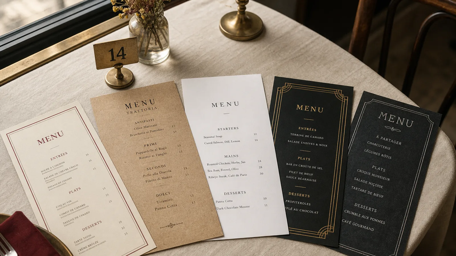
A steakhouse sells the same thing twelve ways, and the menu has to make those twelve ways feel like a choice rather than a quiz. Cut, weight, breed, ageing, cooking, sauce, side: seven variables per order, and every one the guest has to resolve before the server leaves. The layouts that work turn those variables into a structure the eye can read in one pass. Here is how to build the cuts table, price by weight without alarming anyone, and keep sides and sauces from cluttering the main event.
The cuts table is the heart of the card
Most dishes on a restaurant menu are a name, a descriptor and a price. Steaks are different: the same cut appears in two or three weights, from one or two origins, and the guest needs to compare across rows. This is the one place where a tabular layout beats a list. Set the cuts as a table with columns for cut, weight, origin or breed, ageing and price, and give it the most prominent position on the card: the full right-hand face of an A4 bifold, or the centre of a single A3 sheet.
Keep the table to eight to twelve rows. Order it by the way guests actually decide: tender and lean first (fillet), then the classic middle (sirloin, rib-eye), then the large and shared cuts (côte de bœuf, T-bone, tomahawk) at the bottom where a 1.2 kg weight and a 95 € price look like an occasion rather than an outlier.
Table typography
Use lining numerals so weights and prices align vertically, and set the table in a typeface with a real tabular figure set. Columns need at least 6 mm between them; rules between rows are optional, but a hairline of 0.25 pt every row makes a twelve-row table readable at 10 pt. Do not use dotted leaders in a table; the columns do the aligning.
Weights and prices: the honesty problem
Guests distrust steak pricing more than any other restaurant pricing because they cannot see the piece before they order. Two rules solve most of it. First, print the raw weight in grams on every line and say so once at the top of the table ("weights are uncooked"). Second, for the large sharing cuts sold by weight, print the price per 100 g and the typical serving range: "Côte de bœuf, Limousin, 45 days dry-aged, 9.50 € / 100 g, typically 1 to 1.3 kg for two".
Never mix a per-piece price and a per-100 g price on the same row without labelling both, and never abbreviate to "€/kg" on a card where everything else is in grams; the mental conversion is where the argument starts at the bill.
Breed, origin and ageing: say it once, say it precisely
A breed name (Aubrac, Rubia Gallega, Black Angus), an origin and an ageing time are the strongest words on a steakhouse menu, but repeating them on every line turns the card into a wall of proper nouns. Put shared facts in a short introduction above the table (two sentences on your butcher, your ageing room, your grill) and keep only what differs between rows inside the table. If all your beef is dry-aged 35 days, that is a heading, not a column.
- Give each cut a one-line descriptor in plain words: "marbled, rich, best medium" tells a first-timer more than a paragraph about intramuscular fat.
- Recommend a cooking point per cut in italics; it reduces returned plates and it reads as expertise.
- State the maturation method (dry or wet) once, in the introduction, and only flag exceptions in the table.
Sauces, sides and the blocks around the table
Sides are where the ticket grows and where cards get messy. Set them as a separate block below or beside the table, two columns, name and price only, 9.5 to 10 pt, and price them clearly: a 6 € side that is "included with any steak" must say so with the word included, not with an asterisk. Sauces get the same treatment: a compact list, one price if they all cost the same, and a note of which ones are house-made.
Starters and non-steak mains live on the left face of the spread, with a smaller heading, so the steaks stay dominant. A steakhouse that gives its fish and its burger equal visual weight with the cuts table looks unsure of itself. Dessert and cheese can share the back face with a short wine list of big reds by the glass and the bottle.
Materials that match the room
Steakhouses suit weight in the hand. A 350 g matte board in A4, single sheet or bifold, feels right; uncoated stock in a warm white looks better against dark wood than a bright blue-white. A deep colour on the cover (oxblood, charcoal, forest green) with a single spot of cream type reads well under low light, but keep the inside pages light-on-dark free: reversed type at 10 pt under a candle is unreadable. The Bistro Classic and Fine Dining Editorial styles both carry a cuts table well; Art Deco Cocktail suits the bar card at the front of the house.
Allergen information under Regulation 1169/2011 still applies even if the menu is mostly beef: butter in sauces, gluten in béarnaise thickeners, sulphites in the jus, nuts in the salad. A numbered key on the back face, with the 14 allergens listed once, keeps the cuts table clean.
A card that changes with the butcher, not the designer
Weights change with every delivery and prices change with the market. Build the table so a row can be edited without touching the layout, and reprint monthly rather than crossing out. If you print in-house between orders, keep the same paper and the same margins, so a Tuesday reprint does not look like a downgrade. A handwritten price on a steakhouse card undermines the one thing the card is meant to communicate: that you know exactly what you are selling.
In Menu Atelier you can edit a weight or a price in the cuts table and see the change on the card in 3D immediately, then download a fresh 300 dpi PDF with bleed and crop marks, or have the new run printed on 350 g matte board and delivered in 5 to 8 working days.