Summer terrace menus: light, fast and wind-proof
Designing a restaurant terrace menu for summer: a shorter card that reads in full sun, survives wind and spills, speeds up ordering and costs little to reprint.
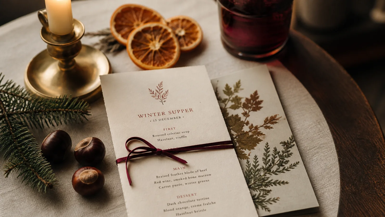
A menu that works perfectly indoors can fail within a minute on a terrace. Sunlight washes out grey type, the wind takes the A4 sheet into the street, a wet glass leaves a ring on the 350 g board, and a table of six on their lunch break spends eight minutes choosing while the server waits. Terrace service has its own physics and its own pace. This is how to design a summer card that reads at noon in July, stays on the table, and helps you turn tables faster when the weather brings twice the usual covers.
Shorter, because the terrace is faster
Guests on a terrace order faster and eat lighter. They also often arrive in larger, looser groups and want to share. Rather than handing them the full indoor carte, build a summer card of 20 to 30 lines: a handful of cold starters and salads, three or four mains, sharing boards, two desserts, and the drinks that matter outdoors (spritz, rosé by the glass and carafe, beer, lemonade, water). A shorter card is not a downgrade if the choices are the right ones for 30 °C.
The kitchen benefits as much as the guest. A 25-line terrace card built around cold and quick dishes lets a small kitchen serve 80 covers at lunch without collapsing, and it makes the daily special genuinely special rather than one more line among sixty.
Legibility in full sun
Direct sunlight on white paper produces glare; the eye compensates by contracting, and light-grey text at 9 pt disappears. On a terrace card, everything gets darker and bigger. Use near-black text (a rich black or a very dark brown, not 60% grey), body sizes of 10.5 to 11 pt, and section titles at 14 to 16 pt. Drop the thin weights of your typeface; a regular or medium weight holds up where a light weight vanishes.
Paper colour matters more than indoors. A cream or light kraft-toned stock reduces glare compared to bright white, and it hides the first day's dust. Uncoated surfaces are easier to read in sun than coated ones, which reflect the sky as a sheet of light at certain angles; a matte or soft-touch finish is the right choice for the same reason.
- Body text 10.5 to 11 pt, dark ink, regular or medium weight.
- No reversed text (white on colour) for anything smaller than a section title; it fills in and blurs in bright light.
- Cream, off-white or light kraft paper rather than bright white.
- Matte or uncoated surface, never gloss.
Formats that stay on the table
Wind is the enemy of the loose A4 sheet. Three formats behave well outdoors. First, a heavy single card in A5 or a slim 105 × 297 mm on 350 g board or thicker; the weight and small surface keep it in place. Second, a card designed for a table stand or a wooden clipboard, which pins it down and also signals that the menu lives on the table. Third, a laminated or synthetic-paper card that survives rain and can be wiped; it is less elegant but for a beach or poolside terrace it is the honest choice.
Bifolds are risky on a terrace: they catch wind like a sail and the fold weakens after a week of damp evenings. If you need more than one face, print double-sided on a single card rather than folding.
Structure the card for speed
A terrace card should be readable in 30 seconds. Put the sharing boards and the daily special where the eye lands first, top of the card or the upper-right block, since those are the items that groups agree on quickly. Keep prices on the same line as the dish, aligned right, without long dotted leaders that force the eye to travel across a wide card. Drinks belong on the same card as the food in summer; nobody wants to ask for a second document when they are already thirsty.
Describe less. A terrace dish needs 6 to 12 words: the main ingredient, the treatment, the one detail that sells it. Allergen information is still required under Regulation 1169/2011; a compact code per dish or a clear line inviting guests to ask keeps the card light while staying compliant.
Print cheaply, reprint often
Terrace cards live hard. Sun fades inks, sunscreen leaves marks, and by mid-August a card printed in June looks tired. Plan two or three print runs across the season rather than one large batch, and spend less per copy than on your indoor carte. A double-sided A5 on 350 g board in a run of 40 costs roughly 2 to 4 € per copy at short-run digital prices; three runs over the summer are still cheaper than one laminated set that looks worse and cannot be changed when a dish sells out.
Keep the file ready to edit. When the tomatoes finally arrive in July or the fish changes in August, a card that can be updated and reprinted in a week keeps the terrace menu honest instead of full of crossed-out lines.
The summer card as a season, not a compromise
The best terrace menus feel like the restaurant on holiday: the same identity, lighter and looser, with the confidence to offer less. Treat it as a proper seasonal edition that runs from late May to mid-September, with a date on the footer and one or two changes along the way.
In Menu Atelier the practical route is to start from your indoor menu, delete down to the summer selection, describe the mood in a sentence (bright, matte cream paper, dark ink, larger type) and switch the format to an A5 single card or slim double-sided sheet in one click; the 3D preview shows how it sits at real size. Reprinting mid-season is a re-export, and print and ship on 350 g matte soft-touch board is 99 € plus 10 € per card, delivered in 5 to 8 working days.