Tapas and sharing menus: guiding guests to order the right amount
How to design a sharing plates menu that tells guests how much to order: portion cues, the recommended count per person, section flow, pricing and the kitchen pacing note.
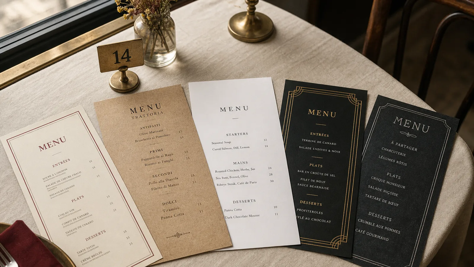
The question every sharing-plates restaurant hears forty times a night is "how many should we order?". When the card does not answer it, the server does, table by table, and the answer varies with how busy they are. Guests either under-order and leave hungry, or over-order and leave with a bill they resent. A sharing menu is a piece of guidance as much as a list, and the layout has a job to do: make the right amount obvious before anyone asks.
Say the number, on the card, in the first ten words
The single most useful line on a sharing menu is the one that states the recommended quantity: "Our plates are made for sharing; we suggest 3 to 4 per person". Put it under the restaurant name, before the first section, in the same size as a dish name. Not in the footer, not in 7 pt grey. A guest who reads it first orders with confidence, and the kitchen gets orders that make sense.
If your plates vary a lot in size, give the number as a range and back it up with portion cues in each section. If you have a house selection ("let us choose, 38 € per person"), give it a boxed block right after the guidance line: it is the easiest order to take and usually the most profitable.
Sections that go from light to heavy
Sharing menus lose guests when sections are organised by kitchen logic (cold section, hot section, grill) instead of eating logic. Order the card the way a good meal unfolds: things to eat while deciding, then vegetables and raw, then fish, then meat, then the one or two big plates, then sweets. A typical Spanish-influenced card runs:
- Para picar: olives, almonds, bread with tomato, croquetas. Priced 3 to 6 €, ordered immediately.
- Vegetables and cold: salads, escalivada, padrón peppers, ceviche or crudo.
- Fish: gambas al ajillo, pulpo, boquerones. The margin section, in the centre of the spread.
- Meat: pluma, albóndigas, chorizo. A heading only slightly stronger than the others.
- To share for two: one paella, one whole fish, one rib. Two or three items, visibly larger portions, priced 24 to 42 €.
- Sweets and sherry, in a compact block at the end.
Six to ten items per section is the sweet spot. Sharing cards tempt kitchens into thirty small plates; the guest then reads thirty prices and orders conservatively.
Portion cues that replace the server's explanation
The card should tell the guest how big each plate is without a paragraph. Three devices work, and you should use only one of them consistently:
- Piece counts in the descriptor: "croquetas de jamón, 4 pieces", "gambas al ajillo, 6 prawns". The most concrete cue and the one that stops the "is it enough for four?" question.
- Size markers next to the name: a small S, M or L set in a lighter weight, explained once at the top. Works for cards with very uneven plates.
- Weight for the sharing items: "pluma ibérica, 250 g". Only where the plate is a single ingredient.
Avoid pictograms of people or hands. They are hard to read at 9 pt, they age badly, and they never survive a reprint on a different stock.
Pricing a card where everything is between 5 and 14 €
Sharing menus have a narrow price range, so a right-aligned column of prices looks like a ladder of nearly identical numbers and makes the card feel like a sum. Set the price at the end of each descriptor, one space after the last word, in the same typeface. Drop the decimals where you can (7 € rather than 7.00 €) and keep them everywhere if any single item needs them; mixed decimals look careless.
Anchor the spread with the big plates. A 42 € rice for two at the bottom of the page makes the 11 € pulpo above it look reasonable, and it tells the table what a full meal looks like. Set menus ("the whole table, 8 plates, 34 € per person") work particularly well in sharing restaurants and should be given a block with a rule around it, not a list of included dishes with prices repeated.
The pacing note
One line most sharing menus forget: "Plates arrive as they are ready". It manages expectations, it lets the kitchen fire in sensible waves, and it prevents the complaint that the ceviche came before the bread. Put it in italics at the end of the guidance block.
Allergens across a table of shared plates
Sharing meals are the hardest case for allergen management because plates cross the table. Regulation 1169/2011 still requires the 14 allergens to be identifiable per dish, so a numbered key per line is the only workable solution on a sharing card, in 7 to 8 pt after the price, with the legend on the back face. Add one line inviting guests to tell the server about allergies before ordering the house selection, since that is where they hand over control.
Format for a table that fills up fast
Sharing tables are covered in small plates within ten minutes. A large A4 card has nowhere to sit after the second round. A5 bifold, or a single A5 sheet printed on both sides, on 350 g board, is the format that survives the table: it slides under a plate, it can be passed around, and four faces is plenty for eight sections when the descriptors are short. Keep 10 to 12 mm outer margins and set the guidance block on the cover so it is seen before the card is even opened.
The Mediterranean style, with its warm white and a single accent colour, was designed for exactly this kind of card; in Menu Atelier you can lay out the guidance line and the house selection block on the cover, switch the design between A5 single sheet and A5 bifold in one click, check it in 3D, and export a 300 dpi PDF with bleed and crop marks or order the run on 350 g matte board.