Tasting menu cards: one column, one story
How to design a tasting menu card: one column, course names, wine pairings, allergens and a format that reads as a sequence rather than a price list.
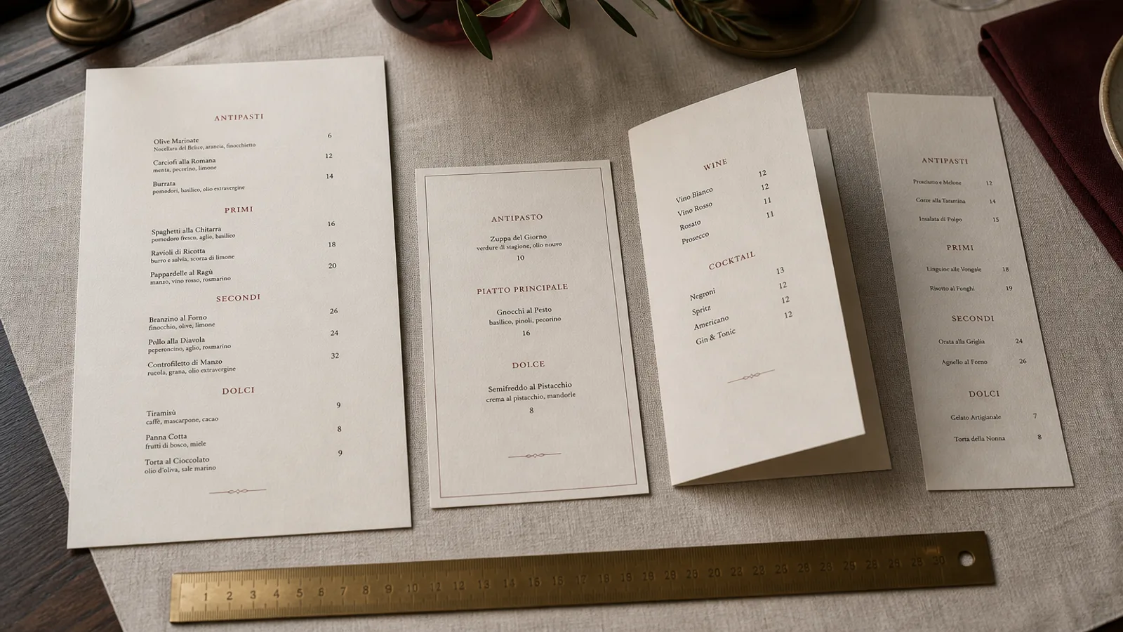
A tasting menu is not a short à la carte. It is a sequence. The card has one job: to tell the guest, in order, what will arrive, at what pace, for how much, and what they need to say now (allergies, a skipped course, the pairing). Two columns, dotted leaders and a grid of prices turn that sequence back into a shopping list. I have watched guests start bargaining with a tasting card that looked like a brasserie carte. Design the object as a programme, not as a catalogue. One column. One story. A price once.
The shape of a sequence
A5 portrait, single face or a light bifold, is enough for six to ten courses. A4 starts to look like a certificate. Landscape can work for a very short sequence (four lines and a pairing) on a two-top that already has a wine book. Do not go to a booklet unless the card is also a keepsake with a title page and a date; nightly tasting cards die on Tuesday and should not be bound.
Paper should be lighter than the dinner carte if the sequence moves weekly: 170 to 250 g, or a 300 g card if the menu is stable for a month. 350 g soft-touch is beautiful and expensive to throw away after the langoustine comes off. Many rooms keep a durable cover and drop in the sequence as an insert. That is the right hybrid.
Centre the column or align it left with a wide right margin. Do not set two columns of courses. If you offer a shorter and a longer menu (five courses and eight), stack them as two labelled blocks on one face, or give each its own card. Side by side they will be compared like prices in a supermarket.
What each line is allowed to say
A course line is a name, not a recipe. Crab, burnt leek, elderflower is enough. A 28-word paragraph under every course is a kitchen talking to itself. If a technique matters (dry-aged, over fire), put it in the name. If a garnish is a surprise, leave it off the card; the surprise is part of the service.
Optional pairings sit to the right of the course or as a second column of wine names only, not as a second price per line. The wine price belongs once, with the menu price, at the foot: menu 95 €, pairing 55 €, juice pairing 28 €. Repeating 14 € next to each glass turns the card into an à la carte of pours and invites skipping.
Dietary notes belong in a quiet line under the title or at the foot, not as icons raining down the column. Regulation 1169/2011 still applies: the 14 allergens must be available in writing. A tasting kitchen that changes a butter last minute needs either a dated card or a spoken plus written insert the same night. A beautiful card that lies about milk is a liability.
- Title and date or season at the top; one price block at the foot.
- Course names in a single column, 11 to 14 pt, generous leading (16 to 20 pt).
- Pairing names, if shown, as a lighter second voice, not a second price list.
- Allergen statement and a line for dietary requests; no sticker over a course.
Type, space and the pause between courses
Leading is the design. Courses need air between them the way the table needs air between plates. 6 to 10 mm between lines is not wasted paper; it is the rhythm of the evening. A card that is packed to the footer reads as anxiety. Fine Dining Editorial and Sushi Zen both understand this; Café Chalk does not belong here unless you are being funny on purpose.
Use one serif for the courses and a smaller sans or italic for the pairing. Old-style figures if you show numbers at all. Skip dotted leaders. Skip a euro after every word. The mark can sit small at the top or the foot; it should not compete with the first course.
A short chef's line under the title (eighteen words, not a memoir) can set the evening. A long about belongs on the dinner carte or the website, not between the guest and the first bite.
Pairings, supplements and the things that break the spell
Supplements (the cheese, the extra langoustine, the rare bottle) should not interrupt the column. Put them under the price block as optional lines, or on a spoken offer. A tasting card that is 40 percent supplements is an à la carte in costume.
If you run two seatings, print the sitting time in 8 pt at the foot so the card and the reservation agree. If you run a shorter lunch tasting, give it its own card in the same type, not a dinner card with three courses crossed out.
Photograph nothing, or photograph the room, not the plates. A tasting card with six food photographs is a catalogue and it spoils the pass. Guests came to be cooked for, not to compare the picture with the plate.
Print it like a programme you can throw away
Short run, light stock, dated. Forty copies of an A5 sequence on 170 g is a Tuesday job, not a seasonal monument. When the kitchen moves a course, reprint; do not sticker. Keep the dinner wine list and the cover as the durable objects. The tasting card is allowed to be ephemeral. That is how it stays true.
Menu Atelier will lay the sequence out in a single column on A5 or A4, single or bifold, and you can see the card in 3D before you commit. Switch to a lighter-feeling A5 single when the menu moves every week, export the 300 dpi PDF with 3 mm bleed, and print a short run; when the sequence is stable for a month, the same file can become a 350 g soft-touch card, 99 € plus 10 € a copy. The story stays one column either way.