Valentine's Day menu design: a card for two, not a greeting card
Designing a Valentine's Day menu that sells a set dinner for two without hearts and clichés: format, restrained palette, pricing, sharing courses and printing on time.
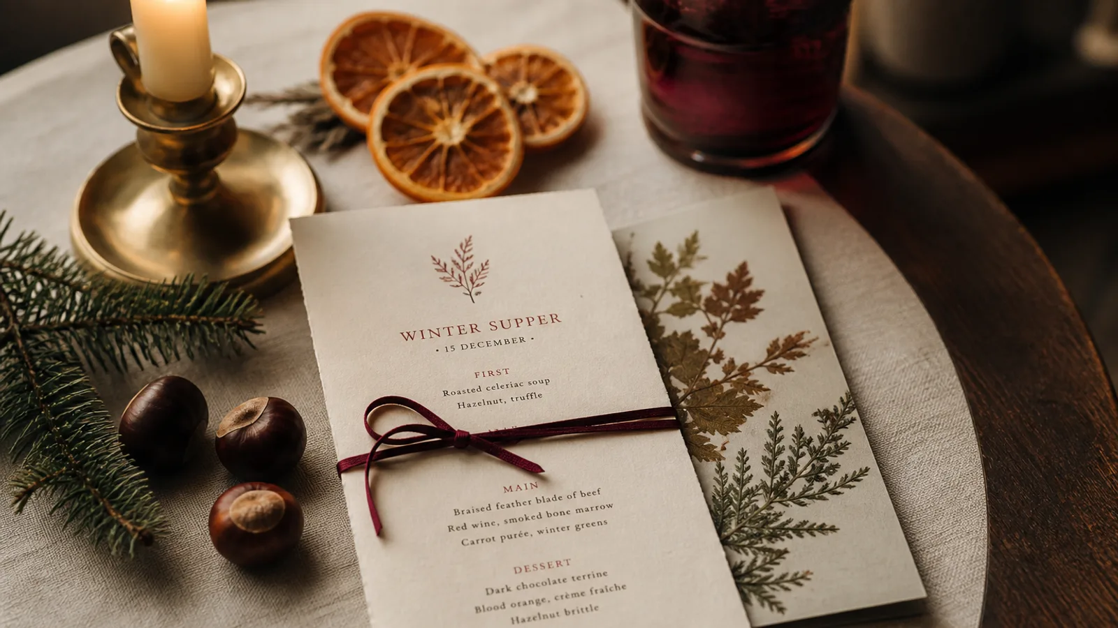
Valentine's Day is the one night when almost every table is a two, every guest has looked at your menu online before booking, and half of them are nervous. The card you put in their hands does more work than usual: it has to justify a fixed price, keep the evening moving, and not embarrass anyone. Pink hearts and a cursive "Amour" achieve none of that. What follows is a designer's approach to a Valentine's menu: one that looks like your restaurant on its best night, sells a dinner for two cleanly, and is printed and on the tables a week early.
Design for how the card is actually used
On 14 February the menu is usually a single fixed dinner, sometimes with two or three choices per course, read by two people sitting close together at a small table with a candle between them. That tells you almost everything about the format. A single A5 card, portrait, one per guest, printed on both sides if you need a drinks pairing on the back. Nothing to unfold across a table for two that already holds a bottle, two glasses and a small vase.
Because the lighting is low and the guests are distracted, set the type larger than you normally would: 11 pt for dish lines, 9.5 to 10 pt for descriptions, 13 to 14 pt for course titles. Leading at 135% or more. If there are only twelve lines on the card, let them breathe; an A5 face with 40% white space looks generous rather than empty.
A palette that avoids the greeting card
Red and pink are not forbidden; they are just usually handled badly. The problem is saturation and quantity. A full pink background with red type is a greeting card. A cream board with charcoal type and one element in a deep, slightly brown red (something like 20/95/80/20 in CMYK) is a restaurant. Blush tones work if they stay very light, around 0/12/6/0, as a paper tint rather than a printed field.
The most convincing Valentine's menus I have printed used no red at all: dark green and cream, black and gold-ochre, or simply the restaurant's normal palette on a heavier, softer paper. The romance is in the dishes and the evening; the card only needs to feel considered.
- Keep: your usual typefaces, your logo in its usual place, your normal dish naming style.
- Change: one accent colour, the paper weight or finish, and possibly a single line illustration or a small typographic ornament.
- Avoid: heart shapes, script typefaces below 24 pt, rose petals, clip art, the word "love" in the header.
How to present a menu for two
Decide before designing whether you price per person or per couple, and be consistent everywhere, including online. Per person is clearer and the industry norm; per couple sounds generous but makes guests do arithmetic. Print the price once, in a size clearly larger than the body text, with what is included: aperitif, water, coffee, service. If a glass of champagne is a supplement, say so next to the price, not in 7 pt at the bottom.
Sharing courses are natural on this night, and the card should make them look intentional. A course labelled "to share" with one dish and no choice reads as a gesture; the same dish listed under "starters" with the note "for two" reads as a restriction. Where choices exist, keep them to two or three per course; couples negotiate, and more options mean longer decision time on a night when you may be turning tables at 7 pm and 9.30 pm.
Words that help, words that hurt
Descriptions on a Valentine's card should be short and sensory, 8 to 15 words, and they should avoid two things: heavy technique and jokes. "Scallops, cauliflower, brown butter, hazelnut" says enough. "Passionate scallops on a bed of desire" makes a table of two wince. Oysters, chocolate and strawberries need no aphrodisiac framing; the guests know.
Include the allergen line. It is required under Regulation 1169/2011 for the 14 listed allergens, and on a fixed menu it matters more, because a guest who cannot eat the only main course needs to know before they sit down. State how substitutions work: "vegetarian and allergen-free alternatives available on request when booking" is enough.
Paper, finish and quantity
A Valentine's card is handled once per guest, for one night, so this is the moment for a paper you would not use every day. 350 g matte board with a soft-touch finish feels velvety and photographs well when guests post it; a 300 g textured or cotton-feel stock is the other classic choice. Avoid gloss, which reflects candlelight and shows fingerprints.
Print one card per guest plus 20%: a 50-seat restaurant doing two seatings needs about 120 cards. Many restaurants let guests keep them, which is a good idea; a well-made card in a coat pocket is a reminder that lasts longer than a social media post.
The calendar behind a February card
Guests choose their Valentine's restaurant in the last two weeks of January, and they choose from the menu published online. That means the content must be final by 15 January and the PDF live on your site and booking platform by the 20th. Print files should go out no later than 1 February; short-run printing on 350 g board with delivery takes 5 to 8 working days, and early February is a busy period for every printer.
In Menu Atelier the quickest path is to start from your regular menu, paste the courses of the Valentine's dinner, describe the mood in a sentence (dark, intimate, cream paper, one deep red accent), and check the A5 card in 3D under the viewer's lighting before you export. The download bundle gives you the PDF for the website and the print-ready file in one go; if you would rather not chase a printer in February, print and ship is 99 € plus 10 € per card on the same 350 g soft-touch board, delivered in 5 to 8 working days.