Wedding menu cards: matching the stationery and the venue
A practical guide to wedding menu cards for restaurants and caterers: sizes, paper, matching the invitations, per-guest names, dietary notes and quantities.
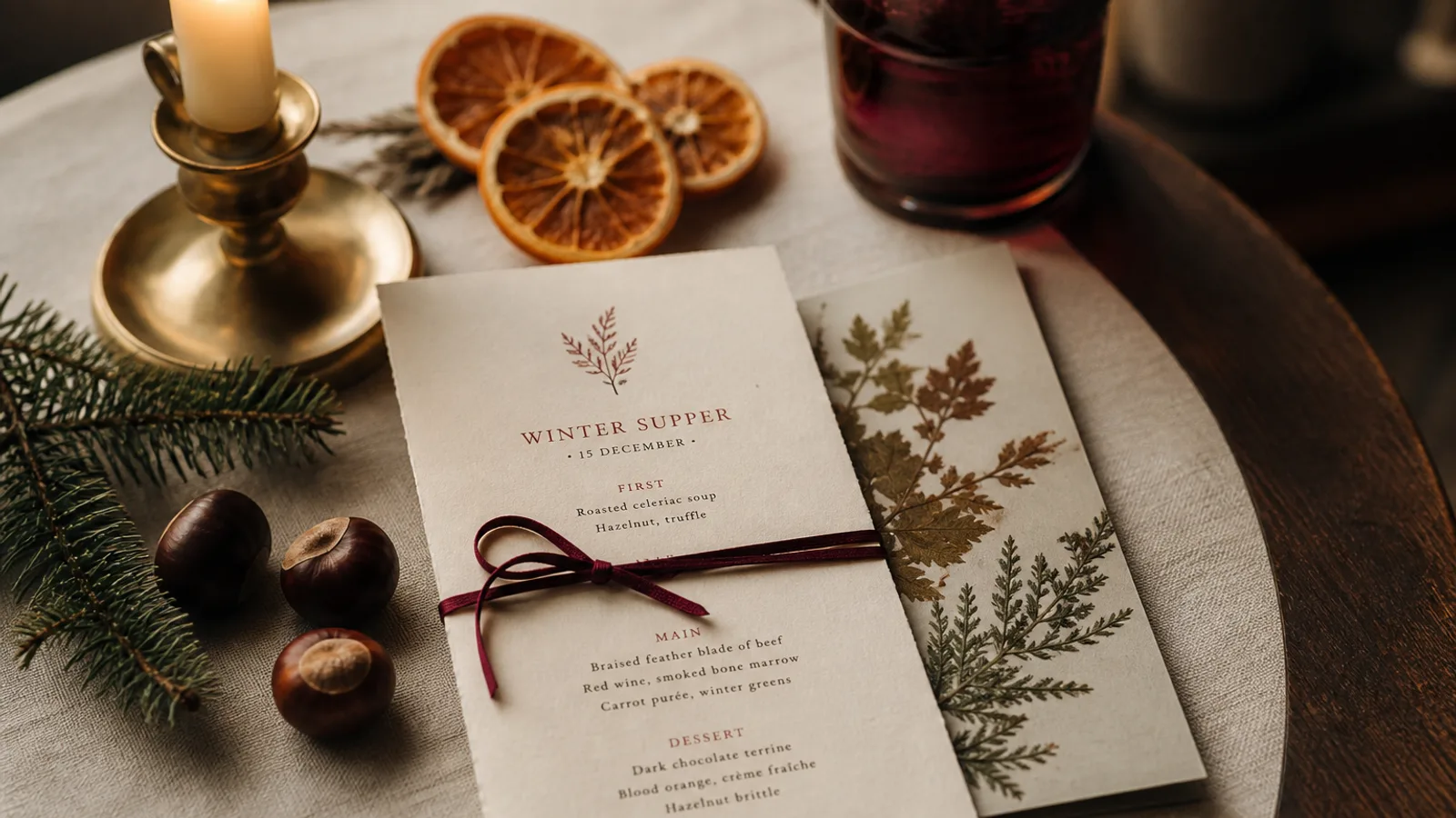
A wedding menu card is the only menu you will ever print that is also a keepsake, photographed forty times before the first course and kept in a drawer for years. It is also the one where the client is not a restaurant but a couple, with a stationer, a planner and a colour palette they have been arguing about since February. This guide is for the restaurant or caterer who has to produce that card: how to match what already exists, what to put on it, which sizes and papers behave on a wedding table, and how many to print.
The card belongs to the stationery, not to the restaurant
Your restaurant's identity does not go on a wedding menu. The card is part of a suite that started with the save-the-date and the invitation and continues with the place cards and the table plan. Ask the couple or their stationer for three things: the typefaces (ideally the font files or at least their names), the exact colours (Pantone or CMYK values, not a screenshot), and any motif or monogram in vector form.
If the invitations were letterpressed on cotton paper, the menu should not be glossy digital print on white board. You will rarely match the process, but you can match the tone: a matte, uncoated, slightly textured stock in the same shade as the invitation gets 90% of the way. Your logo, if it appears at all, goes in 6 pt on the back.
Sizes that work on a wedding table
Wedding tables are crowded: chargers, glassware, flowers, favours, place cards. A tall narrow card fits between these better than a wide one. The classic formats are DL-ish (roughly 100 × 210 mm), 105 × 297 mm (a third of A4 lengthwise, which cuts economically from A4 sheets) and A5 portrait. For a menu of five to seven courses with a wine per course, 105 × 297 mm is the sweet spot: one course per block, plenty of air, standing or lying on the charger.
One card per guest is the norm and doubles as part of the place setting. Some couples want one per couple or per table to save money; the saving is small at these quantities and the table looks less finished. Print per guest.
- 105 × 297 mm slim card: five to eight courses, 300 to 350 g, best value per unit.
- A5 portrait (148 × 210 mm): shorter menus, or when the card carries a welcome note on the back.
- A6 (105 × 148 mm): cocktail or buffet menus with few lines, or as a card slipped into a napkin.
- Folded A5 (A4 folded once): when the menu needs a cover with the couple's names and a full inner spread for food and wines.
Type and content: less than the couple wants
Couples arrive with a long list of things for the card: names, date, a quote, the order of service, the menu, the wines, thank-you text. The card cannot carry all of it and still look like the invitation it is meant to match. Keep the menu card to the menu: the couple's names or monogram, the date, the courses, the wines, and one line for dietary information. Everything else goes on a separate welcome card.
Set course names at 11 to 12 pt and descriptions at 9 to 9.5 pt; wedding guests read in low evening light after champagne. Script typefaces are almost mandatory in this genre and almost always misused: use them for the names and the word "Menu" at 24 pt or larger, never for the dishes. Descriptions should be short and legible, 8 to 14 words, in a serif or clean sans that echoes the invitation.
Personalised cards and dietary notes
The most useful trend in wedding menus is the personalised card: each guest's name printed at the top, so the card is also the place card, and dietary choices printed under it (vegetarian, no shellfish, pre-ordered fish). It saves the kitchen and the servers the roulette of asking who ordered what, and guests love it. It requires a clean guest list with final choices two weeks before the day, and a print process that handles variable data, which digital print does easily.
Allergen information is still required at a catered event under Regulation 1169/2011; a discreet footer line, "please speak to a member of staff about allergens", together with the personalised dietary line, covers it elegantly.
Paper and finishes that photograph well
Wedding cards are photographed in daylight and in candlelight. Matte, uncoated, cotton-textured or soft-touch stocks look good in both and never glare. Weight 300 to 350 g so the card stands or lies flat without curling. Colours: warm whites, ivory, blush and pale stone are the workhorses; deep colours as full backgrounds show scuffs and fingerprints by the time the starters arrive.
Foil, letterpress and edge painting are lovely and expensive; at 80 to 150 cards they add 200 to 500 € to the job. If the budget is limited, put the money into the paper and keep the printing simple. A single-colour print on a beautiful stock reads as more expensive than four-colour on a cheap one.
Quantities, proofs and the timeline
Print the number of guests plus 10%: cards get bent, spilt on and stolen by cousins. For 120 guests, order 130 to 135. Always produce a printed proof on the final paper three weeks before the wedding and send a photo to the couple; a colour that looked right on screen next to the invitation may be a shade off on paper, and three weeks leaves time to correct it.
The realistic timeline: content and guest list final two and a half weeks out, proof approved two weeks out, print files sent with 5 to 8 working days for printing and delivery, cards in hand three to four days before the wedding. In Menu Atelier you can set the couple's colours and typefaces as the style, paste the courses and wines, switch to the slim or A5 format and preview the card in 3D on a table before anything is printed; print and ship on 350 g matte soft-touch board is 99 € plus 10 € per card, which for a 120-guest wedding lands at around 1,400 € for a card that matches the rest of the day.