Wine bar menus: by the glass, by the bottle, and the plates
How to design a wine bar card so guests find a glass, a bottle and something to eat without treating the list like a shop catalogue or a restaurant menu.
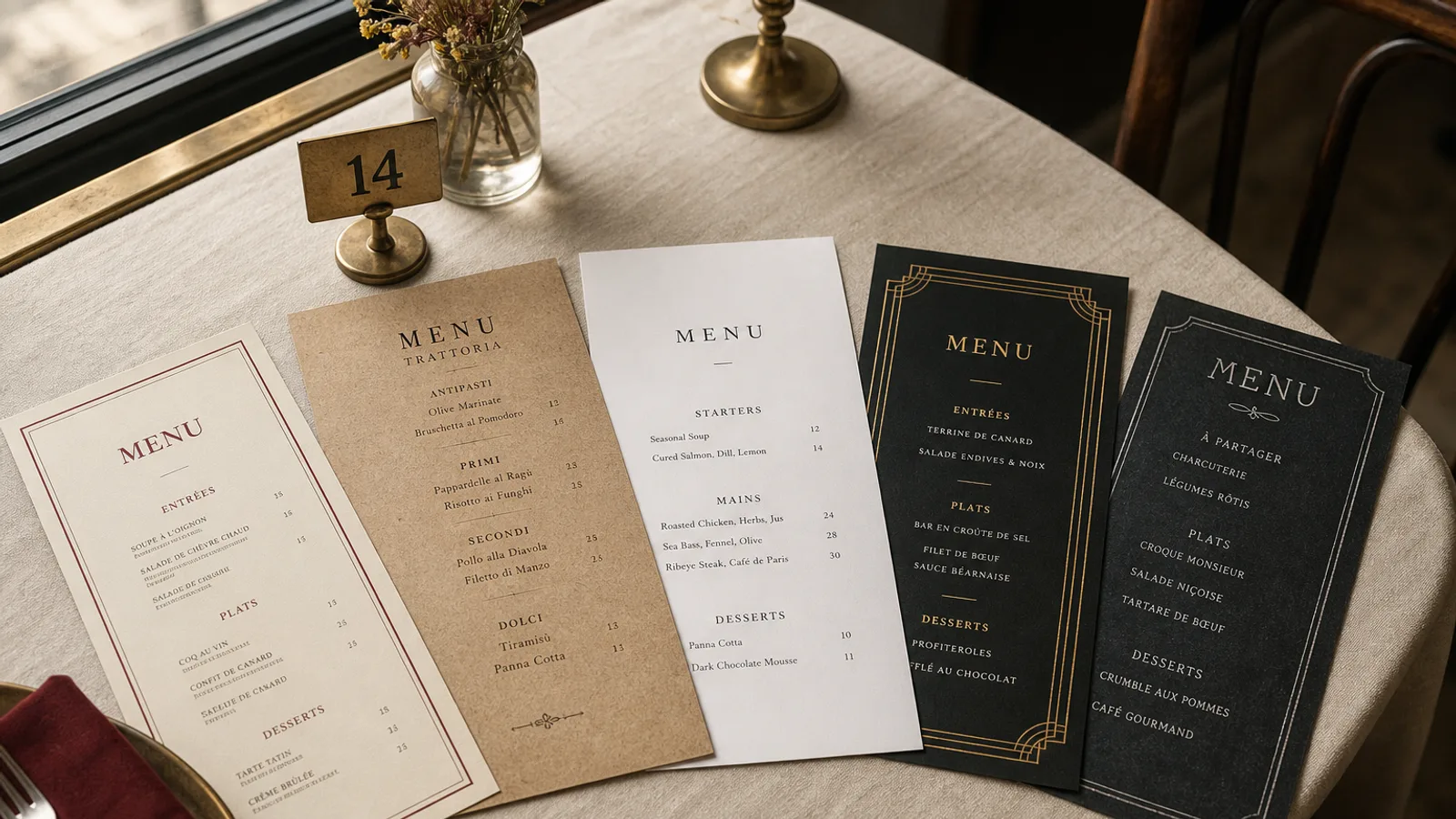
A wine bar is not a restaurant with a long list, and it is not a shop with stools. Guests come to drink a glass, sometimes a bottle, and to eat just enough that the second glass makes sense. Cards that open with twelve pages of producers lose the person who sat down for one Chenin. Cards that open with a bistro à la carte lose the person who came for wine. The design job is the split: glasses first, bottles second, plates as a third voice, not a rival.
By the glass is the front door
Eight to sixteen wines by the glass is the honest range. Fewer than eight and regulars get bored; more than sixteen and you are running a shop on tap. Print the measure in cl on every line or once in the header (12.5 cl is the European default; 10 cl feels mean; 15 cl is a small pour pretending to be generous). A second price for a 25 cl pot or a carafe, where you offer it, belongs on the same line: "Chenin, Loire 2023 7 € / 18 €".
Write each glass as producer or cuvée, region, vintage, price. One extra word of style ("skin-contact", "oxidative", "pet-nat") is useful when the wine would otherwise surprise. A sentence of tasting notes is not: that is what the person behind the bar is for. Group by colour or by mood ("bright", "savoury", "sweet and fortified"), not by a rainbow of grape icons.
Bottles as a second face, not a book
The bottle list can be longer, but it should still fit on one or two faces of an A4 bifold or a short A5 booklet of eight pages maximum. Forty to eighty bottles is a wine bar; two hundred is a cellar that should print a separate list and keep a short card on the table. Order by colour, then by region or by weight, and keep the same line structure as the glasses so the guest is not learning a second language.
Mark the wines that are also by the glass with a small glass symbol or a shared number, once, consistently. Do not reprint the full glass description on the bottle page. If the list changes weekly, design the bottle faces as a short-run insert and keep the glass and food faces stable. A card that is out of date on Thursday afternoon is how you get the "we just sold the last bottle" conversation at every table.
- Coravin or by-the-glass icons belong in one column, 6 pt, not as a second colour that fights the type.
- A "staff pour" or "open tonight" line at the top of the glass list, dated or left blank for a pen, sells more than any badge.
- Fortified, cider and a beer or two can share a compact block; they should not wander through the reds.
Small plates that know they are not dinner
Six to twelve plates is a wine-bar kitchen. Cheese, a terrine, anchovies, a vegetable, one hot thing, bread and a dessert. Write them like the wines: name, two components, price. "Comté 24 months, walnut bread, 9 €." A three-course structure (starter, main, dessert) turns the room into a restaurant and the wine list into an afterthought. If you run a lunch formule (two plates and a glass at 22 €), give it a band at the top of the food face, weekday hours included.
Pairing suggestions on the food side work if they are specific and rare: one wine under two or three plates, named as it appears on the glass list. A pairing under every plate is a sommelier playing waiter on paper, and it dates the moment the glass list moves.
Type, paper and a room that is talking
Wine bars are louder and often dimmer than dining rooms. 11 pt minimum on the glass list, a serif that can hold accents and vintage figures (old-style numerals if the face has them), a sans for the food if you want a split. Avoid the cellar-book script and the all-caps grotesque that belongs on a natural-wine poster. One accent colour, usually the same as the sign. Paper 350 g matte, cream or a pale grey, soft-touch so it survives rings of red and oily anchovies.
A4 bifold is the default: glasses and staff pour on the left inner, plates on the right, bottles on the back or a tucked insert. A5 works only if the bottle list is short or lives elsewhere. Do not put the full bottle list on a QR code as the only option; a code is a backup for the 200-bin cellar, not a substitute for the sixteen glasses.
Sulphites, allergens and the honesty line
Sulphites are in almost every wine; Regulation 1169/2011 still wants them identifiable, plus the food allergens on the plates. A single sulphite line at the foot of the wine faces ("contains sulphites") and a numbered key on the food face is enough. If you pour unsulphited wines, mark them with a small note, not a manifesto. Guests who care will ask; guests who do not should not have to read an essay before they order a glass.
Reprint at the pace of the taps
Glasses change faster than bottles, plates faster than both. Design three blocks you can update independently, and reprint the glass face weekly if you must. A wine bar card that still lists last month's Jura on a Saturday night is telling the room you stopped tasting. Keep the object small, the type large, and the plates in their place.
In Menu Atelier you can set the glass list as a tight column, park the plates on the facing page, and drop bottles onto the back or an insert. Switch A4 bifold and A5 in one click, check the card in 3D, and download a 300 dpi PDF with 3 mm bleed or order the run on 350 g matte board with a scored fold.