Accessible menus: large print, contrast and Braille options that work
A practical guide to accessible restaurant menus: large-print versions, contrast ratios, typefaces, Braille and tactile options, and what a QR menu must do for screen readers.
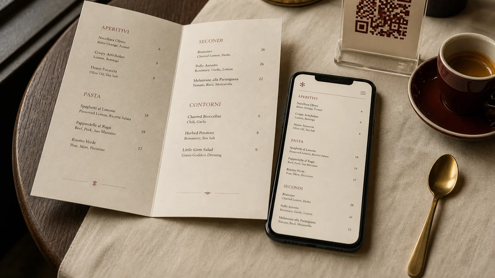
About one European in thirty lives with a visual impairment that glasses do not fully correct, and roughly one in four is over sixty and reads small type with difficulty in dim light. In a 60-cover restaurant that is several tables every evening who cannot comfortably read a 9 pt menu set in grey on cream. Making a menu accessible is not a separate project: it is a large-print edition, a few decisions on contrast and type, an honest look at your QR menu, and, for some venues, a Braille or tactile version. Here is how to do each, with numbers.
The large-print edition: two copies that pay for themselves
The single most effective step is to keep two or three large-print copies of the menu at the host stand and offer them without being asked, the same way you offer a high chair. Large print in the accessibility sense means a body size of 16 to 18 pt, headings of 24 pt or more, and leading of at least 120 percent. On an A4 sheet that holds a third of the content of a normal card, so a 25-dish menu becomes a four-page A4 booklet or two single-sided sheets.
Do not shrink your standard design and enlarge it on a photocopier. Set it properly, single column, left aligned, with the price directly after the dish name rather than pushed to the far margin. Print on 160 to 200 g uncoated white paper; a matte surface avoids glare under spotlights, and off-white or cream reduces contrast, which is the opposite of what you want here.
Cost is trivial. Three copies printed at a local shop cost 5 to 10 € and last a season if they go into a plain sleeve. Add a small line at the bottom of your standard menu: “A large-print menu is available, just ask.” Guests who need it will rarely ask otherwise.
Contrast and colour: measure, do not guess
The WCAG guidelines for screens give a contrast ratio of at least 4.5:1 for body text and 3:1 for large text, and they are a sensible benchmark for print as well. Black on white is 21:1. Dark grey (hex 444444) on white is about 9.7:1 and still fine. The fashionable mid-grey (888888) on cream drops to roughly 3.3:1, and gold foil on black, once the light hits it, is unpredictable.
A few rules that survive any design style. Never set body text in a colour lighter than 60 percent black. Avoid reversed text (white on dark) for anything under 12 pt because ink spread on uncoated paper closes the counters of small letters. Do not rely on colour alone to convey meaning: a red chilli for spicy, a green leaf for vegetarian, are invisible to the eight percent of men with red-green colour deficiency unless a letter or symbol accompanies them.
Type choices that help everyone
The debate over serif versus sans is less important than x-height, letter spacing and weight. What helps a partially sighted reader helps a tired one at 22:00 under 150 lux.
- Body text at 11 pt minimum on the standard menu, 16 pt on the large-print version. Measure the x-height rather than the nominal size: a face like Georgia at 11 pt reads like many sans faces at 12 pt.
- Regular or medium weight, never light or thin for running text. Bold for dish names is fine and helps scanning.
- Generous letter spacing on small caps and all-caps headings, around 5 to 10 percent, and no all-caps for descriptions.
- Distinct letterforms: check that the capital I, lowercase l and figure 1 look different, and that the 3, 6, 8 and 9 in prices are unambiguous. Lining numerals are easier to read than old-style ones for prices in a large-print edition.
- No italics for more than a few words. Italic descriptions are a menu cliché that costs legibility for nothing.
Braille and tactile menus: when and how
Fewer than ten percent of blind people in Europe read Braille fluently, but those who do will remember for years the restaurant that had a Braille menu ready. Braille is bulky: one A4 page in embossed Braille holds about 25 lines of 30 cells, so a full card runs to 8 to 15 pages. Transcription and embossing is done by specialised associations and services; expect 3 to 6 € per page and a lead time of one to two weeks, so it makes sense for a stable core menu rather than a weekly card.
Keep the Braille edition short: dish name, main ingredients, price, allergens. Skip the poetry. Bind it with a spiral or comb so it opens flat, and store it flat so the dots do not crush. Update it when prices change; an out-of-date Braille menu is worse than none, because the guest cannot check it against the printed one.
A cheaper complement is a tactile cue on the standard menu: a raised varnish on the section headings, or a thicker 400 g board with an embossed logo, helps guests orient a page they can partially see. And the most inclusive tool of all costs nothing: a server who offers to read the menu aloud, section by section, without rushing.
QR menus and screen readers
A QR code that opens a PDF is inaccessible to most screen-reader users unless the PDF has been tagged, and menu PDFs almost never are. A screen reader will read a two-column layout across the columns, mixing dish names with prices from the neighbouring section. If you offer a digital menu at all, the accessible version is an HTML page: headings for sections, a list per section, dish name and price in the same element, allergen codes spelled out.
Check three things on your own phone. Turn on the system screen reader and listen to the first section: does it make sense in order? Zoom the text to 200 percent: does the layout reflow or does it require horizontal scrolling? Look at it outdoors at noon: is the contrast still readable? If any of these fails, the QR menu is a decoration, not an accommodation.
Under Regulation 1169/2011 the fourteen allergens must be communicated to every guest before ordering. A guest who cannot read your menu has the same right to that information, which is one more reason for the large-print edition and for staff who know the allergen matrix by heart.
A checklist you can run this week
- Print three large-print copies at 16 to 18 pt, single column, black on white, and put them at the host stand.
- Add one line to the standard menu announcing that a large-print version exists.
- Measure the contrast of your body text and fix anything under 4.5:1.
- Replace any icon that carries meaning through colour alone with an icon plus a letter.
- Test the QR menu with a screen reader and at 200 percent zoom.
- Decide whether a Braille edition of the core menu is right for your venue and price it with a local association.
None of this changes how your menu looks to the guests who read it easily; it only stops excluding the ones who do not. In Menu Atelier, a large-print edition is the same design switched to a different format: pick A4 single sheet, raise the body size in the typography settings, check the fit in 3D and export a second print-ready PDF alongside your standard card, with the allergen legend carried over automatically.