Photographing your printed menu for social media: light, angle and legibility
How to photograph a printed menu so it looks good on Instagram and stays readable: window light, angles that avoid glare, props, crops, and what to post when prices change.
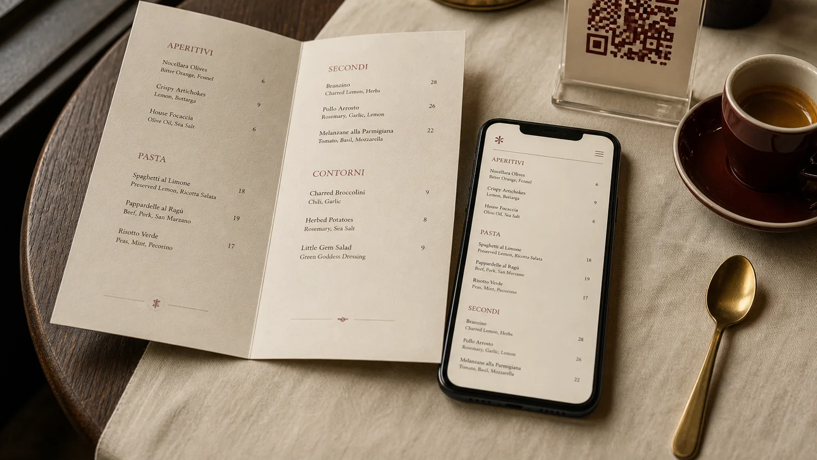
A new menu is one of the few pieces of restaurant news that guests actually want to hear, and a photograph of the printed card is the natural way to announce it. Most of those photos fail in the same three ways: a grey cast from the kitchen lights, a glare stripe across the paper, and type so small in the feed that nobody can read the dish that was supposed to tempt them. None of this needs a photographer. It needs a window, a phone, ten minutes, and a few decisions taken before you press the button.
Light first: one window, no overheads
Paper is a flat, slightly reflective surface, and it shows every light source in the room. Turn off the overhead lights and the spots; their mixed colour temperature is what produces the yellow-grey cast that makes cream board look dirty. Use a single window with indirect daylight, ideally north-facing or on the shaded side of the building, between mid-morning and mid-afternoon. Put the menu on a table 50 cm to 1 m from the window so the light rakes across the paper from one side.
If the shadows on the opposite side are too deep, hold a sheet of white paper or a white napkin there to bounce light back. That is the entire lighting kit. Avoid direct sun, which burns out the highlights on matte board and produces hard, ugly shadows from any prop; if the sun comes through, hang a white tablecloth over the window.
Angles that kill glare
Glare is the reflection of a light source at the same angle as the camera, so moving the camera solves it. Three angles work for menus, and they read differently in a feed.
- Straight down, the flat lay. The menu fills the frame, type is fully legible, and the composition is graphic. Shoot from directly above with the window to one side, never behind you, or your phone's shadow will fall on the paper.
- Forty-five degrees from the side, the reading angle. Shows the paper's thickness and finish, especially on 350 g board with a soft-touch surface. Lay the menu on a textured tablecloth or wood and focus on the first section.
- Low and close, the detail shot. A single dish name and price fill the frame, the rest of the card falls out of focus. Good for a story announcing one new dish.
Coated and laminated menus are the hardest to shoot; the glossy surface mirrors the window. Tilt the card a few degrees away from the light until the reflection slides off, or accept that gloss menus photograph best half open, casting their own shadow.
Make the type readable at feed size
Instagram shows a square post at roughly 1080 pixels wide and a story at 1080 × 1920; in the feed on a phone the image is about 7 cm wide. An entire A4 card in that space renders 11 pt body text at the equivalent of 2.5 pt. Nobody will zoom. So either shoot a section rather than the whole page, or accept that the whole-page shot is a mood image and pair it with a second slide that crops one section large enough to read: the dish name should be at least 40 pixels tall in the final export.
Carousel posts solve this neatly: slide one is the full card on the table, slides two to four are legible crops of the starters, mains and desserts. Guests who care swipe; guests who do not still get the picture.
Props, backgrounds and restraint
The menu is the subject; everything else is context. One or two objects that belong to the restaurant are enough: a glass of the house wine, a fork on a linen napkin, a lemon if the new card is Mediterranean. Keep props out of the corners where they pull the eye, and never put them on top of the text. Backgrounds should be real surfaces from your dining room, wood, marble, zinc, tablecloth, because guests will recognise them when they visit.
Style consistency matters more than any single shot. If your menu is Modern Minimal, the photo should be spare; if it is Trattoria Rustica, a checked cloth and a carafe are in character. Guests read the photo as a promise of the room.
Phone settings and a light edit
- Clean the lens. Fingerprints are the number one cause of soft, hazy menu photos.
- Tap to focus on the text, then slide the exposure down a touch so the paper does not blow out to pure white; you want to keep the texture of the board.
- Shoot at the phone's native 4:3 or 3:2 and crop later; never use digital zoom.
- Lock white balance if your camera app allows it, or correct it afterwards so white paper is white, not blue or yellow.
- Edit gently: straighten, crop, lift shadows slightly, add a little contrast. No filters that tint the paper, no heavy vignettes. Export at 1080 pixels on the short side or larger.
What to post, and when prices change
The photo of a menu is a short-lived asset. Prices move, dishes rotate, and a two-month-old post with a price that is now 2 € higher becomes a complaint at the table. Post the whole card only when it changes, keep those posts as announcements rather than pinned references, and use dish-level crops for evergreen content because they age better. If you show prices, mention the month in the caption. Never photograph a card with a hand-corrected price; reprint first.
Allergen codes and footnotes can be cropped out of a social photo without any regulatory problem; Regulation 1169/2011 concerns the information available to the guest at the point of ordering, not your Instagram grid. But do not crop them out of the actual card.
A ten-minute routine for every new card
When the new menus arrive, take one clean copy before service, while the room is empty and the light is good. Shoot the flat lay, the 45-degree reading angle and three section crops. That is one carousel for the feed and three stories, and the whole set takes less time than folding the napkins.
If you designed the card in Menu Atelier, you also have a shortcut for the days when the room is dark or busy: the 3D preview renders the finished menu in the chosen format, single sheet or bifold, with realistic paper and shadow, and the PNG export of each face gives you a clean, perfectly legible image of every page to post alongside the real photograph. The physical shot shows the paper; the export shows the words.