AI-generated ornaments, icons and logos for restaurant menus
When AI ornaments, icons and logos help a restaurant menu and when they wreck it: what to generate, what to refuse, and how to keep assets print-ready at 300 dpi.
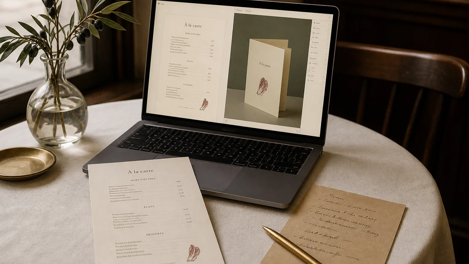
A generated fleuron that looks charming on a laptop will often fail three tests at once: it will not survive a 300 dpi CMYK conversion, it will contain a letter that is almost a letter, and it will sit at a weight that fights the type. Restaurant owners now have tools that can invent ornaments, icons and even a stand-in logo in seconds. That speed is useful. Treating the output as camera-ready is how menus start to look like they were assembled from a clip-art folder in 2009. This article draws a line between assets you can generate and drop in, assets you can generate and then redraw, and assets you should never generate at all.
What an ornament actually has to do on a menu
Ornament on a menu is not decoration for its own sake. A hairline, a fleuron, a small icon next to a section heading: each one either separates, groups, or sets a tone. If it does none of those, it is noise. Generated assets fail this test more often than human-drawn ones, because the model has no idea what job the mark is supposed to do. It produces a pretty object. You still have to decide whether that object earns its millimetres.
The practical test is the same as for any rule or border. Remove the ornament and look at the page. If the hierarchy collapsed or the room lost its character, keep it. If nothing changed, delete it and recover the space for type. A menu of 36 dishes on A5 cannot afford three generated wreaths that do no work.
Geometric and abstract marks: the safe zone
AI is competent at geometric pattern, repeating texture, and abstract marks that do not depict a specific thing. A diamond rule, a Greek-key fragment, a small sunburst that is clearly a sunburst and not a misspelt word: these survive print if you export them as vector or as a PNG at 300 dpi with a transparent background, then convert to CMYK against Fogra39 / ISO Coated v2. Keep the mark simple. Two or three strokes. No interior detail smaller than 0.3 mm, because that detail will fill in on 350 g matte board.
Use generated geometry as a spacer, not as a picture. A 8 mm wide mark centred between two sections is enough. A 40 mm illustration of a generated olive branch across the header is already competing with the restaurant name. If the mark has to sit next to 10 pt dish names, draw it at the size it will print and judge it there, not at 400 percent on a retina screen.
- Safe to generate: geometric rules, abstract fleurons, repeating patterns, simple section icons that do not depict a real dish
- Usable after redraw: a promising silhouette that you then trace in a vector tool at a single stroke weight
- Never generate: a logo that contains lettering, a portrait of the building, a drawing of a named dish, any word inside an ornament
Icons next to dishes and sections
Section icons (a small fish, a leaf, a glass) are tempting and usually a mistake unless the whole system is drawn at one weight. A generated set will almost never share a stroke width. One icon will be outlined, the next filled, the third will have a drop shadow the model invented. On a printed menu that inconsistency reads as amateur before a guest has reached the first price.
If you want icons, commission or choose a single set, or generate one mark and repeat it. A repeated leaf at 3 mm, same weight as your hairline (0.25 to 0.35 pt), next to vegetarian dishes, is clearer than twelve unique generated pictograms. For allergens under Regulation 1169/2011, do not invent symbols. Use a numbered key or the standard letter codes your market already understands, set in the same typeface as the prices, 7 to 8 pt, and keep generated pictures out of the legal line.
Dietary marks that guests can actually read
A 3 mm icon is readable if it is a simple silhouette. It is not readable if it is a generated illustration with internal hatching. Prefer a letter in a small circle (V, VG, GF) set in your heading face at 7 pt, or a single consistent pictogram. Place it 2 mm to the right of the dish name, never in the price column. Guests scan names and prices; an icon that sits between them slows the order.
Logos: do not let a model invent your name
A generated logo that includes lettering is the single most common disaster in AI menu work. The model will produce a word that looks like your name from a metre away and is misspelt, or set in a letter that does not exist, at arm's length. Print that at 18 pt on the cover and you have paid to advertise a restaurant that is not quite yours. Use your real logo file, preferably a vector PDF or SVG, and place it at a fixed size: 18 to 28 mm wide on an A5 cover is typical. If you do not have a logo yet, set the name in a real typeface and leave a generated mark out of the wordmark.
A generated emblem without letters (a monogram shape, a small crest, a geometric seal) can work as a secondary mark if you redraw it. Trace the silhouette, lock a single stroke, delete the interior mush. Then place it once: cover, or the foot of the back page, not both plus every section heading. One emblem, one job.
Keeping generated assets print-ready
Screens lie about contrast and colour. A pale gold ornament that looks expensive on sRGB will vanish on uncoated cream board and turn muddy on coated stock if you leave it in RGB. Convert every asset to CMYK before you trust it. Check the black: a generated ornament often arrives as rich black (C60 M60 Y60 K100) which will offset on the facing page of a bifold. Use a single black, K100, or a warm black you have already chosen for the type (for example C20 M30 Y40 K80) and apply it to every mark.
Resolution is the other trap. A PNG downloaded from a generator at 1024 px and dropped at 40 mm wide is about 650 dpi, which is fine. The same file dropped at 90 mm wide on an A4 header is about 290 dpi and will look soft next to 10 pt type. Generate or upscale so the asset is at least 300 dpi at the size it will print. Prefer vector. If the generator only gives raster, keep the mark small.
Bleed is not optional if the ornament touches a trim edge. A generated wreath that sits 2 mm from the edge of an A5 will lose its outer leaves when the sheet is cut. Keep decorative assets inside the 5 mm safe margin, or extend them 3 mm past the trim and accept that the outer 3 mm will disappear. Crop marks belong on the print file, not inside the ornament.
A short working method
Generate more than you will use, then throw most of it away. Ask for geometric marks in a single colour, on a transparent ground, at a stated size. Reject anything with lettering, faces, buildings, or a specific dish. Pick one survivor, redraw it at one stroke weight, convert it to CMYK, and place it in one or two positions. Then look at the menu in the room, on the paper you will actually print, under the lighting you actually have. A mark that worked on a white screen often fails on 350 g matte board in warm tungsten.
If the first three generations produce nothing you would put next to your type, stop generating ornaments and let the typography do the work. A well-set menu with a 0.35 pt rule under each heading does not need a fleuron. Most rooms look more expensive when you remove the extra pictures, not when you add them.
When to stop decorating and start printing
Ornament is finished when the page has a clear hierarchy and a recognisable tone, and not one mark more. That is usually one rule system, one optional fleuron, and your real logo. Generated assets can supply the fleuron if you treat them as sketches. They cannot supply the logo, the allergen system, or a drawing of the food.
In Menu Atelier you upload your own logo and brand photos, and the eight starting styles (Bistro Classic, Trattoria Rustica, Art Deco Cocktail and the rest) already carry ornaments drawn to a single weight; you can turn a design in 3D, switch A4 to A5, and export a 300 dpi PDF with 3 mm bleed and crop marks without dropping a generated wreath on top of the type.