Allergen information on menus: legal requirements and elegant layouts
What EU Regulation 1169/2011 actually requires from a restaurant menu, the three ways to lay out the 14 allergens, and how to keep the card readable while staying compliant.
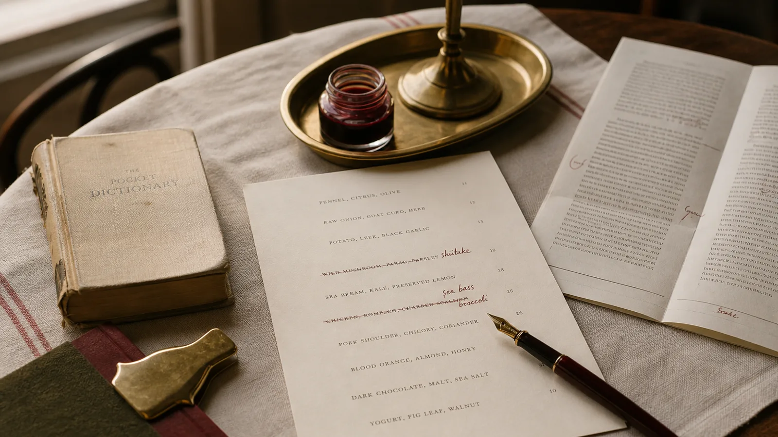
A guest with a nut allergy does not read your menu the way you do. She skips the poetry, scans for a symbol or a footnote, and decides in about four seconds whether your restaurant is safe or a risk. Since December 2014 every food business in the EU has been legally required to make that decision easy, and yet most menus still handle allergens either badly (a vague line at the bottom) or clumsily (a wall of superscript numbers). This article explains what the law demands, the three layouts that work in print, and how to keep your card looking like a card rather than a spreadsheet.
What Regulation 1169/2011 actually asks of you
The Food Information to Consumers regulation (EU 1169/2011) lists 14 substances or groups that must be declared whenever they are present in a dish served to the public: cereals containing gluten, crustaceans, eggs, fish, peanuts, soybeans, milk, nuts, celery, mustard, sesame, sulphites above 10 mg per kg or litre, lupin and molluscs. That covers ingredients, processing aids and anything carried over into the plate, including the flour you dust a fish with before pan-frying.
What the regulation does not do is dictate the format. Member states decide how the information is delivered for non-prepacked food. France allows written information on the menu or in a document available on request; Italy requires that the customer be informed in writing, with the menu or a separate register both accepted; Spain follows the same logic and Ireland goes further by requiring the information to be written where the food is ordered. In practice, the safest interpretation everywhere is: write it down, make it findable, keep it current.
One point is enforced strictly across the Union: you cannot rely on a generic disclaimer alone. "Our dishes may contain allergens, please ask a member of staff" is not a declaration, it is a deferral. It is acceptable as an addition, never as a substitute, unless your national rules explicitly allow oral information and you have a written internal record to back it up.
Three layouts, from lightest to heaviest
There is no single right answer, but there are three patterns that hold up in print. Choose based on how many dishes you serve and how often the menu changes.
- Numbered key. Each of the 14 allergens gets a number; after every dish name or price you set the relevant numbers in a smaller size, typically 6 to 7 pt against a 10 pt body. The legend sits at the bottom of the page or on the back cover. It is compact and works for long menus, but numbers are meaningless without the legend and the strings get ugly (1, 3, 7, 8, 12) on rich dishes.
- Icon set. A pictogram per allergen, printed at 3 to 4 mm, in a single ink colour or in grey. Faster to scan than numbers and friendlier for tourists, but 14 different tiny pictures are hard to memorise, so you still need a legend, and icons eat horizontal space on a two-column layout.
- Separate allergen matrix. The menu stays clean; a laminated A4 sheet or the back page carries a grid with dishes in rows and the 14 allergens in columns, ticked where present. It is the clearest format for kitchen and guest alike and the easiest to update, but it only works if staff genuinely hand it over and if the menu mentions it in a visible line.
For a bistro with 25 to 35 dishes and a card that changes every season, the matrix on the back cover of a bifold is usually the best compromise. For a tasting menu with 7 courses, the icon set inline is fine. For a large brasserie with 80 references, a numbered key is the only thing that fits.
Typography that stays legible at 6 pt
Allergen markers are the smallest text on the page, so they are where cheap typography fails first. Use the same typeface family as the body, or a neutral sans, in a regular weight rather than light; thin strokes at 6 pt disappear on uncoated 350 g board. Set numbers as superscript only if the font has true superior figures; faked superscripts scaled to 60 percent turn into grey dust after printing.
Give the markers a fixed position. Either directly after the dish name, separated by a thin space, or in a dedicated narrow column aligned right before the price. What you must not do is let them float between the description and the price line, because that breaks the dotted leader and forces the eye to hunt. Colour helps: a warm grey at 60 percent black keeps the numbers present without competing with prices.
The legend itself deserves 7.5 to 8 pt minimum, set in two or three columns with the number or icon, the allergen name and nothing else. Do not translate it into a paragraph. Guests do not read paragraphs at the bottom of a menu.
Wording and the cross-contamination question
The declaration answers one question: does this dish contain the allergen as an ingredient? Cross-contamination in the kitchen is a separate issue that the regulation does not force you to declare, but the sensible line is one sentence, placed near the legend: "All dishes are prepared in a kitchen that handles the 14 declared allergens; please tell us about any allergy when ordering." That sentence protects you and helps the guest without being alarmist.
Avoid "may contain traces" on individual dishes; it is a packaging phrase that reads as evasive on a menu. Avoid "allergen-free" too, because nothing in a shared kitchen is guaranteed free. Write about what is in the plate, not about what might be.
If your menu is bilingual, the legend must exist in both languages, and the numbers or icons must be identical. The one thing you can share across languages is the pictogram.
Keeping it accurate after the print run
The legal risk is not the design, it is the drift between what the card says and what the kitchen does. A supplier changes the bread and it now contains sesame; a cook swaps butter for margarine that contains soy; the tiramisu recipe adds a splash of Marsala with sulphites. Every one of those changes must reach the card.
- Keep a master allergen register in the kitchen, dish by dish, dated and signed by whoever owns the recipe.
- Check the register against the card before every reprint, and mark the print date discreetly in the footer (for example 07/2026) so an outdated card can be spotted and pulled.
- Print in small runs when your menu moves often: 30 cards at a time cost more per unit but you will never be tempted to keep a wrong card in circulation.
Compliant and still beautiful
A menu that handles allergens well is not covered in warning signs. It has a quiet, consistent system that a guest with an allergy finds in seconds and that everyone else barely notices. Decide on your format once, give the markers a fixed home on the line, size them so they survive the press, and treat the register in the kitchen as the source of truth.
In Menu Atelier, allergen tags are attached to each dish when you enter it, and the layout engine renders them consistently as numbers or icons with a legend generated on the back face; if you switch from A4 single sheet to A5 bifold, the legend moves with the design and stays readable in the 3D preview before you export.