Service charge, cover and footnotes: the small print done clearly
How to set service, cover charge and legal footnotes so guests can read them: size, placement, wording, and the lines that prevent an argument when the bill arrives.
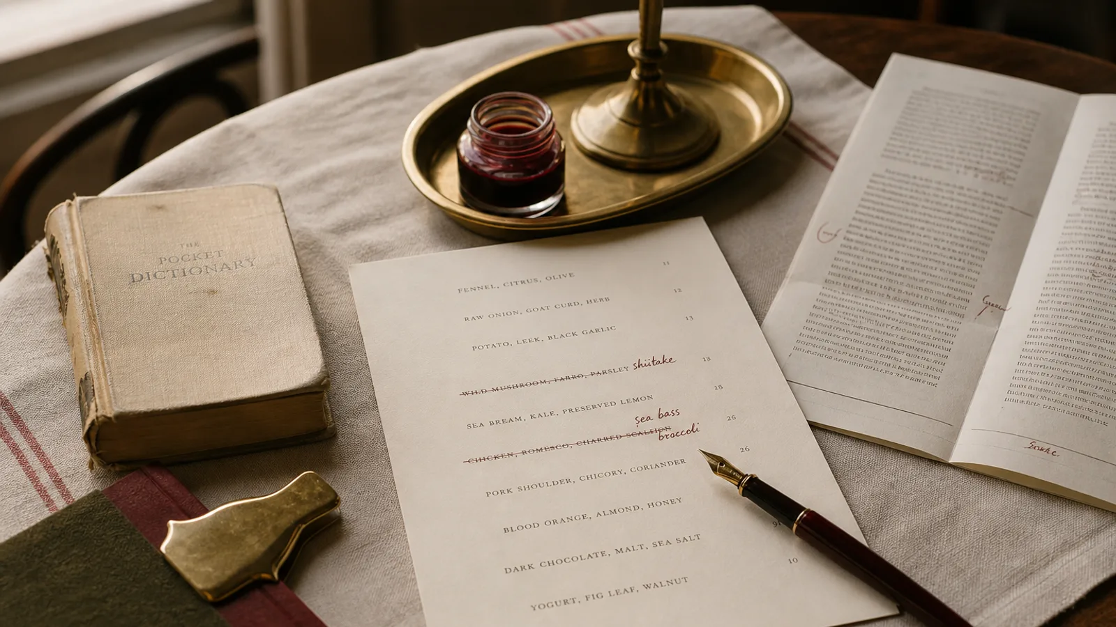
The last six lines of a menu do more damage than a bad heading. A service charge the guest did not see, a cover that appears only on the bill, an allergen key in 6 pt grey: these are how a good dinner ends in a conversation nobody wanted. The small print is still type. It has a size, a place, and a wording that is either clear or it is a trap. This article is about making those lines do their job without turning the foot of the card into a contract.
Service and cover are not the same sentence
Service compris, a discretionary service charge, a cover, a room hire: these are different facts. In much of France the price is service included and you say so once, in the same type as the allergen key, 8 pt, at the foot of every face that carries prices. In Italy a coperto is common and must be a figure, not a surprise ("coperto 3 €"). In Spain a cubierto is less universal; if you take one, print it. In the UK a discretionary 12.5 percent must be described as discretionary if it is, and the guest must be able to take it off. Do not borrow wording from another country. Write the rule you actually apply.
One line, one fact. "Prices include service" is enough when they do. "A discretionary 12.5% service charge is added; ask us to remove it" is enough when that is the policy. "Cover 2.50 €, bread included" is enough when you charge a cover. Stacking three policies into one 9-word sentence is how nobody reads any of them. If you do not charge a cover, do not print a cover line to look European.
Size, contrast, and the foot of the card
Footnotes live at 7 to 8.5 pt. Below 7 pt they fail in a dining room at 80 lux, and they fail for anyone over fifty. They stay in the same type family as the descriptions, not in a condensed gothic that looks like a terms page. Contrast is near-black on the board, not 40 percent grey. Grey small print is a design that hopes not to be read. If you are ashamed of the line, change the policy, not the ink.
Place the block 6 to 8 mm above the trim, inside the 5 mm safe margin, on every face that has prices. A service line only on the back of a bifold is a line half your guests will never turn over. A line only on the lunch card and not on dinner is how a regular gets a surprise at 9 pm. Same wording, same size, every version.
- One policy per line: service, cover, allergens, origin of meat if required
- 7–8.5 pt, near-black, same family as the descriptions, never grey
- On every priced face, inside the safe margin, 6–8 mm above trim
- Wording that matches the country and the policy you actually run
The allergen key is not optional decoration
Regulation 1169/2011 requires that the 14 allergens be available. The cleanest printed form is a numbered or lettered key at the foot, plus numbers after the dishes that need them. Set the key in the same 7 to 8 pt as the service line, with a 2 mm gap between the two blocks so they do not read as one paragraph. Do not replace the key with icons you invented. Do not hide it on a separate sheet the waiter produces when asked, unless that sheet is offered to every table as a matter of course.
If a dish changes and an allergen appears, the key on the reprint must match. A laminated card with last March's numbers and a kitchen that moved on is a legal problem. Date the source. Reprint when the list changes. At 99 € plus 10 € a copy, a short run is cheaper than a complaint that was waiting in the footnote.
Origin, VAT, and the lines the law actually asks for
Some countries require origin of certain meats on the menu or on a notice. If yours does, put it in the same block, same size. VAT included should be obvious from the prices; if you ever show prices without tax, say so in the same 8 pt, because a guest will assume the figure is what they pay. Do not invent extra legal poetry ("consumed at your own risk") that no statute asked for. It reads as fear and it does not protect you.
Wording that prevents the argument
Write as if a tired guest is reading at the moment the card arrives, not as if a lawyer is reading after a complaint. Short verbs. No double negatives. "Service included" beats "all prices are understood to be quoted on a service-inclusive basis". "Ask us to remove the service charge" beats "the discretionary gratuity may be adjusted upon request". If a staff member cannot say the line in the same words as the card, the card is too clever.
Supplements belong next to the dish, not only in the foot. "+8 €, 5 g truffle" under the name is a fact. A footnote that says "some dishes may carry a supplement" is a fog. The foot is for policies that apply to the whole card. The line is for facts that apply to one plate.
Small type, large honesty
Set the policies you actually run, at a size a guest can read, on every priced face, in language they would use. That is the small print. Everything else (grey ink, a line only on the back, a joke instead of a figure) is how a good kitchen loses the last five minutes of the evening.
In Menu Atelier the foot is part of the layout: you add the service line, the cover, and the allergen key as content, and they reflow when you switch A4 to A5 or single sheet to bifold; the 300 dpi export keeps them inside the safe margin with the 3 mm bleed, so the small print survives the trim instead of disappearing into it.