Beer menu design: styles, ABV, sizes and prices without the grid
How to design a beer list that reads as a card, not a spreadsheet: style, ABV, glass sizes and prices in a hierarchy a guest can scan from a stool.
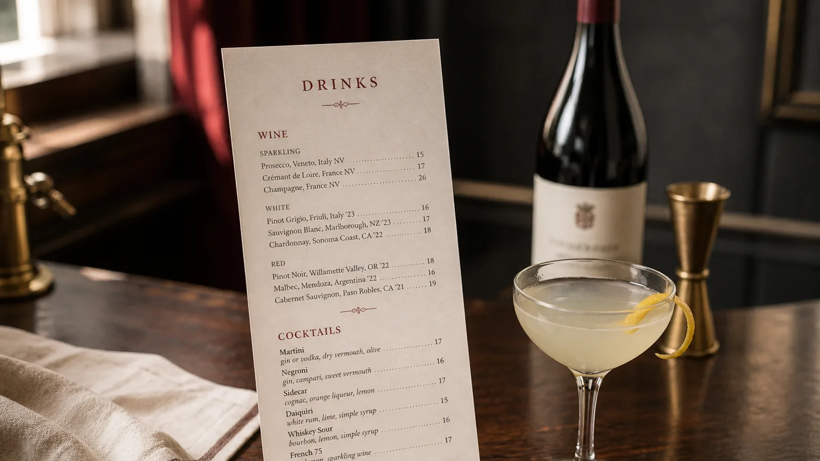
Beer lists slide into spreadsheets because the data is real: style, brewery, ABV, three sizes, three prices, sometimes IBU. A guest on a stool does not want a grid. They want to find a pale ale, see how strong it is, and know what a half costs. The design job is to keep the facts and lose the cells. If the card looks like an inventory export, people order the lager they already know and the rest of the taps go still.
Group by what people actually ask for
Group by family the room uses: lager and pils, wheat, pale and IPA, dark, sour and wild, cider if you pour it. Eight to sixteen draught lines is a bar list; a bottle and can shop of forty belongs on a second face or a short booklet. Do not group by country unless the room is built on that (a Belgian café, a Czech lager bar). Do not group by ABV; that is a shop sort, not a drinker's path.
Put the house lager or the best-selling pale at the top of its group, not in a star badge. Guest taps change: give them a reserved block headed "This week" or leave two ruled lines for a pen. A printed guest beer that left on Tuesday is how the card starts to lie.
One line that carries style, strength and size
The useful beer line is name or brewery, style, ABV, then prices for the sizes you actually pour. "Kernel Table Beer, pale, 3.1 % 3.80 € / 6.20 €" with 25 cl and 40 cl stated once in the header of the group. If you pour a third size (a 20 cl tasting glass, a 50 cl mug), add it to the header, not as a footnote the guest will miss. IBU can stay off the card unless the room is a taproom full of people who asked; it is a number that looks precise and helps almost nobody choose.
- ABV in one place, after the style, in the same size as the style word, not as a red warning. People need it; they do not need it shouted.
- Half and full as a pair of figures, right-aligned or after a 2 em space. Dotted leaders turn a beer card into a railway timetable.
- Bottles and cans in a second block with the volume in cl or ml on the line (33 cl, 37.5 cl, 75 cl). A bottle without a volume is a fight at the till.
Type that can hold a German name and a number
A grotesque with a good figure set, 11 to 12 pt on names, 10 pt on style and ABV. Old-style numerals look handsome and make a column of percentages harder to scan; lining figures are clearer for ABV and prices. Accents and umlauts are not optional (Hefeweizen, Jever, Saison). A beer list in a face that lacks them looks like it was typed on a till. One accent colour for section words; the rest stays dark on cream, or cream on a dark board if the room is a taproom at night. 11 pt minimum: bar lighting is not a desk lamp.
Skip the hop illustrations, the faux stamps and the tasting-note paragraph under every pale. One word of character is allowed when the style name would mislead ("West Coast IPA", "hazy"). A sentence about citrus and pine is the bartender's job, or a chalkboard for the two guests who want it.
Food, wine and the beer card's edges
If the room is a pub that serves food, a short pairing line under two or three plates on the food menu ("good with the stout") sells more beer than a novel on the beer card. Wine, if you have six bottles, can share the back face. A beer list that tries to be the entire drinks offering will either grow into a booklet or shrink the type until nobody reads the ABV, which is the one number you must not lose.
Allergens, gluten and the cider note
Barley, wheat and sulphites (in some ciders and bottle-conditioned beers) sit under Regulation 1169/2011. A line at the foot ("beers contain gluten unless marked; ciders may contain sulphites") plus a GF mark on the two or three truly gluten-free pours is enough. Do not print a medical paragraph on the cover. If you serve a gluten-reduced lager, say "gluten-reduced" not "gluten-free" unless you can stand behind the claim.
Paper that survives the bar
Beer cards live on wet wood. 350 g matte with a soft-touch finish wipes; 170 g uncoated dies on Friday. A5 or a tall card at the bar, A4 bifold if the bottle list is long. Reprint when more than two taps move, or design the guest block as an insert. A list that still shows last month's DIPA is telling regulars you stopped tasting.
In Menu Atelier you can set a draught column with a locked size header, park bottles on the facing page, and keep the guest taps as a short block you swap. Switch A5 and A4 bifold in one click, check the card in 3D, and download a 300 dpi PDF with 3 mm bleed or order the run on 350 g matte board.