Formatting vintages, regions and producers on a wine list
A field order and typographic system for wine list entries: which element leads, how to set producer, cuvée, appellation and vintage, and how to keep 80 lines consistent.
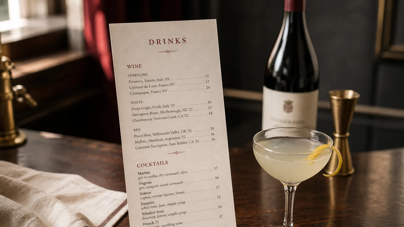
Every wine on a list carries the same five pieces of information: producer, cuvée or wine name, appellation or region, vintage, price. Most lists present those five things in a different order on every line, because they were typed one at a time from labels over several years. The result is a list that is technically complete and practically unreadable. A wine list needs a field order and a typographic system, decided once and applied to every line; this article proposes one that works for 20 wines or 200, and explains where the exceptions are.
Decide what leads the line
The first word of the line is what the guest scans. There are two defensible choices. In producer-led lists, the estate name comes first: Domaine Vacheron, Sancerre, 2022. This suits lists built around growers and natural wines, where the producer is the point. In appellation-led lists, the place comes first: Sancerre, Domaine Vacheron, 2022. This suits classic lists organised by region, where a guest looks for a Sancerre rather than for a Vacheron.
Mixing the two is the most common fault. If your Burgundy section leads with the village and your Italian section leads with the producer, the guest has to relearn the line every time they turn the page. Pick one for the whole list, and if your sections are already organised by region (Loire, Burgundy, Piedmont), lead with the producer, because the region is already in the heading.
A field order that handles most wines
Within a section headed by country and region, a line that works for the great majority of wines is: producer, cuvée or vineyard name (if any), appellation with its classification, grape (only if not implied by the appellation), vintage, price. Set the producer in the strongest weight on the line, the cuvée in regular, the appellation in regular or small caps, the grape in italic, and the vintage and price in tabular figures at the right.
- Producer: as it appears on the label, without Domaine, Château, Azienda or Bodegas unless it is genuinely part of the name people use (Château Margaux yes, Bodegas Muga optional).
- Cuvée or single vineyard: in quotes only if the producer uses them; otherwise plain. Omit fantasy names for entry wines if they add nothing.
- Appellation and level: Sancerre, Chablis 1er Cru Montmains, Barolo DOCG, Rioja Reserva. Write the classification as the region writes it.
- Grape: only when the appellation does not tell the guest (a Languedoc blend, a Sicilian IGT). Chablis does not need chardonnay after it.
- Vintage: four digits, tabular figures, in its own column or immediately before the price. NV or a dash for non-vintage.
- Price: tabular figures, right-aligned, whole or half euros, in a column with glass and bottle headings if both are offered.
Regions as headings, not as text
The region belongs in the section heading, in a hierarchy of at most two levels: country, then region (France, then Loire; Italy, then Piedmont). A third level (Loire, then Sancerre, then producer) is only needed on lists above 150 wines. Use the same typographic treatment for every heading at the same level, and give the guest a sense of place with the order: run France north to south or west to east, Italy north to south, Spain by major region, so that the list has a geography the reader can follow.
Avoid grouping by grape on a European list unless your concept demands it; guests looking for a Barolo do not think of it as a nebbiolo. Grape grouping suits New World sections and by-the-glass lists where the style matters more than the origin.
Colour before region, or region before colour?
Both orders exist. Colour first (all whites, then all reds, each by region) suits shorter lists and restaurants where the guest chooses the colour before anything else. Region first (Burgundy: whites, then reds) suits long lists and wine-focused restaurants. Under 60 wines, colour first is almost always easier for the guest.
Vintages: one column, no exceptions
The vintage is the field most often abused: sometimes before the producer, sometimes after the appellation, sometimes missing. Put it in the same position on every line, ideally a narrow column just left of the price, in tabular figures so the four digits stack. This column doubles as a proofing tool: when a vintage changes, you can see at a glance which line to update.
If a wine's vintage changes frequently and you cannot reprint each time, the honest solutions are a note at the top of the list (vintages subject to change; ask your server) or a dash in the column. Printing a wrong vintage is worse than printing none; in many jurisdictions it is a labelling offence and it is always a trust problem.
Keeping 80 lines consistent
The system fails at the moment a new wine is added by someone who did not design the list. Write the field order down as a one-line template (Producer, Cuvée, Appellation, grape, Vintage, Price) and keep it with the list source. Before every reprint, sort each section by the vintage column and by producer alphabetically as a check for duplicates and inconsistencies. Look at the right-hand edge of every page with the file at 100 percent: if it is not a straight line, a figure style or a column width has slipped.
Accents and diacritics are part of the name: Château, Bründlmayer, Rías Baixas, Gewürztraminer. A list that drops them tells a knowledgeable guest the list was typed in a hurry.
One template, every line
A wine list that follows one field order, uses the region as a heading, keeps the vintage in a column and writes producers as the label does reads as the work of someone who knows wine, even before the guest has looked at a single bottle. It also takes less time to update, because every line has an obvious slot for every change.
In Menu Atelier, a wine entry is a dish line with a secondary line, so producer, appellation and vintage each have a consistent typographic slot in every style; the list reflows across A4 and A5 formats and you can proof the column alignment in 3D before exporting print-ready files.